Dior Homme Été 2016

IN ALL DISORDER A SECRET ORDER
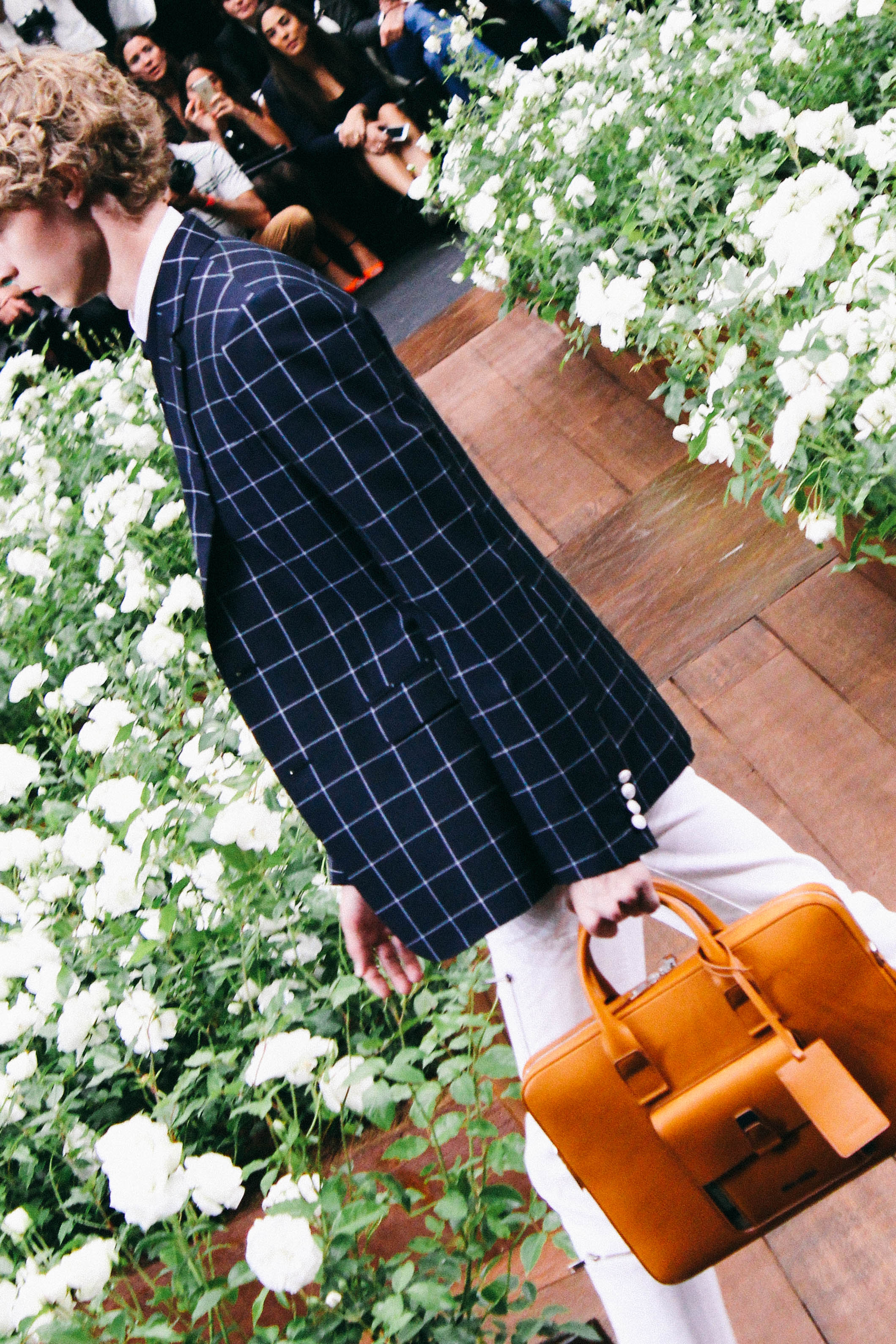
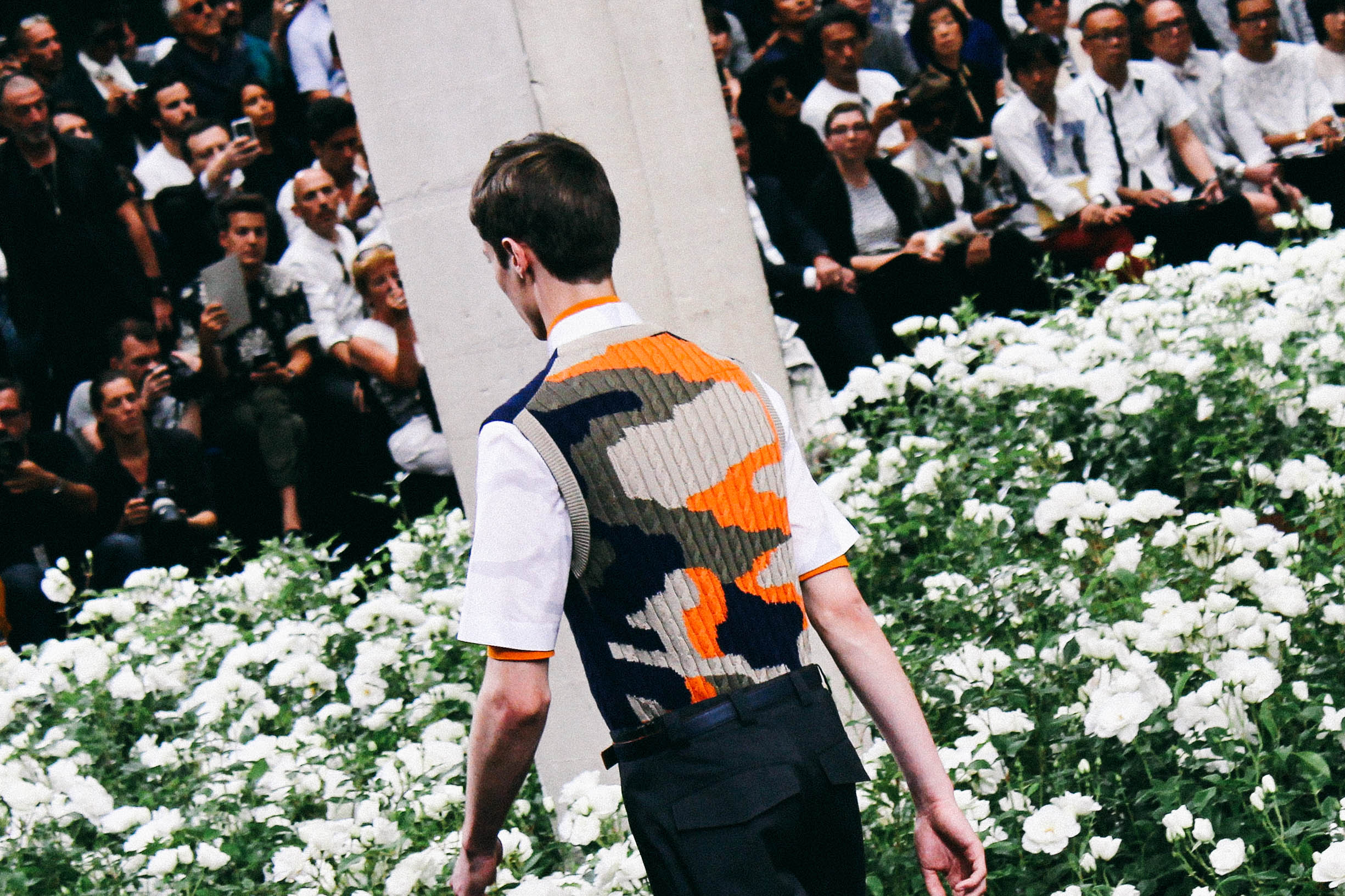
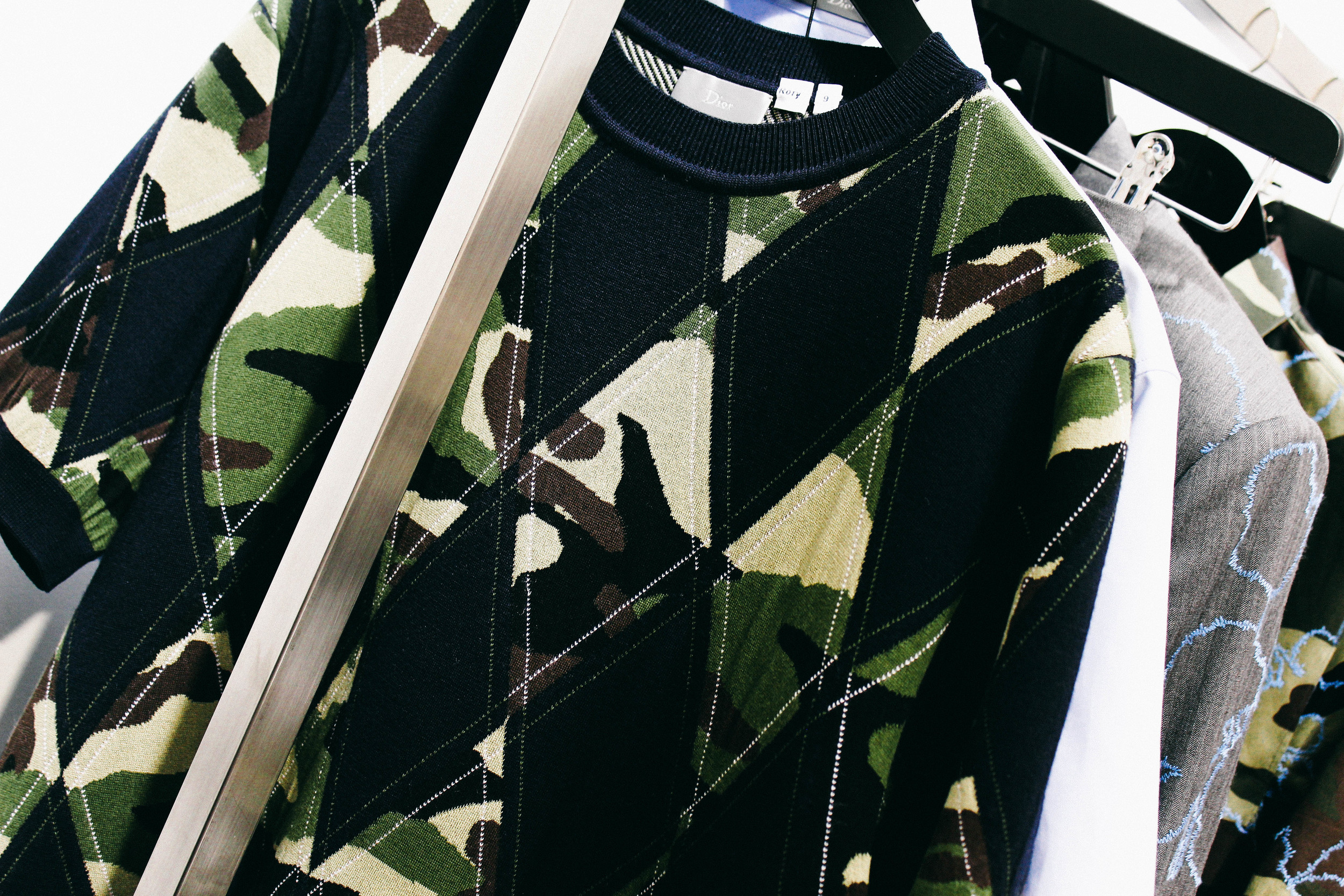
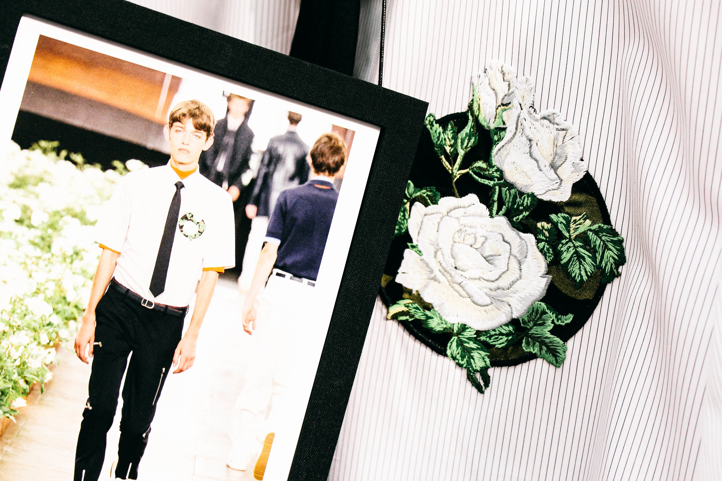
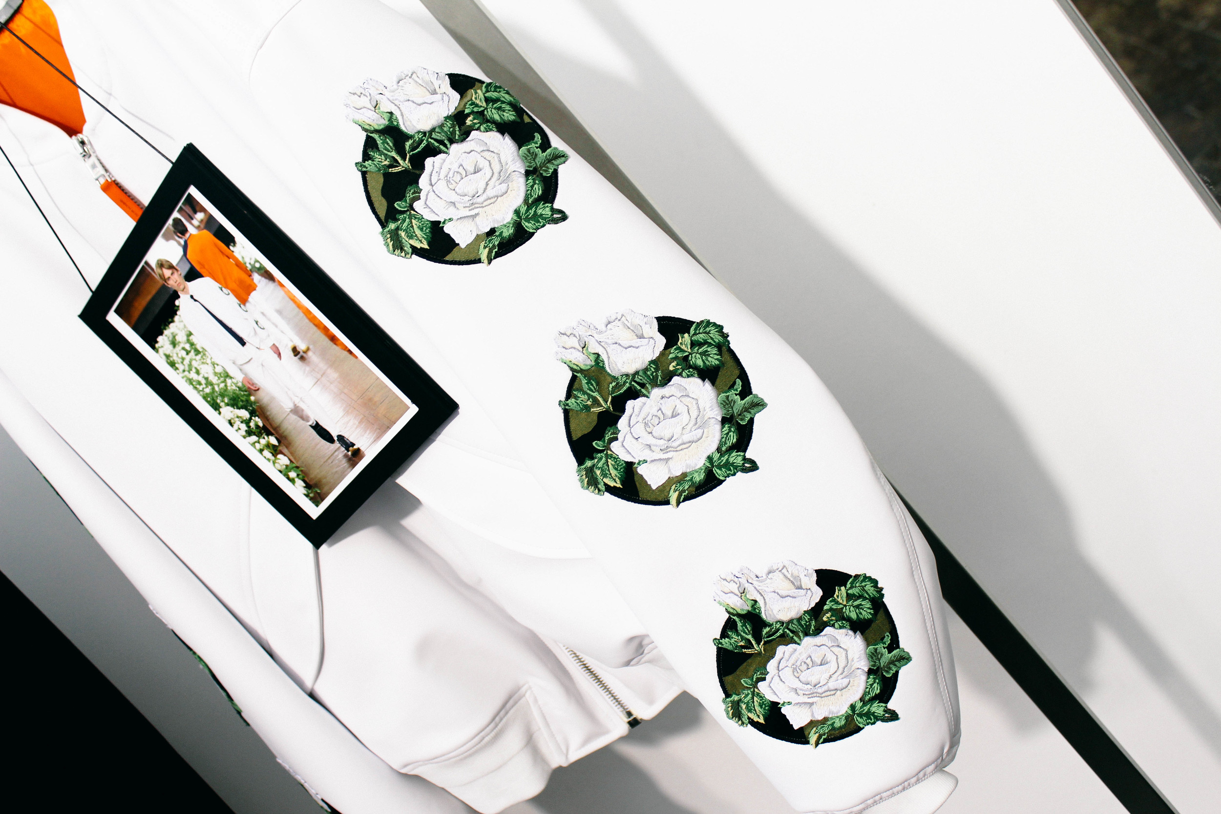
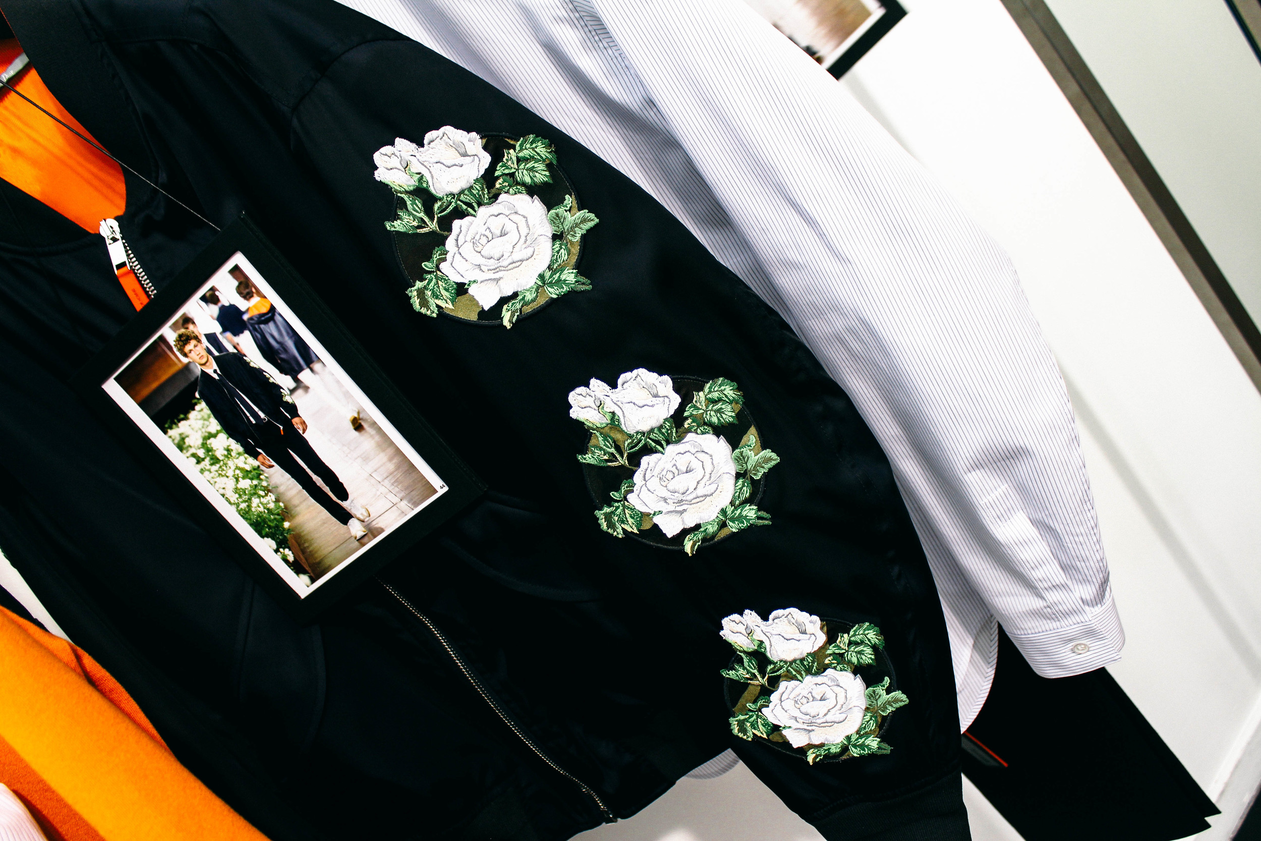
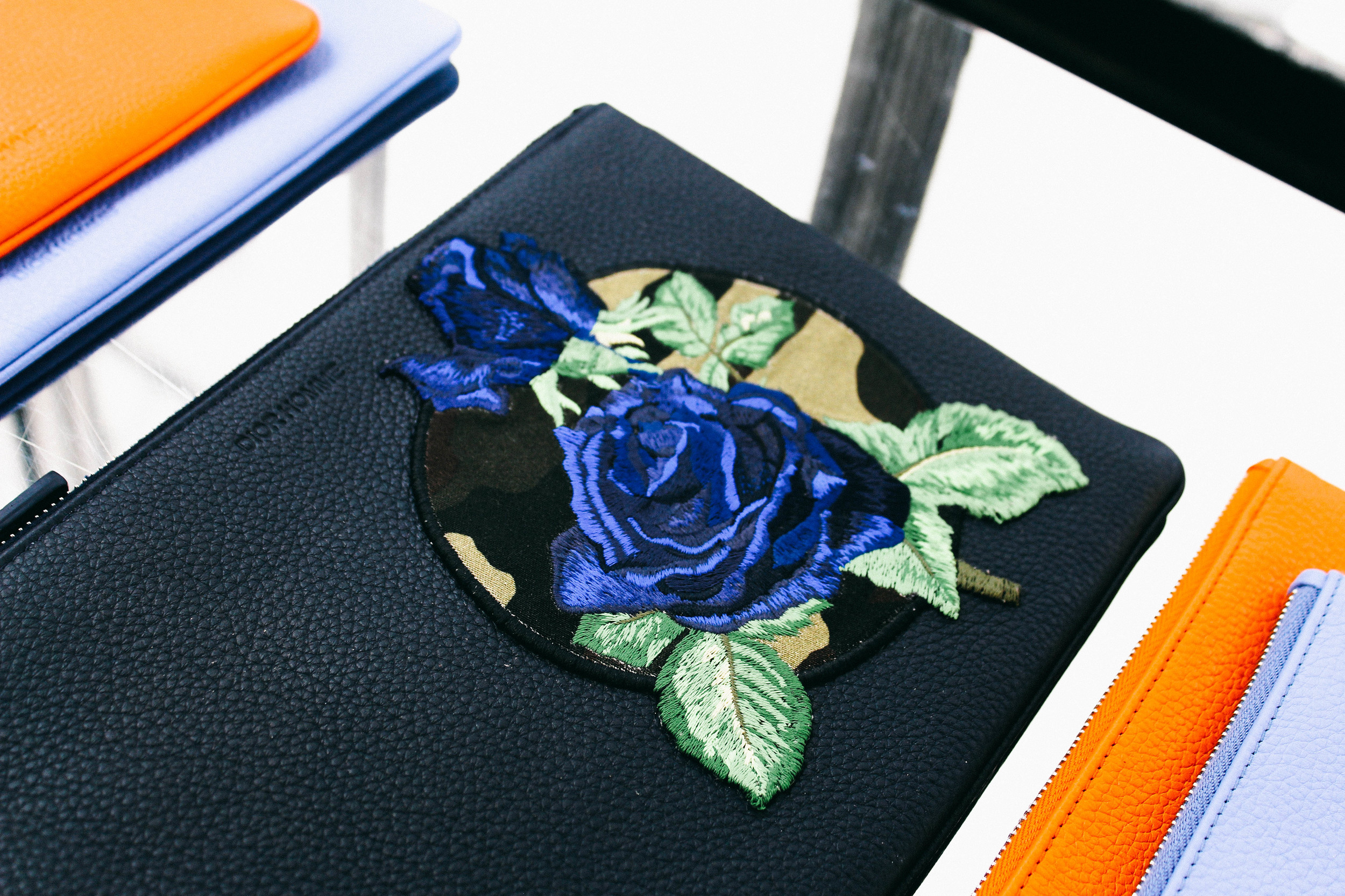
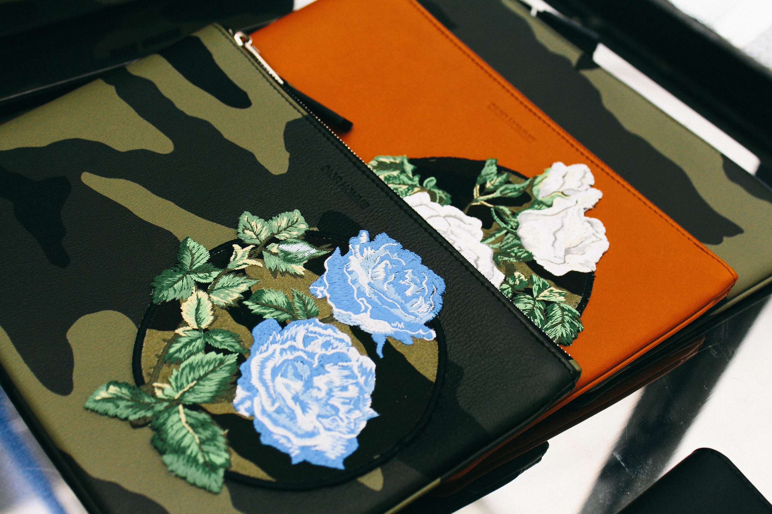
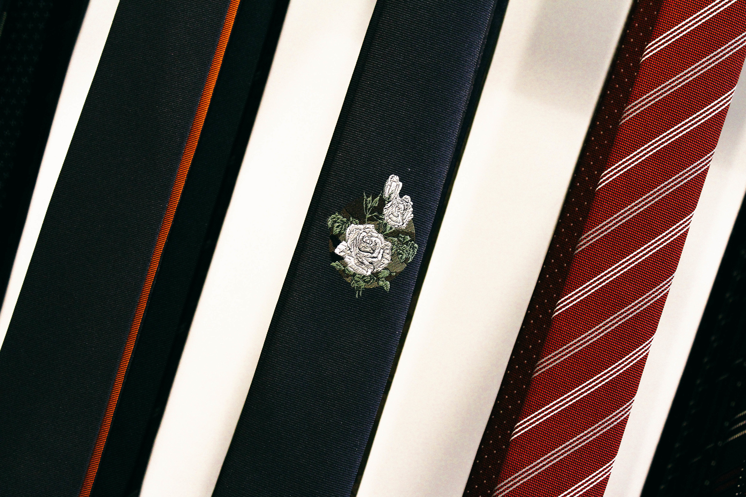
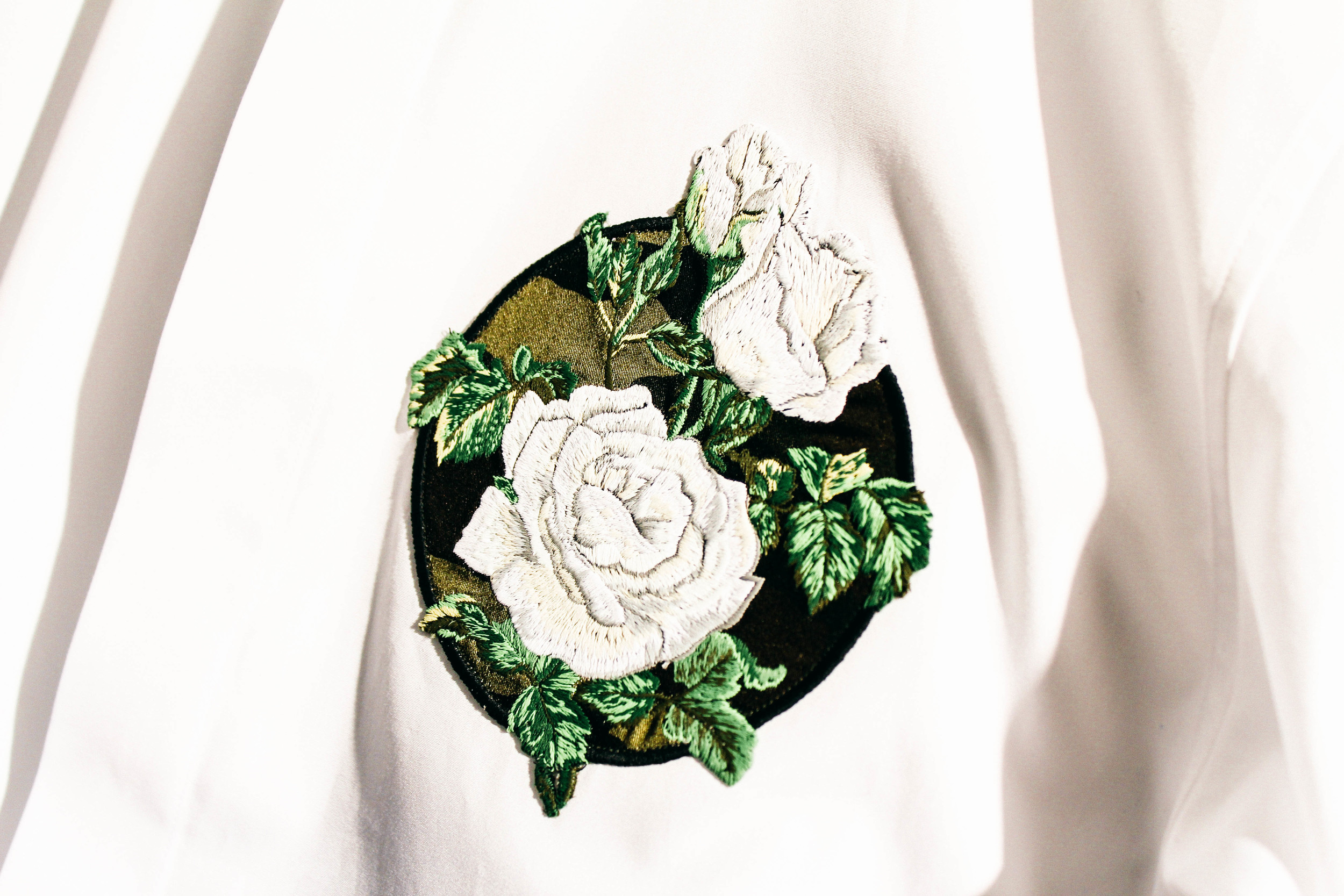
Invitations give the best clues, in the discretion of the designer. Every small detail somehow translates into something larger on the runway. A black, neat, square box arrived enclosed with the invitation and the poster (that naturally comes with the invitation every season). An orange pop of colour encircles the inner lining of the black box, giving hints to what seems like the Dior Homme orange for Summer 2016. The centre of the poster presents a man painted with a yellow face with an additional colour palette: blue, orange, green and pink. The painting, when glimpsed, looks similar to any post-impressionistic self portrait of Van Gogh. Attention to detail is key; and studying the poster, or invitation for any other show, is no different from observing an art piece. But invitations never gives everything away. There’s a stem of leaves lying across the man’s face diagonally to the back of the neck. Sitting below the man’s face is a sketched rose bud. There’s also an abstract print of argyle all-over the poster in silver and differing in sizes.
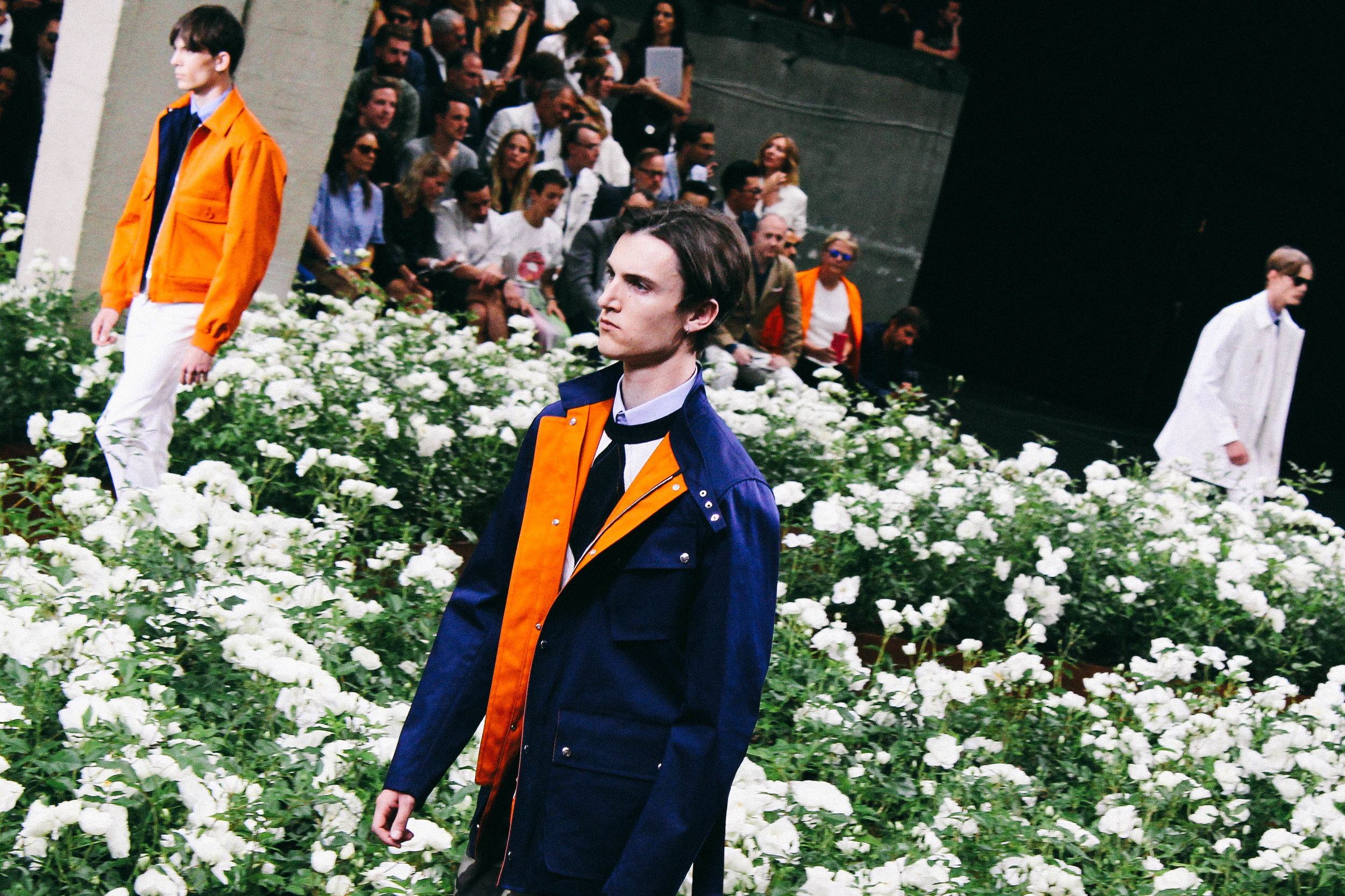
From what I gathered from the invitation, prior to the show, I had 3 predictions: floral from the rose bud (as from Hiver), pops of colour from the bottles of paint (though that could be deceiving as the colourful florals from the Hiver invitation ended up as badges) and argyle prints. And these clues were fairly accurate.
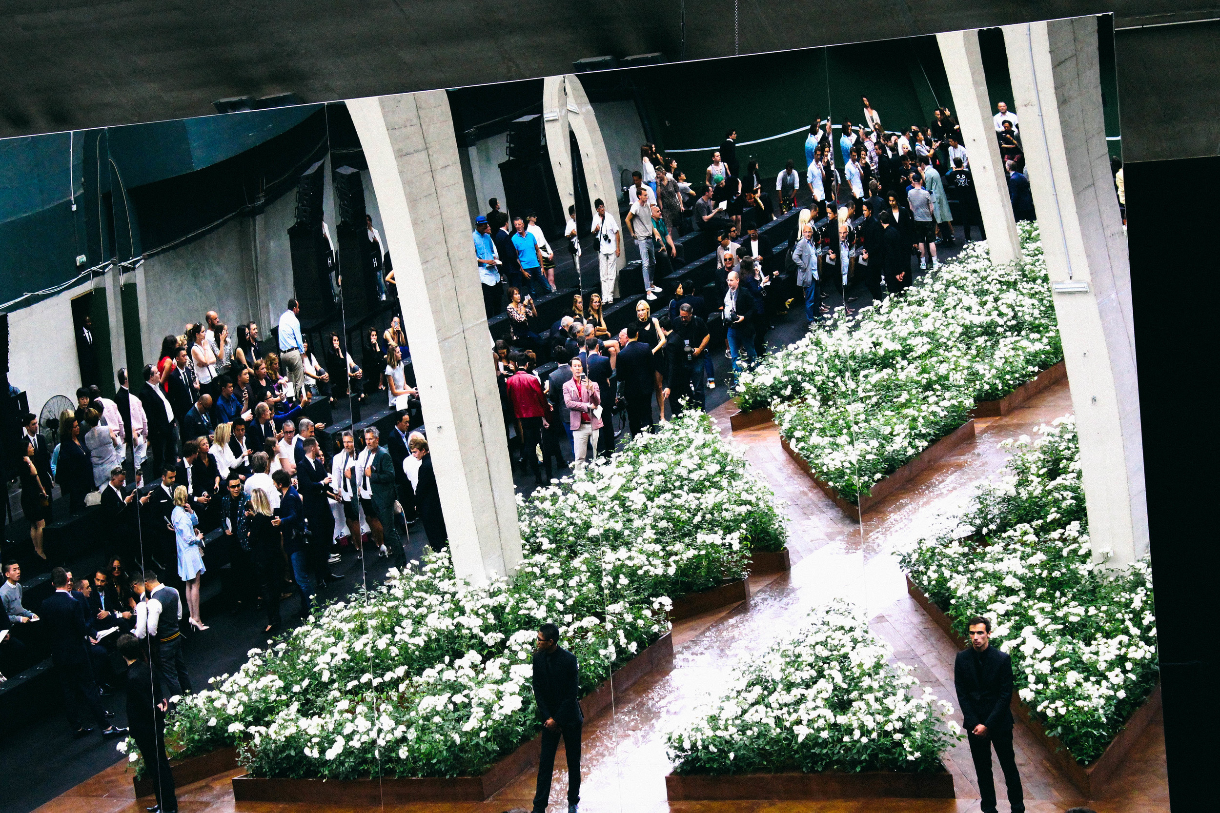
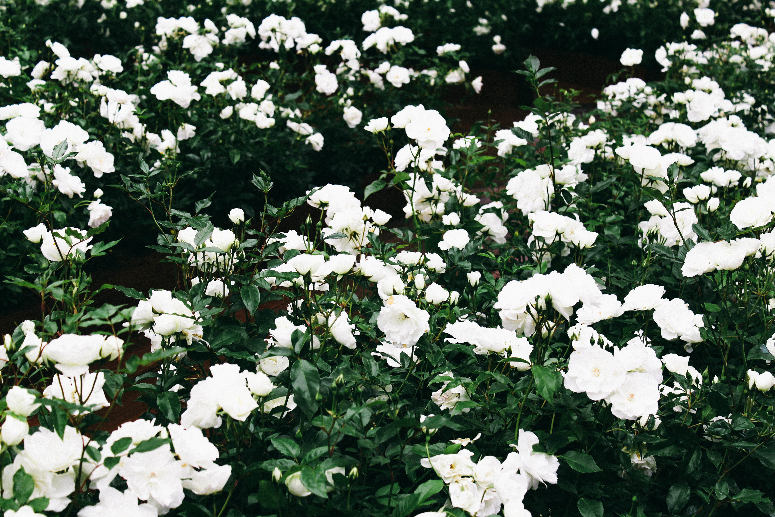
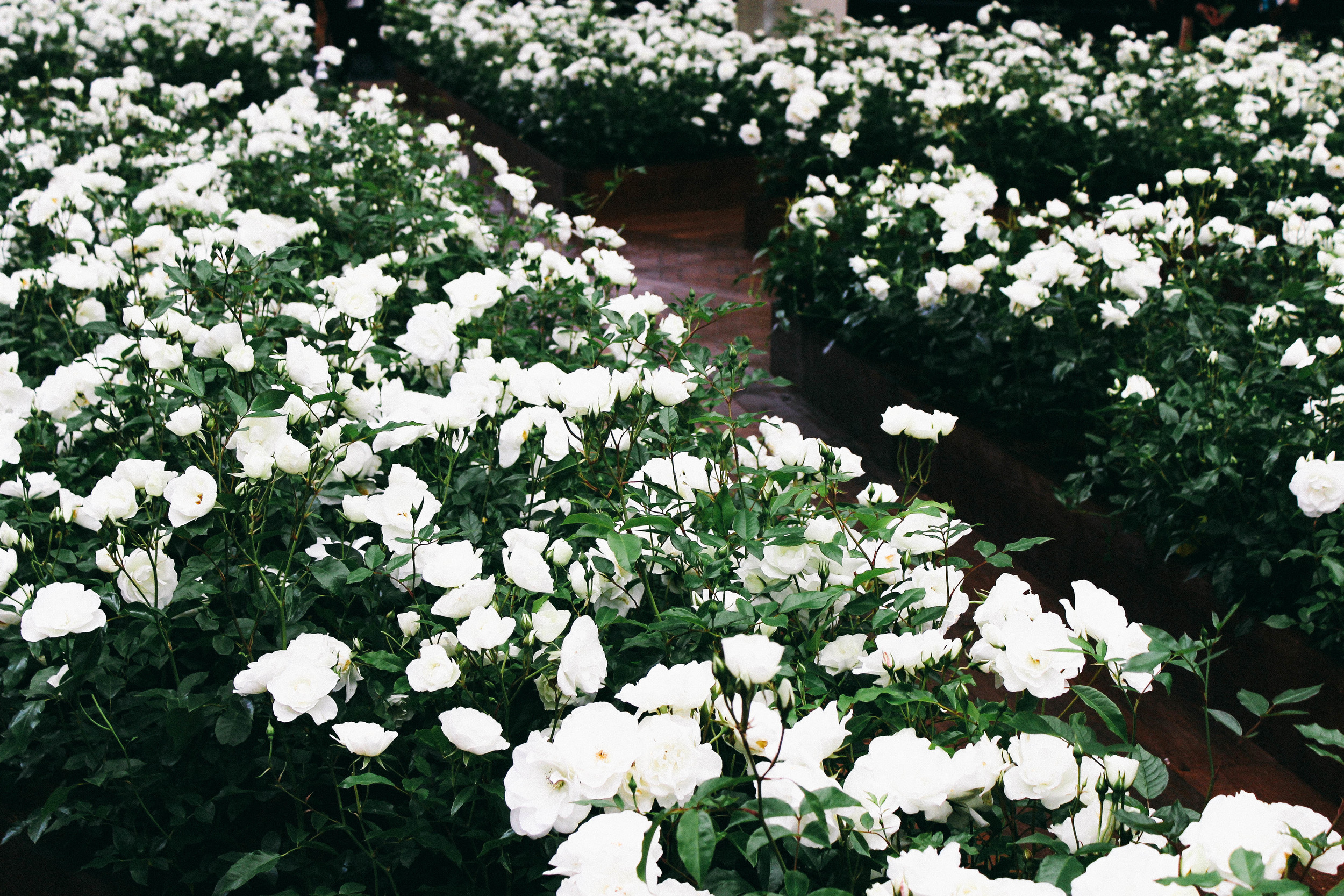
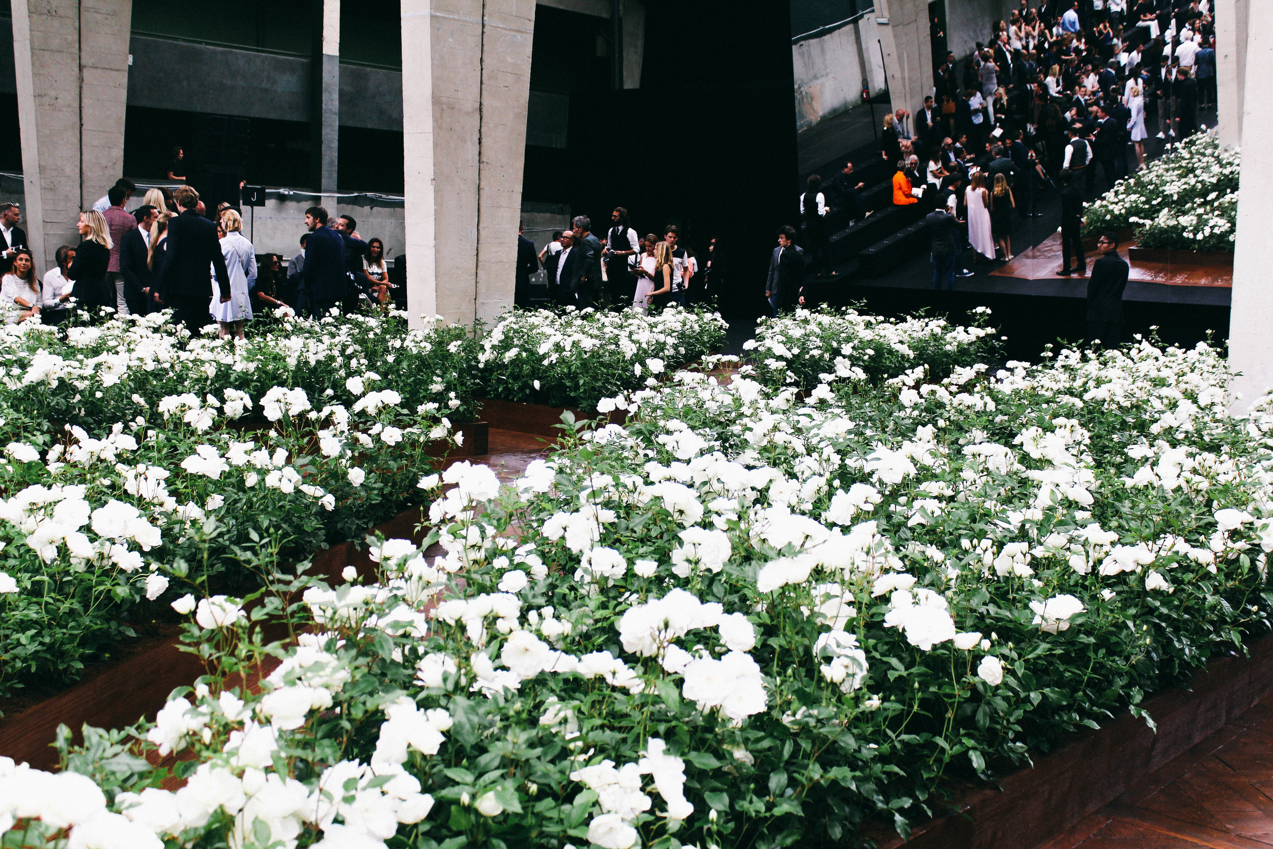
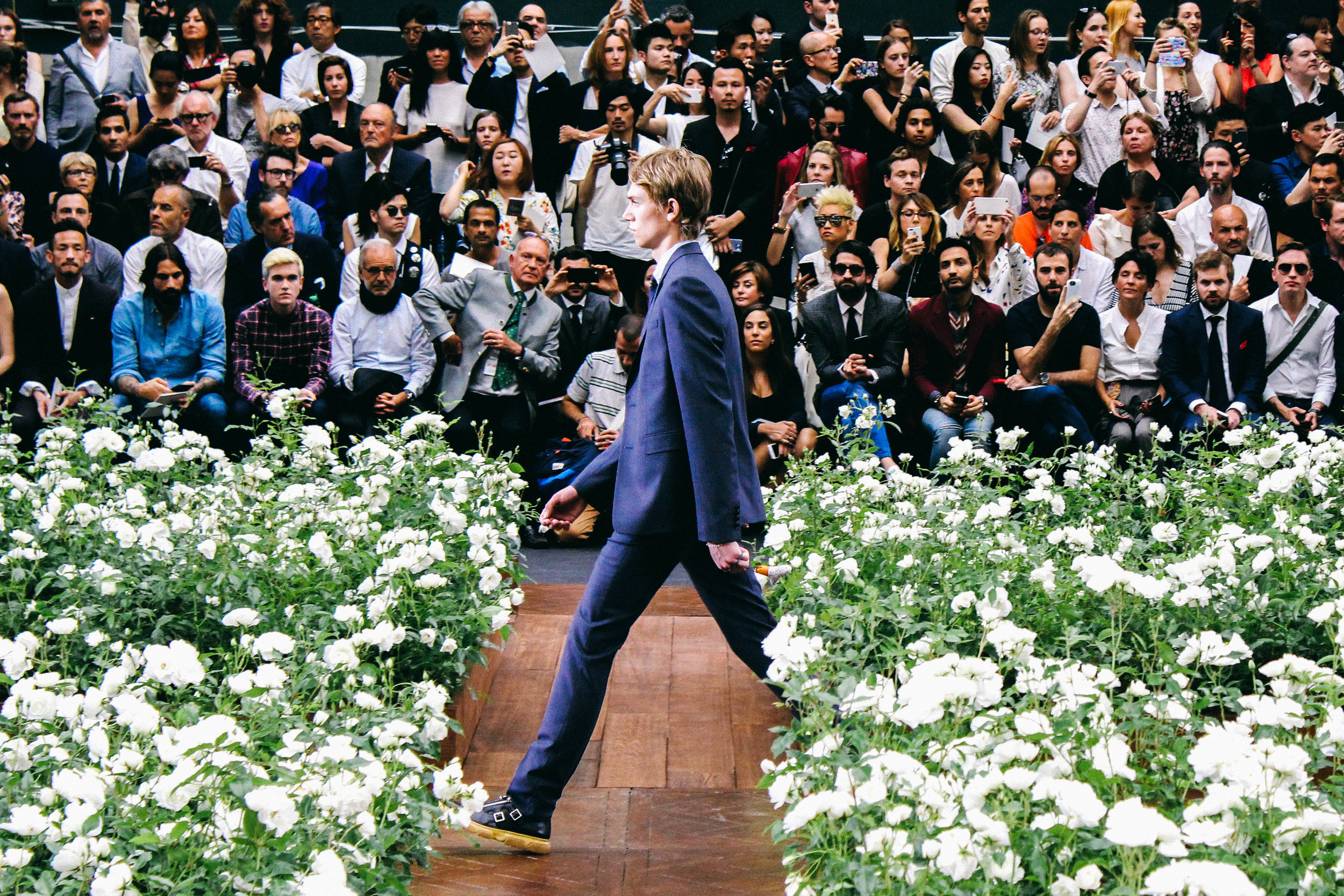
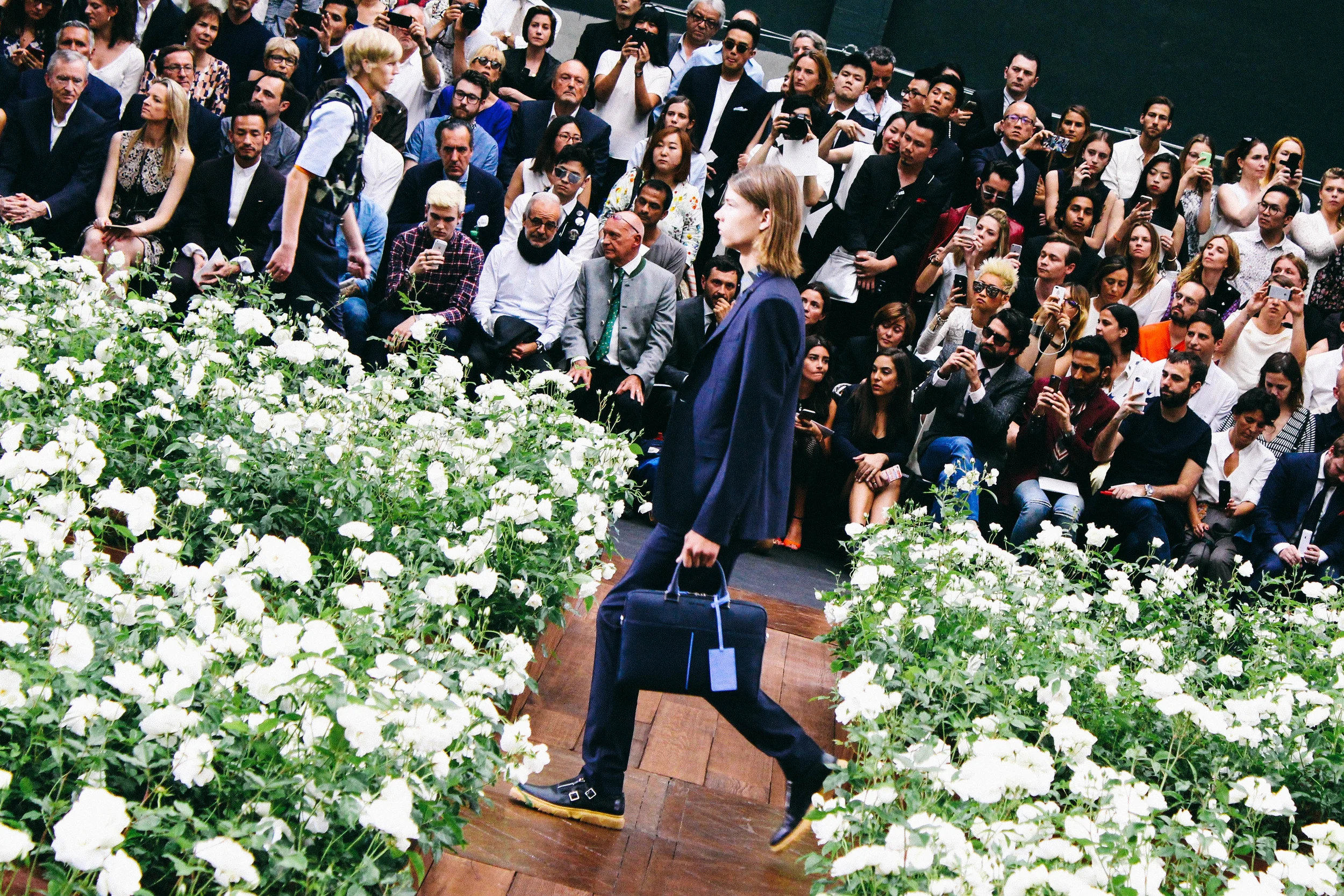
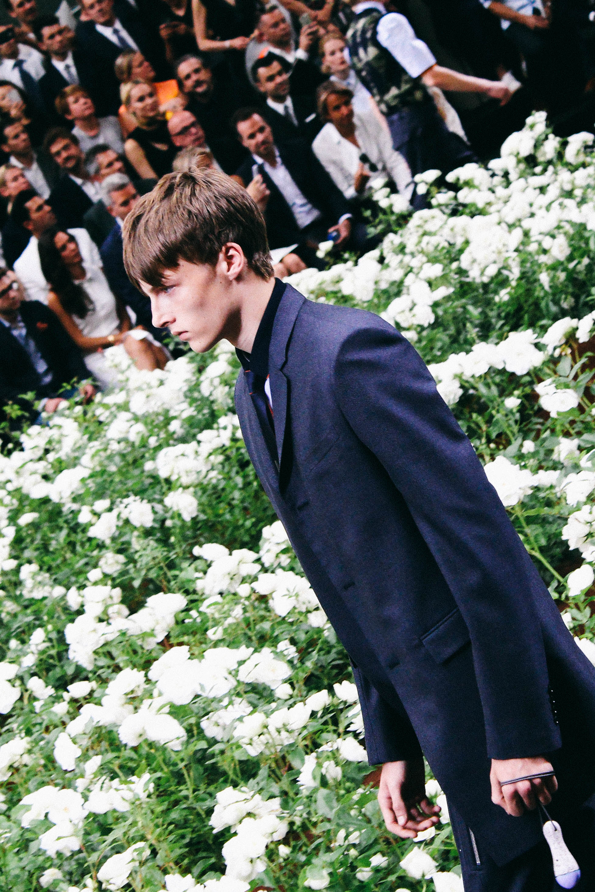
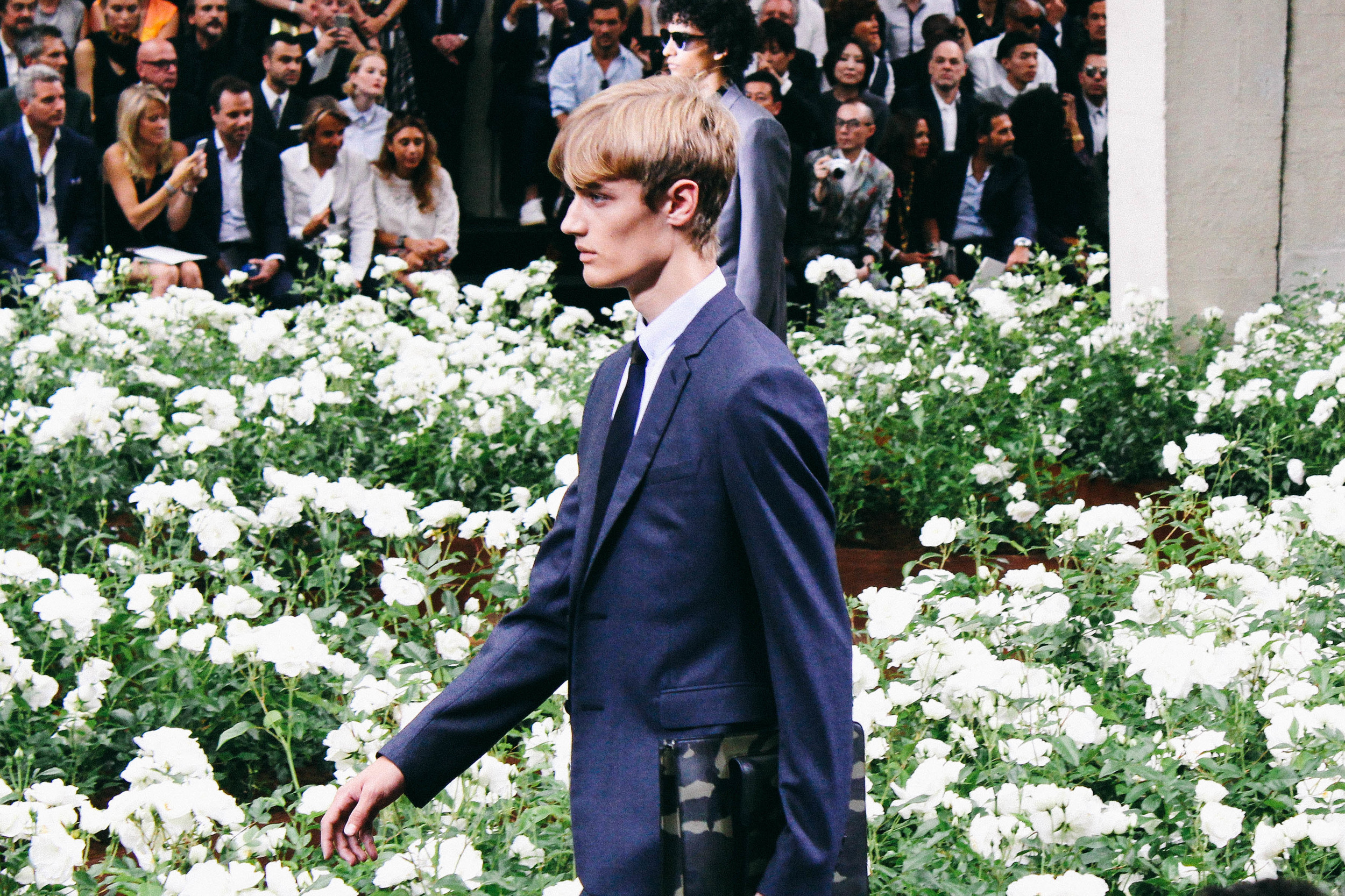
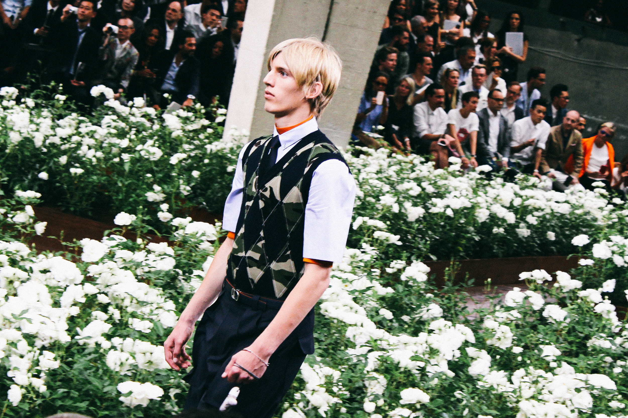
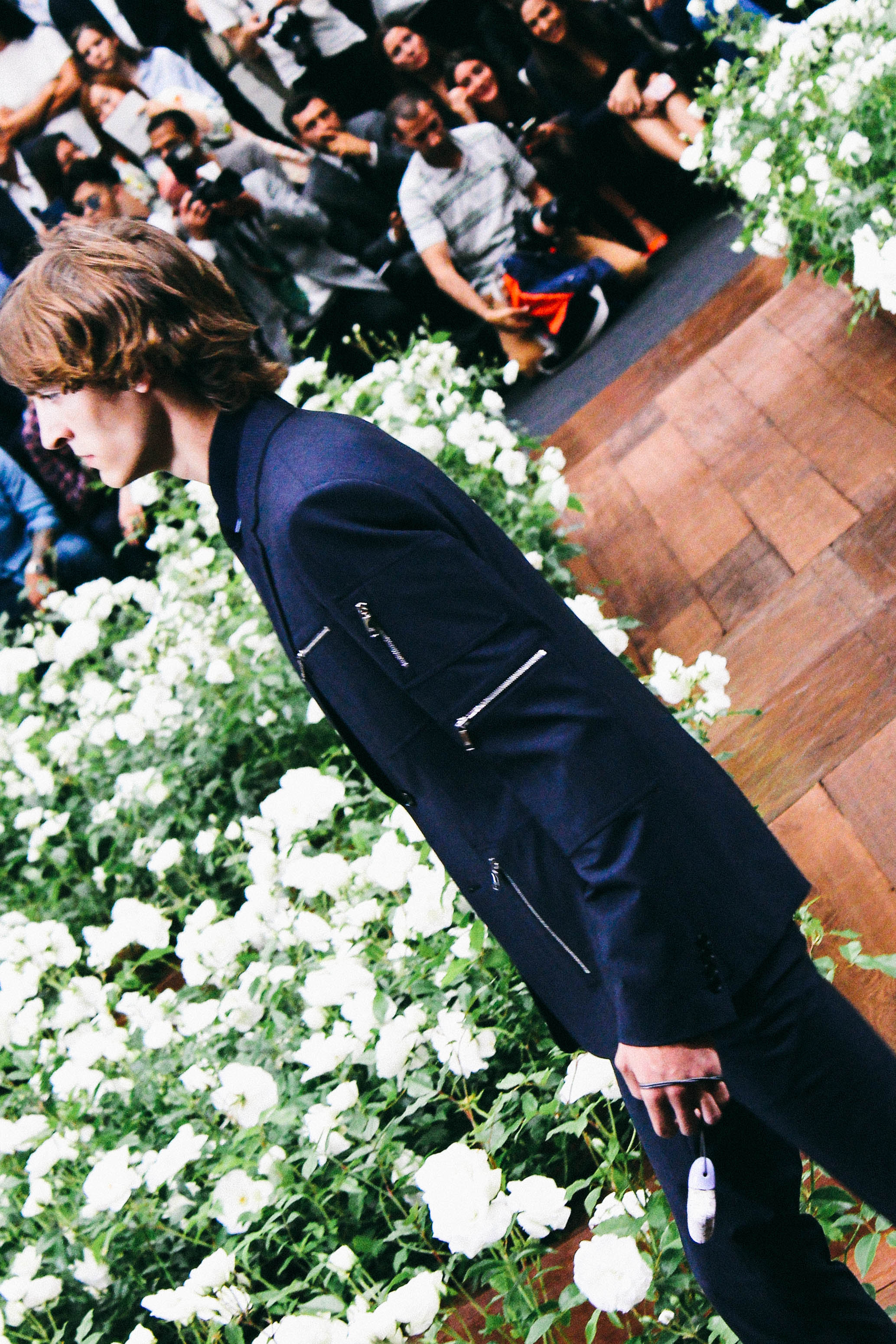
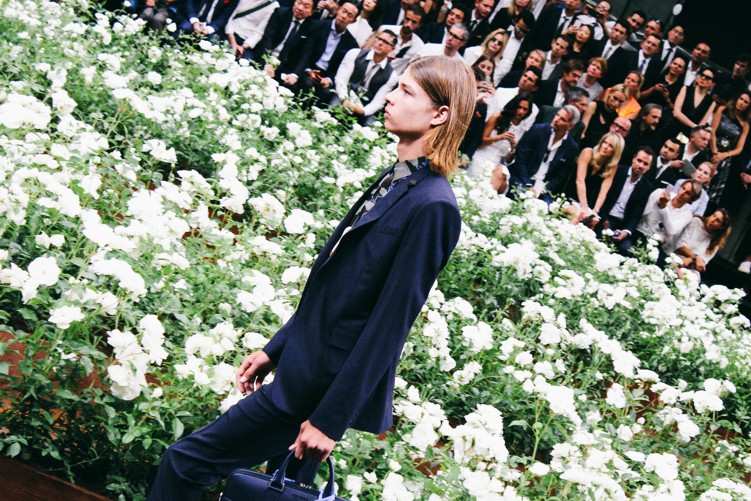
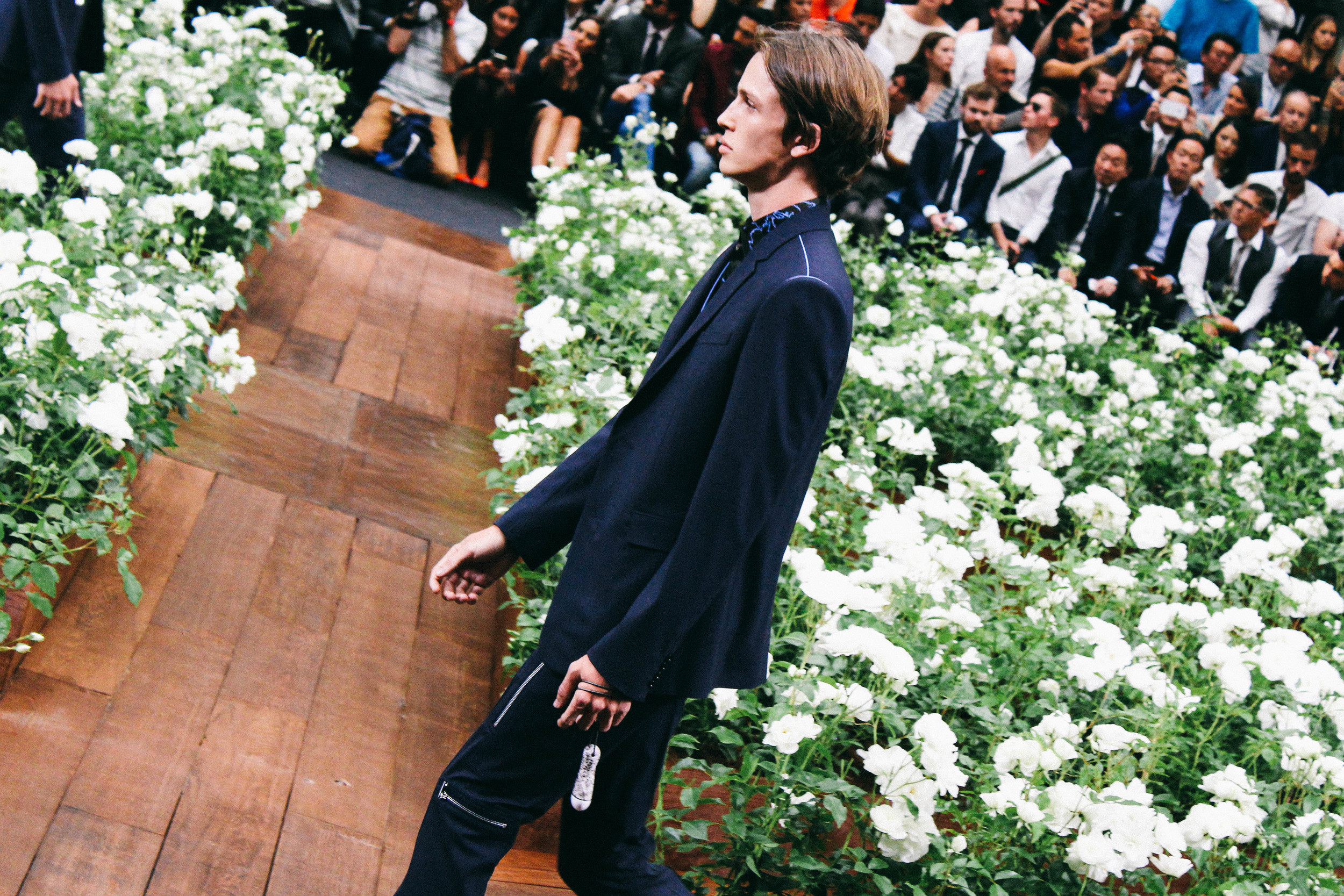
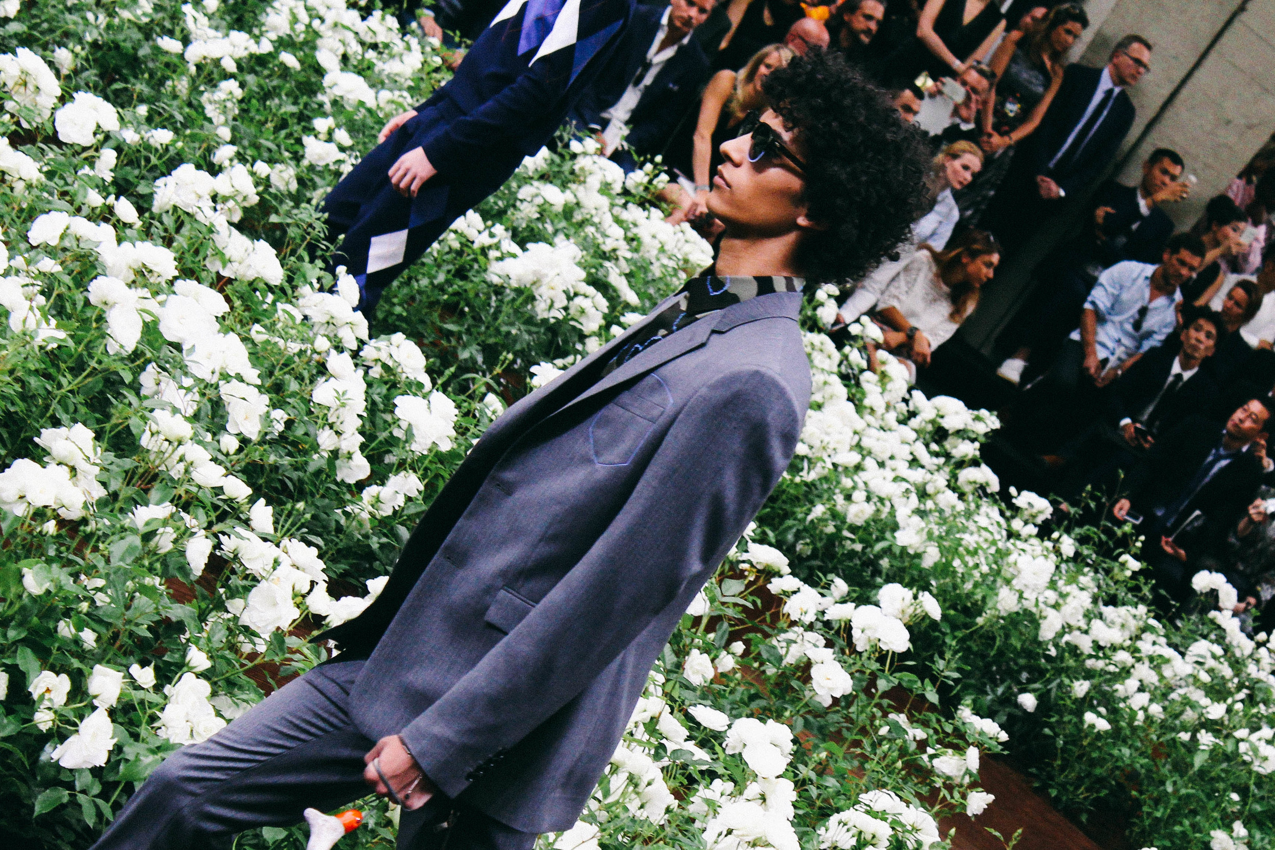
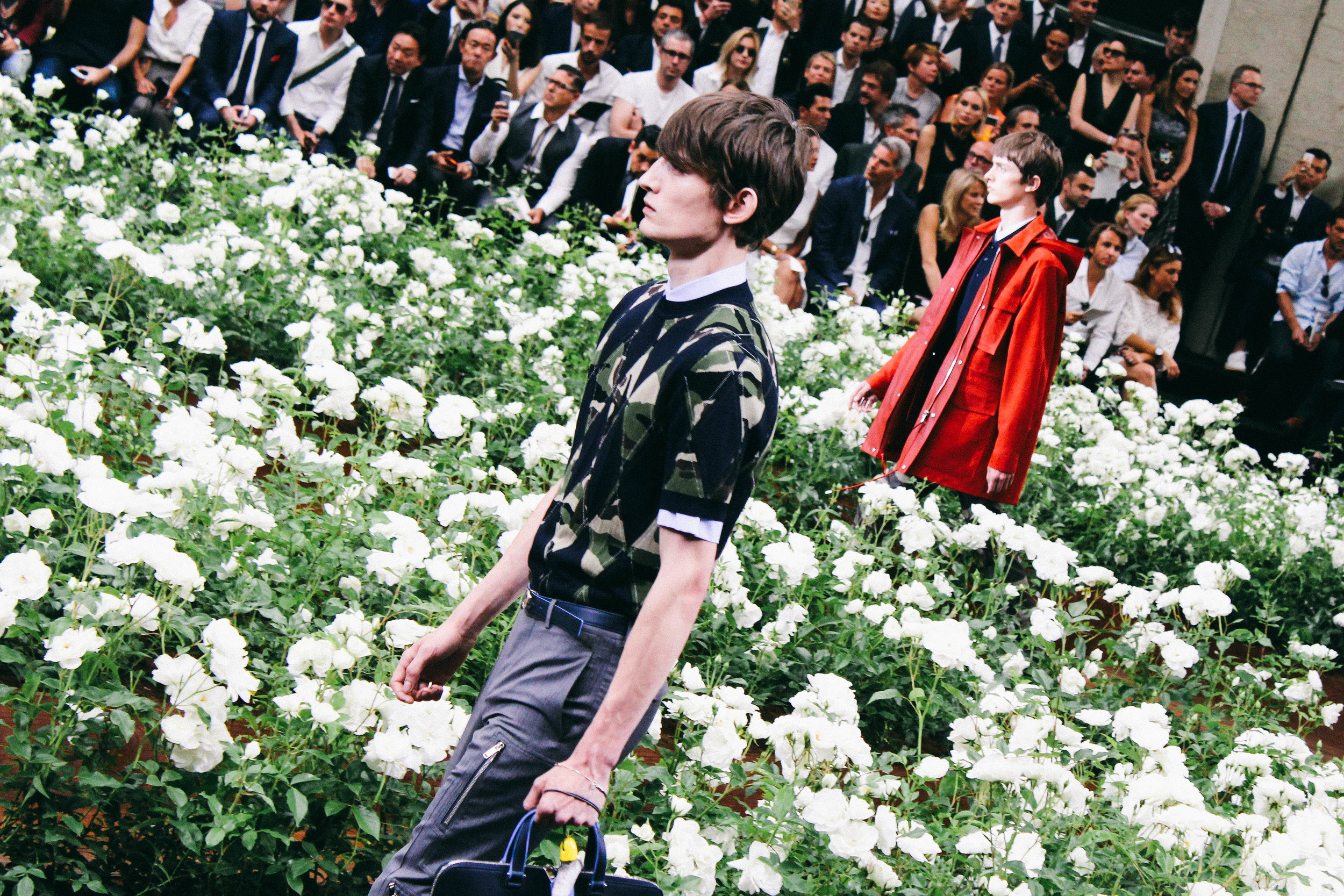
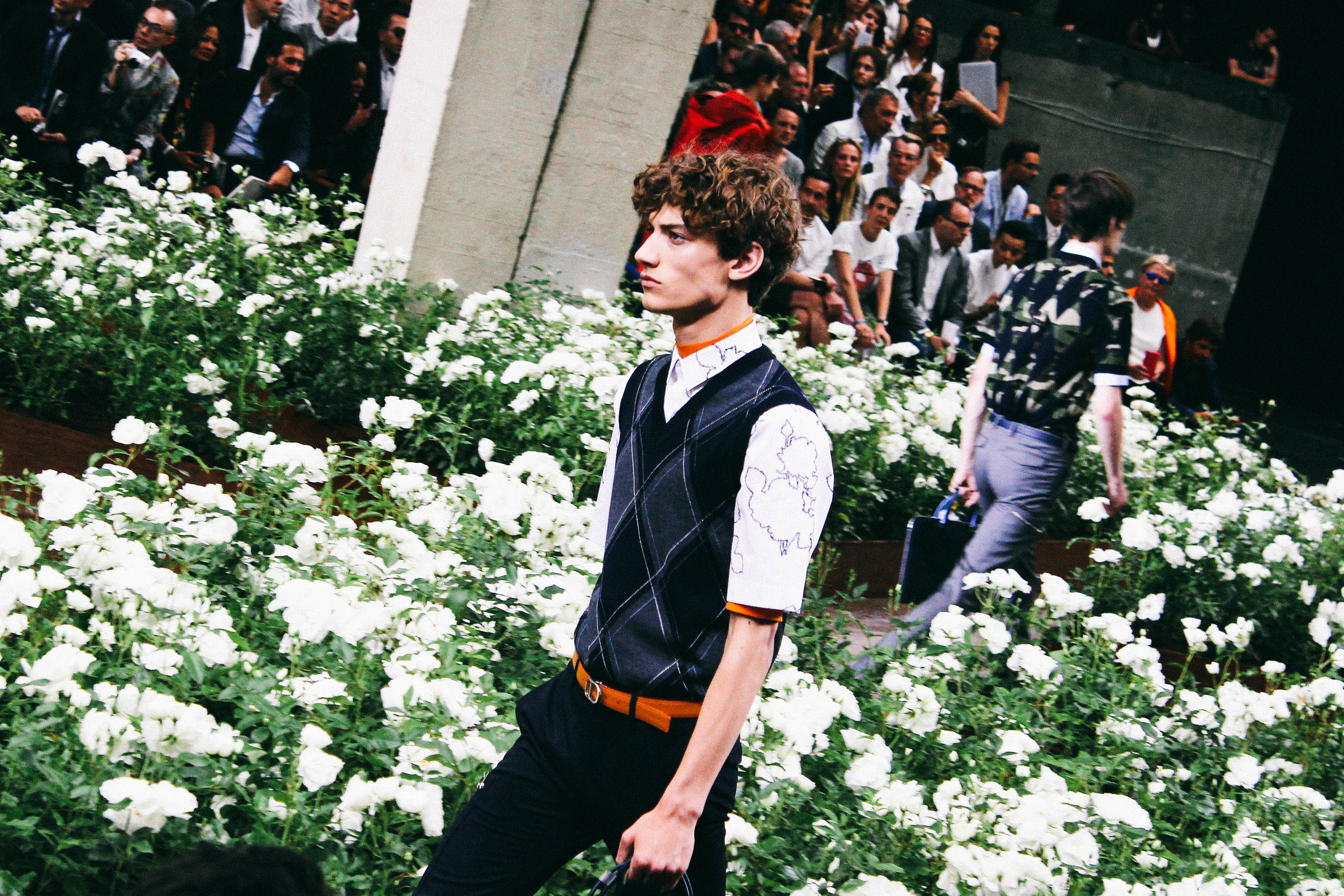
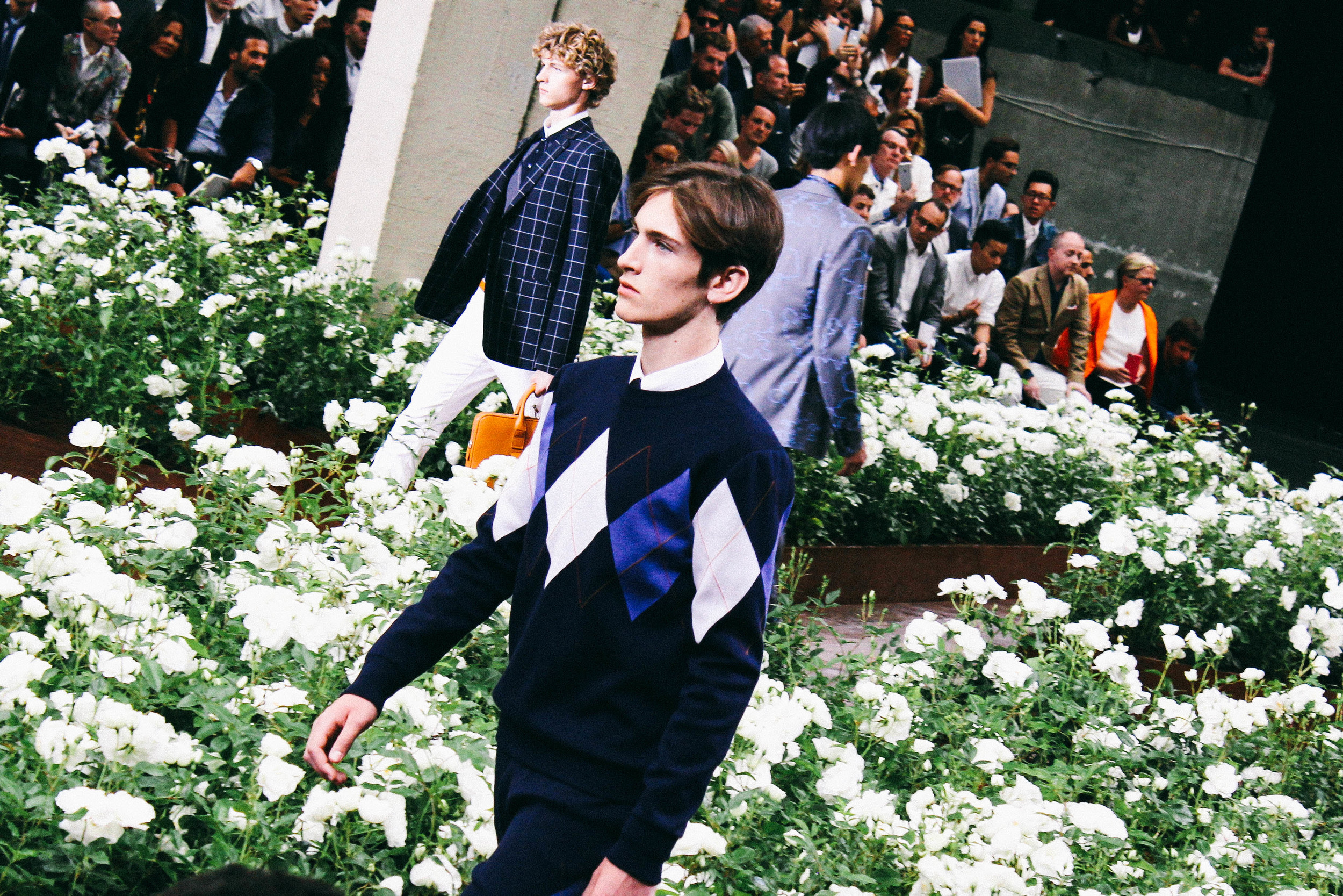
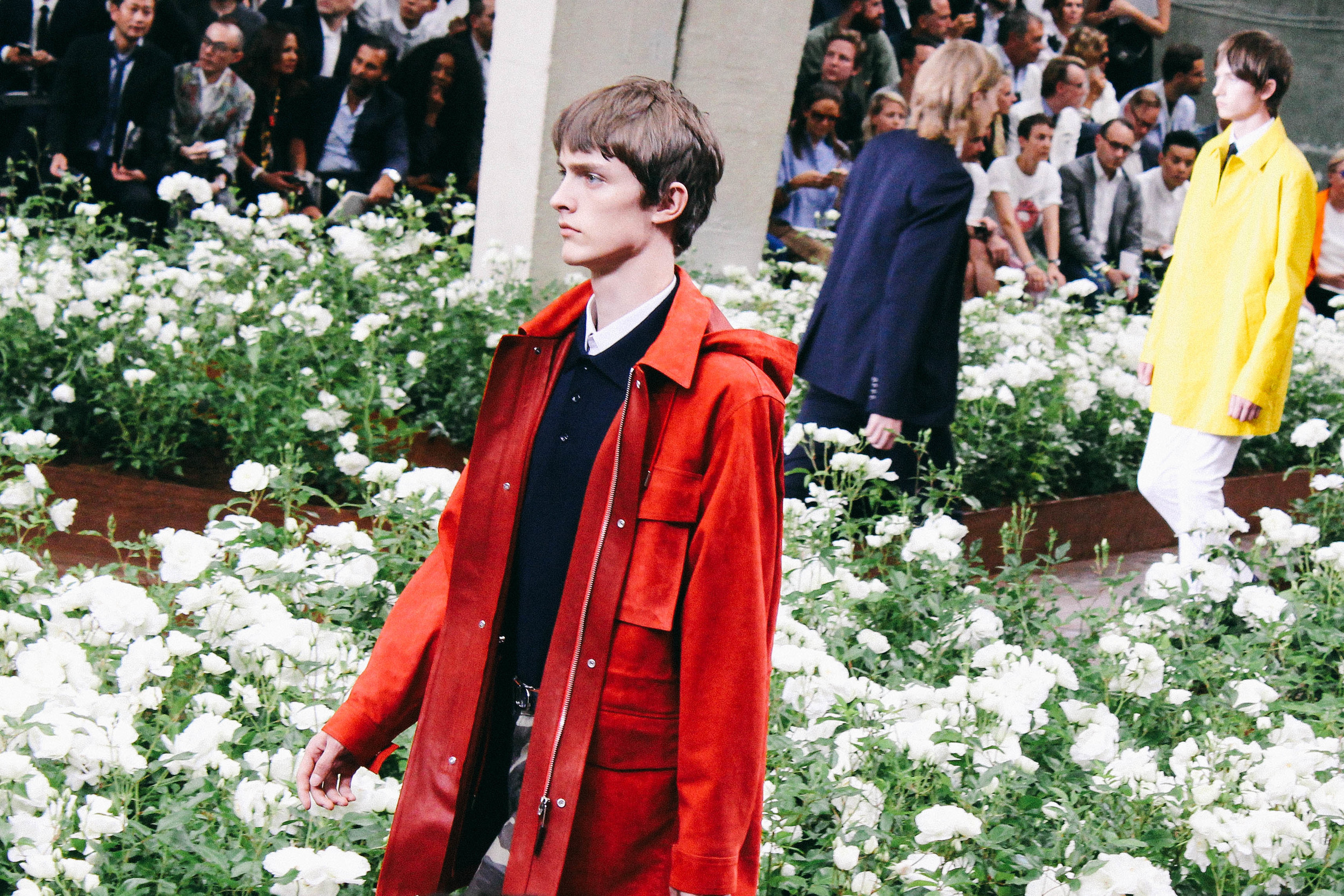
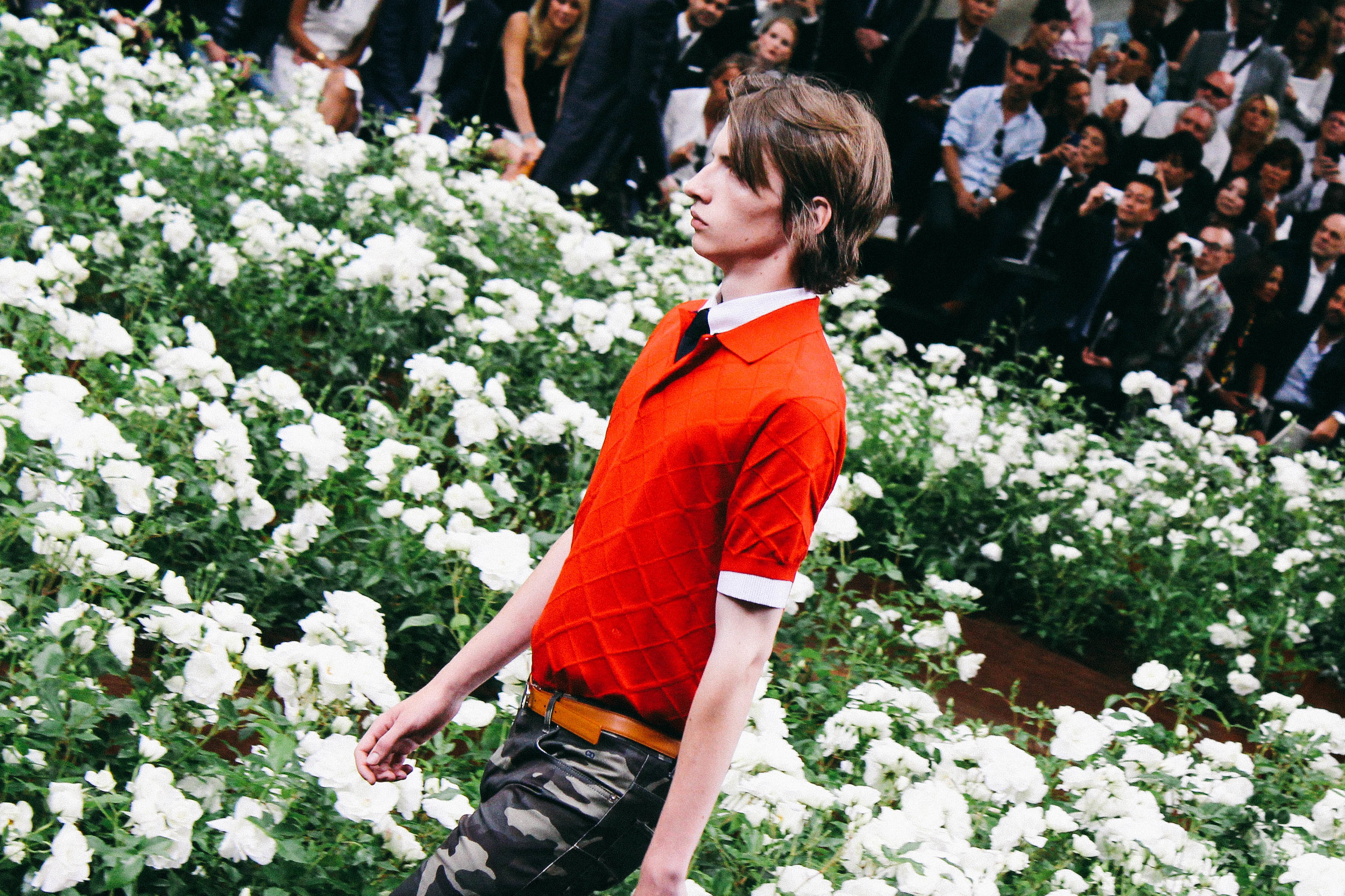
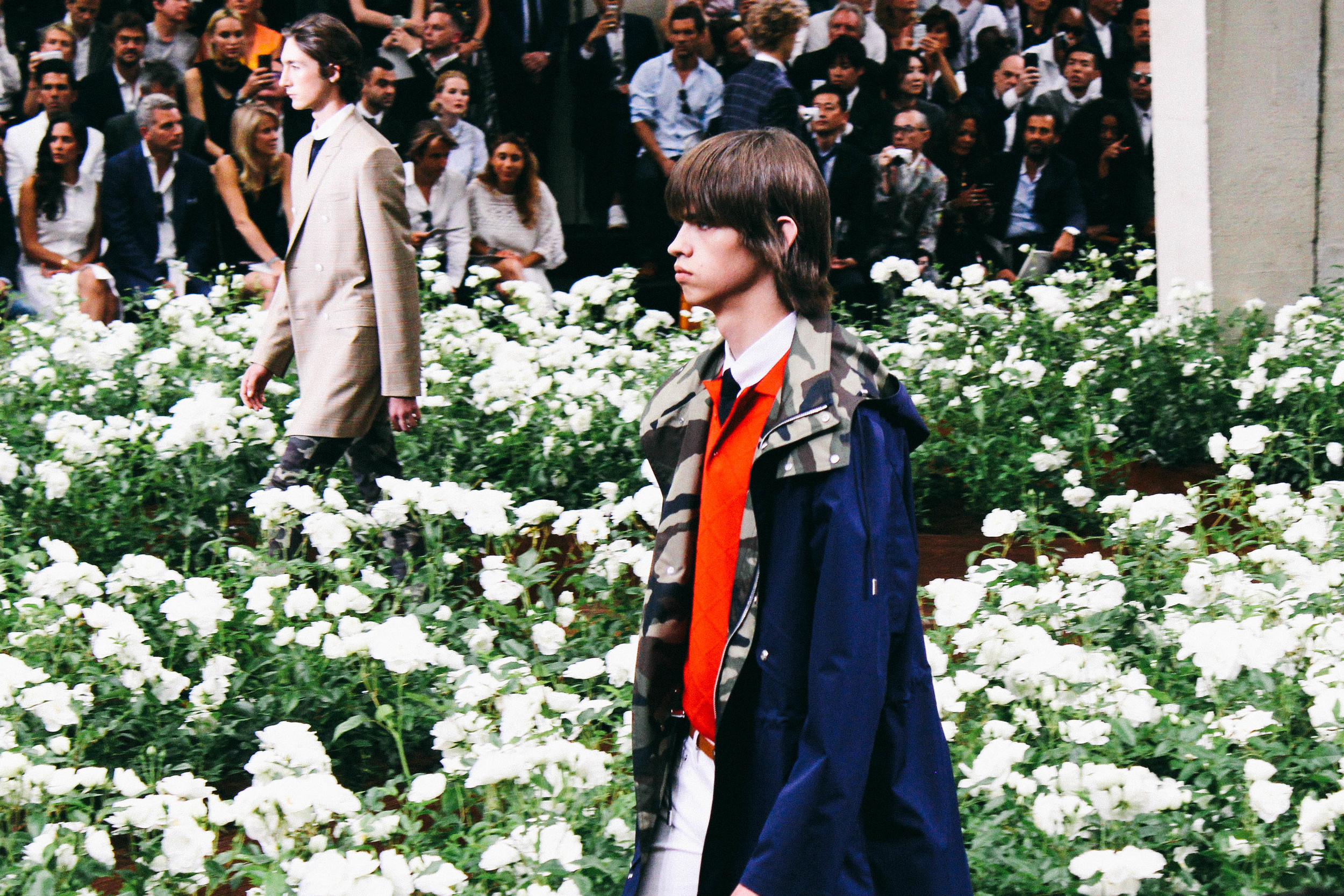
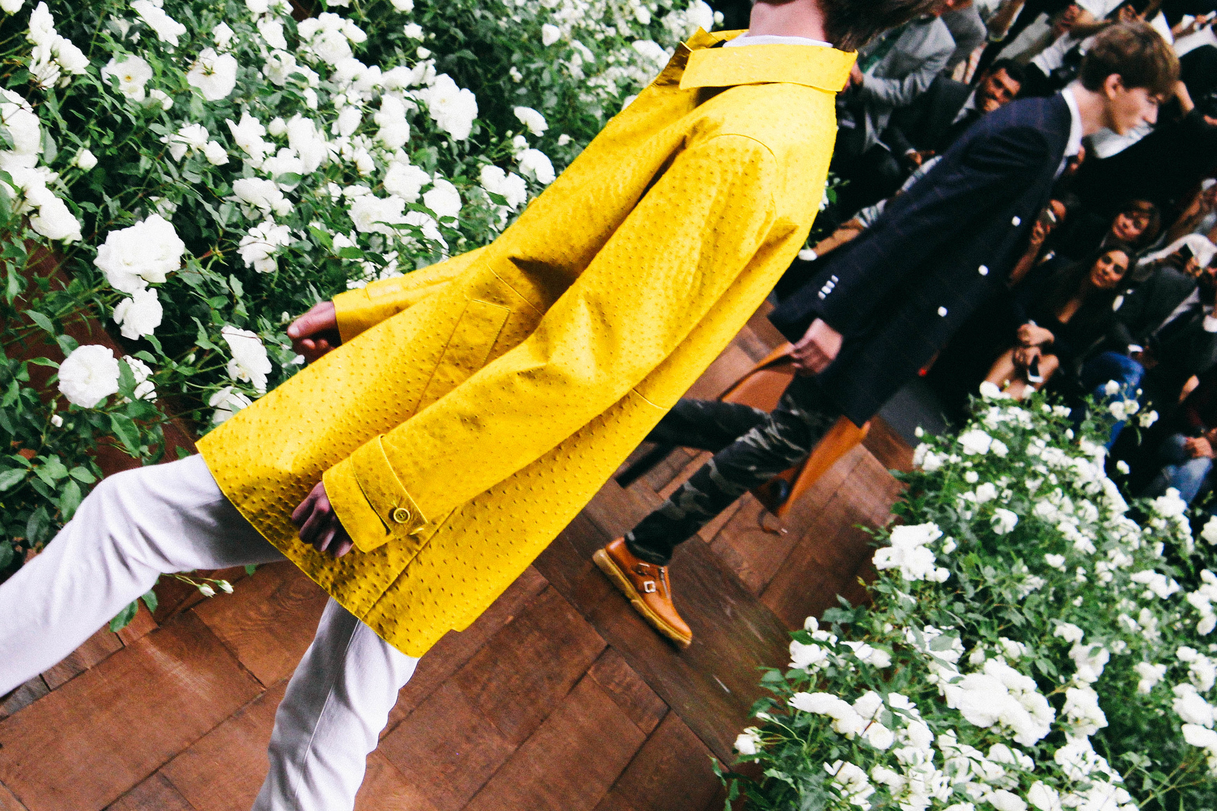
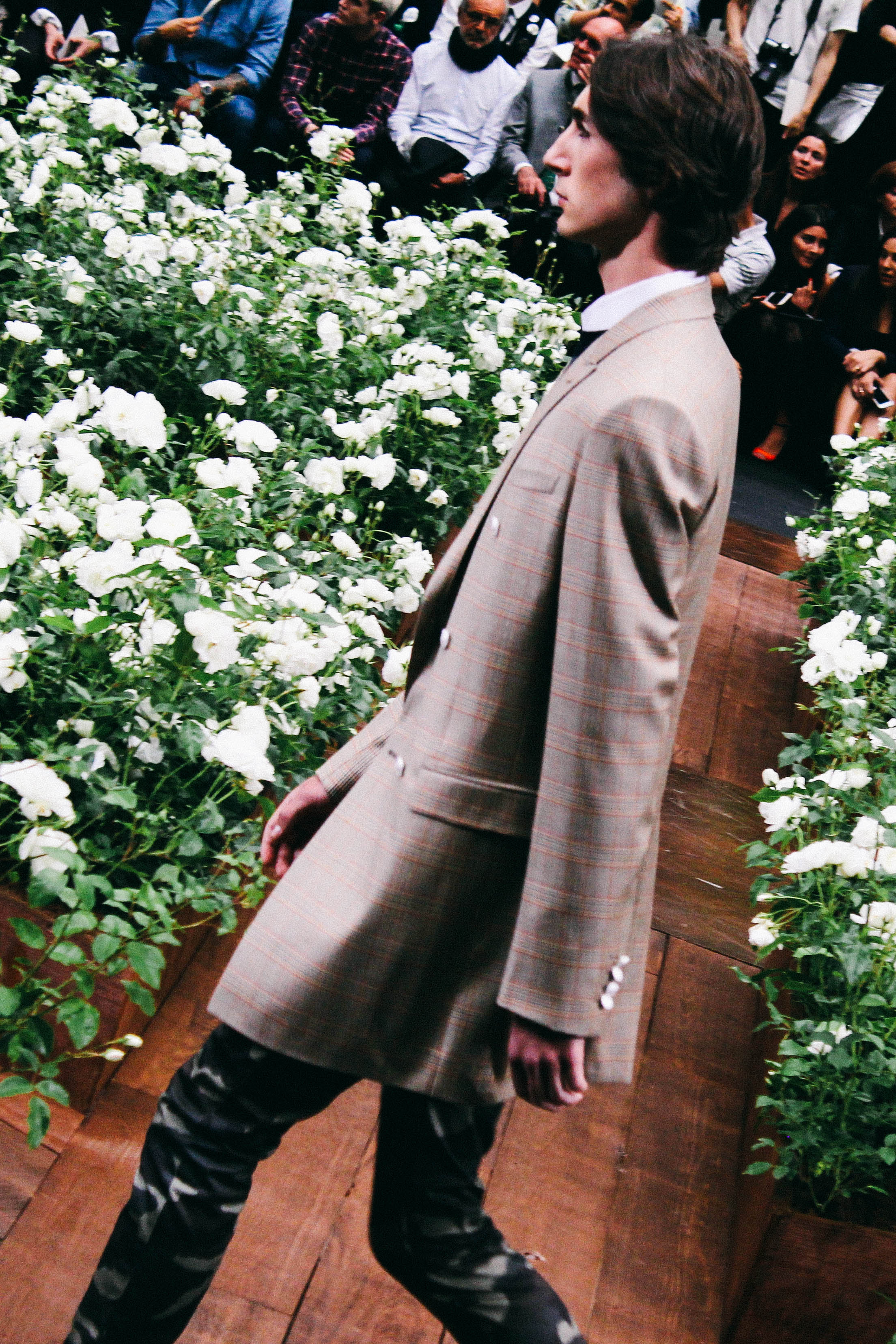
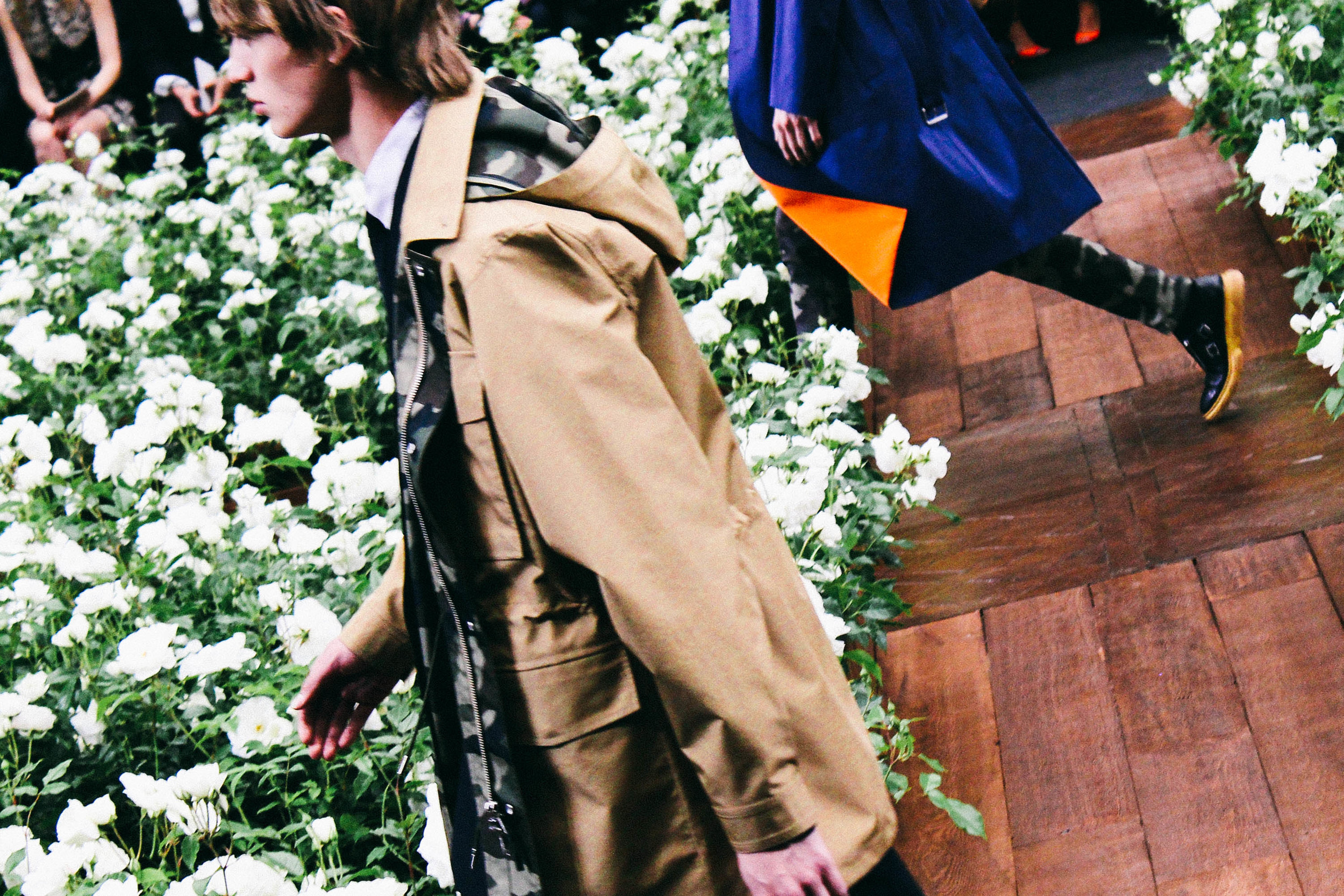
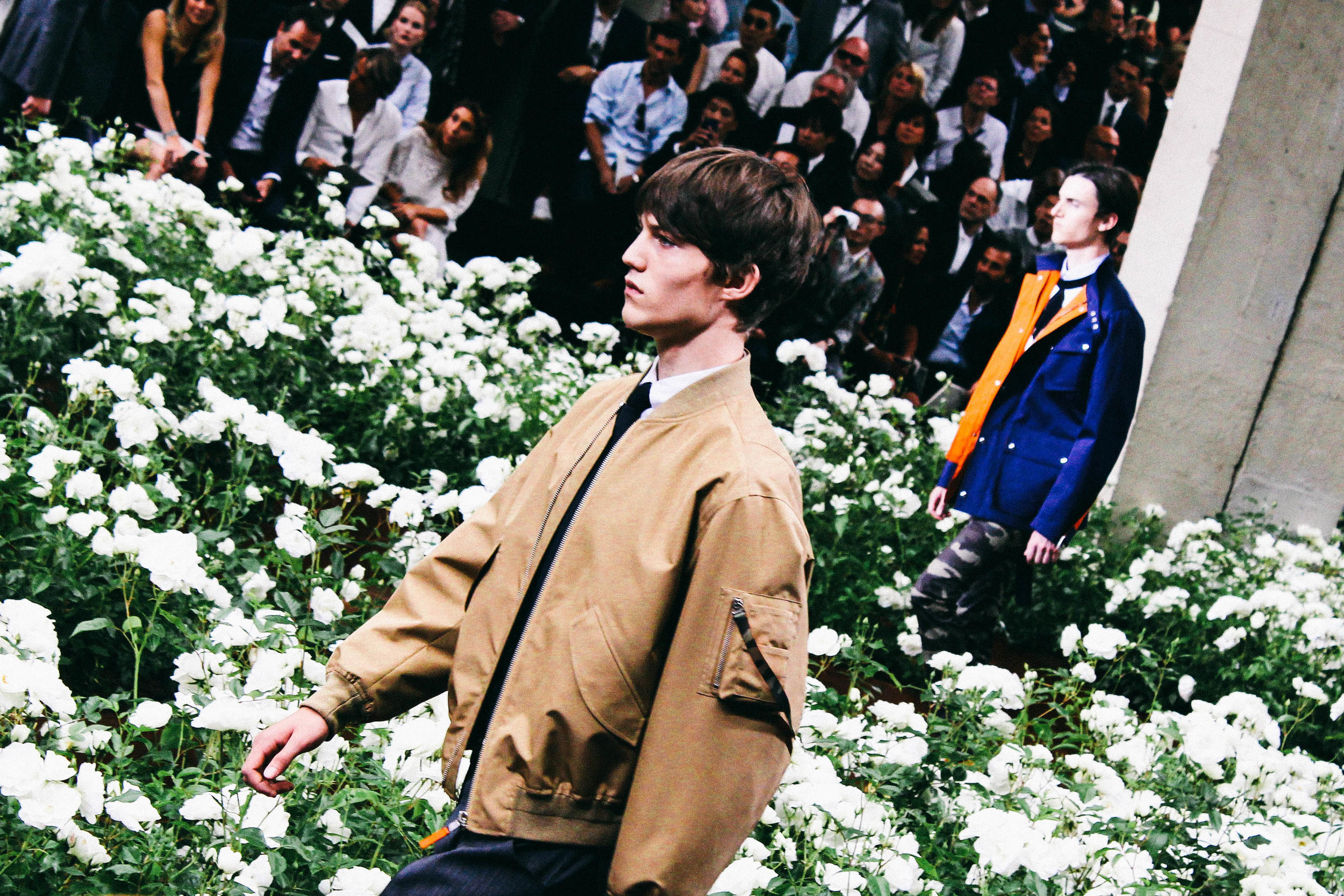
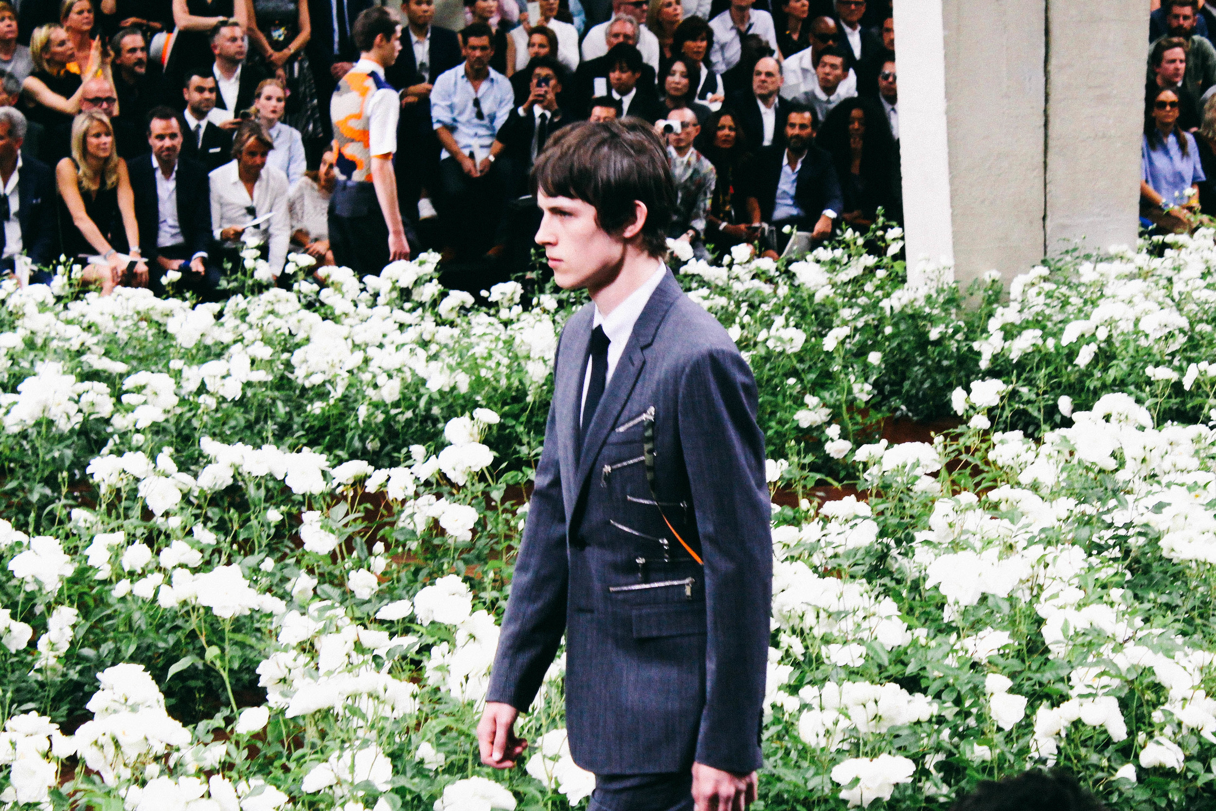
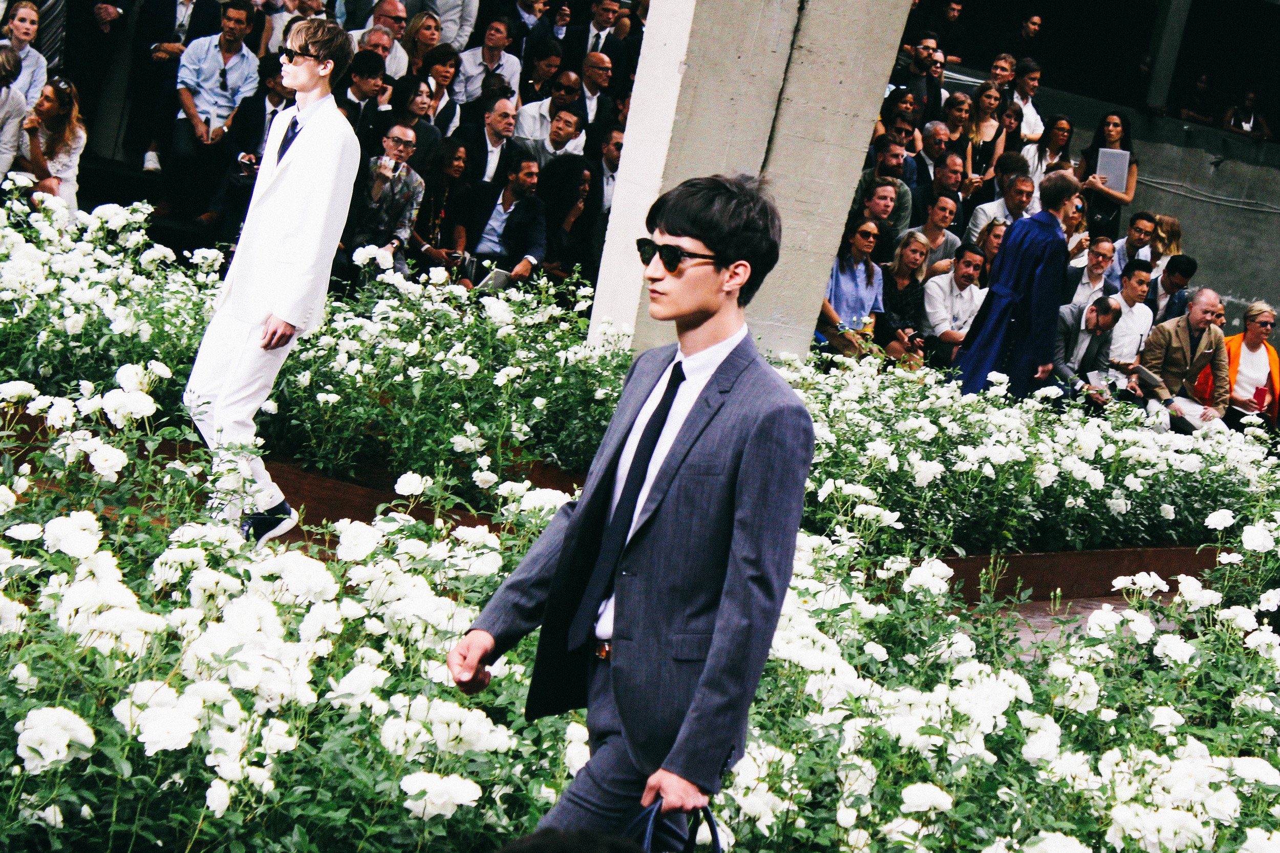
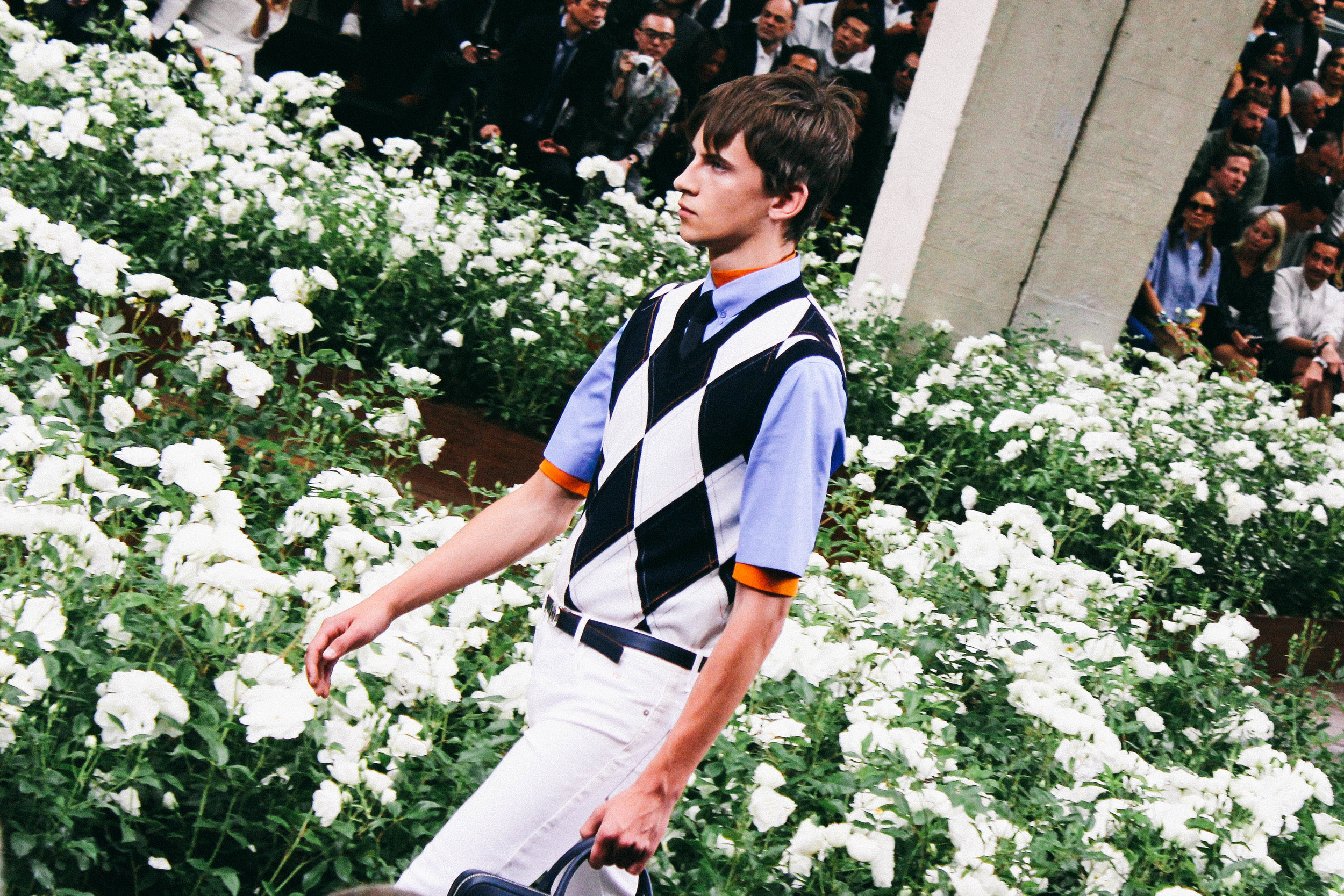
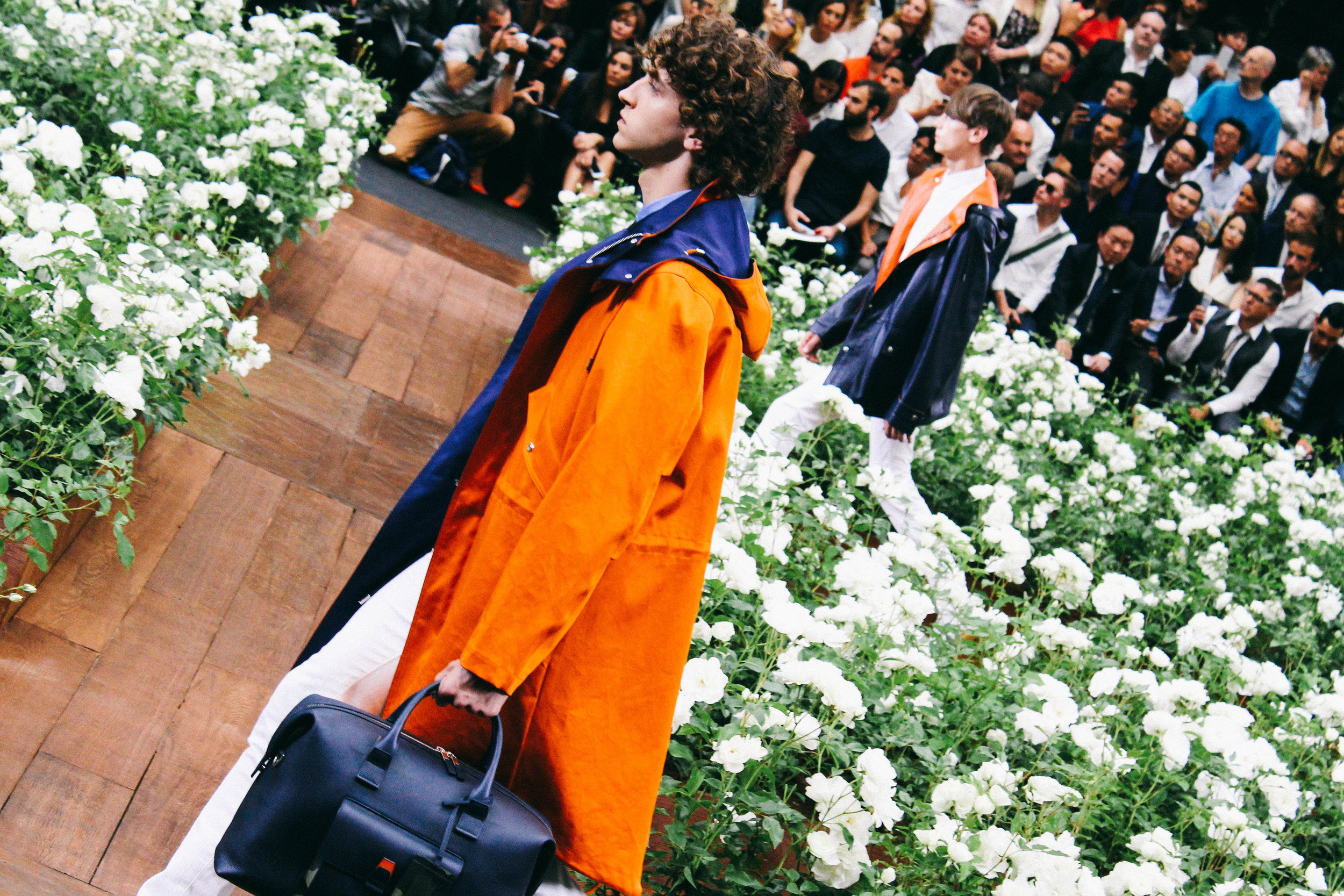
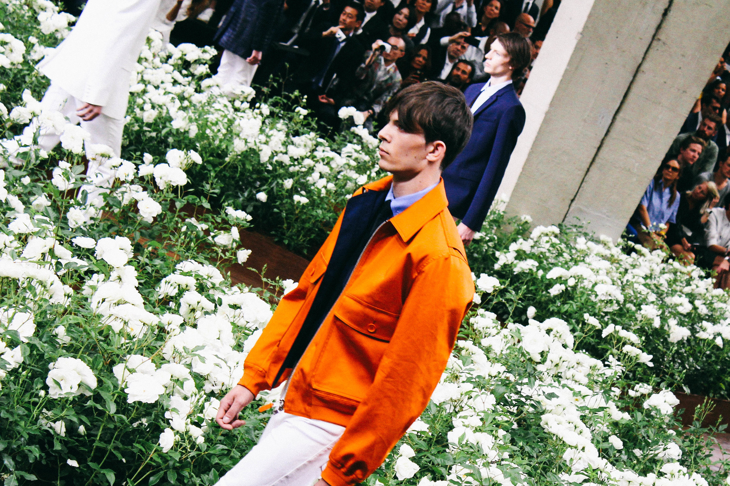
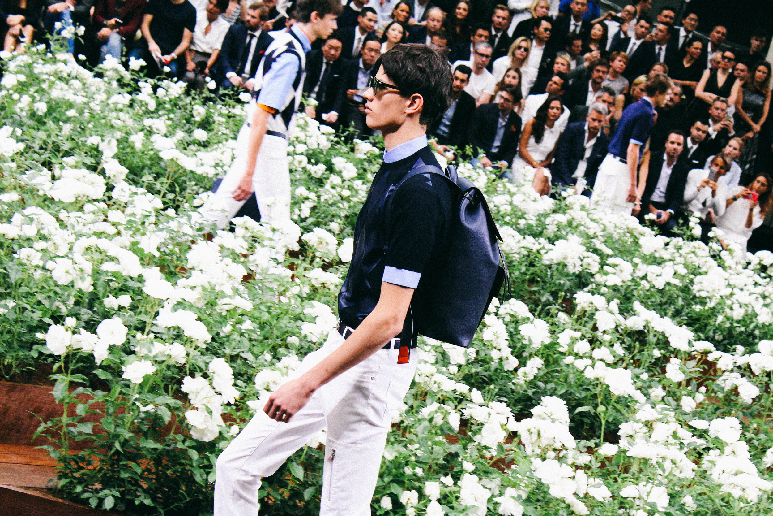
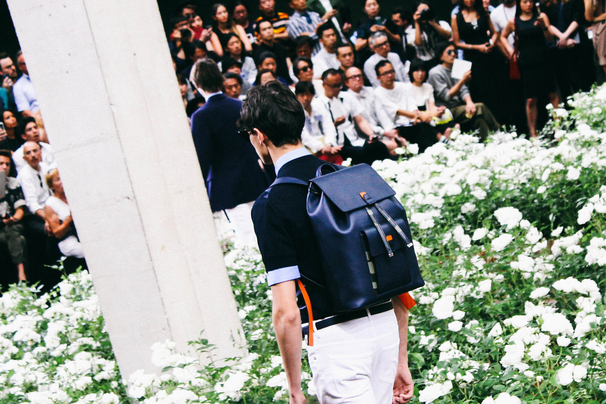
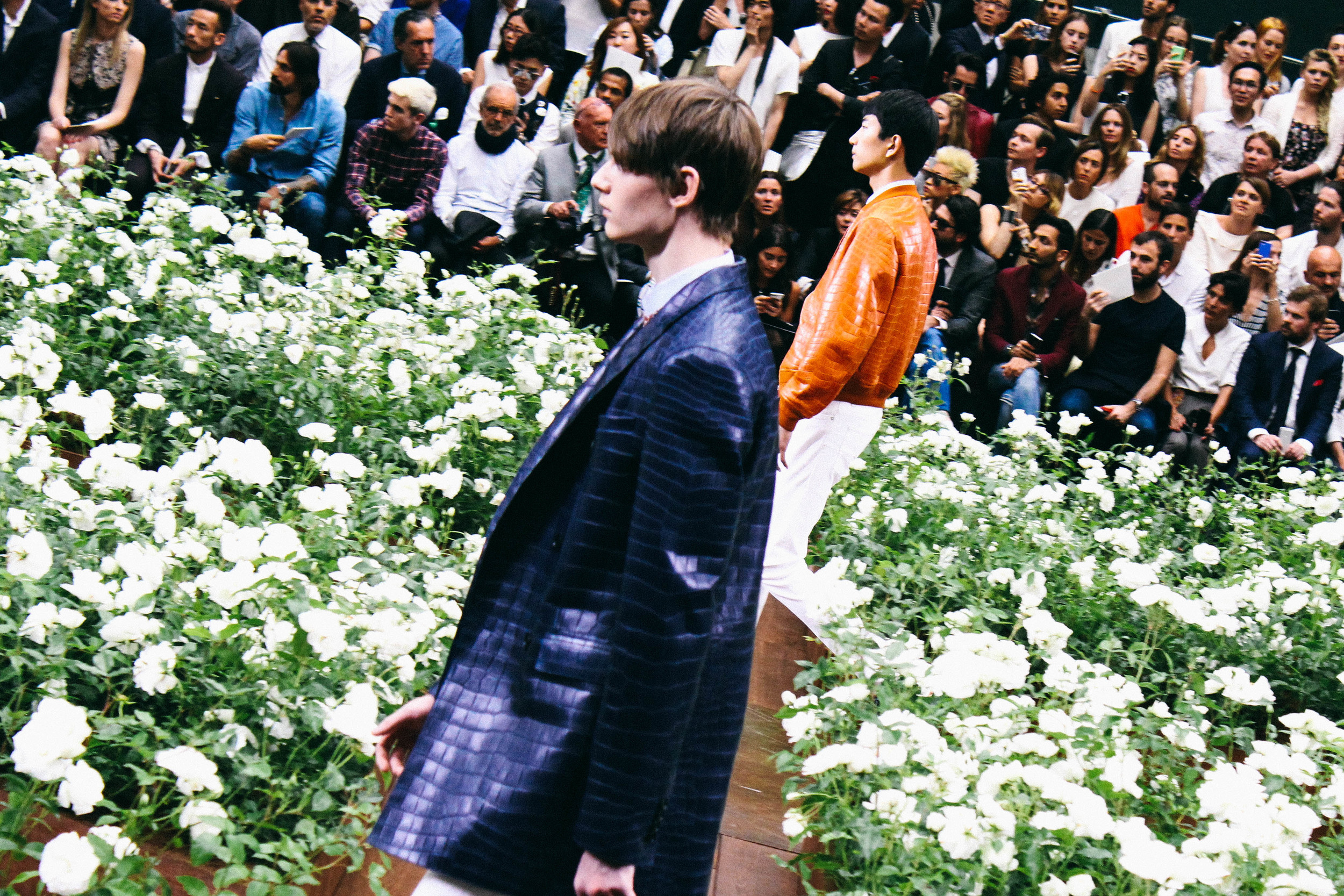
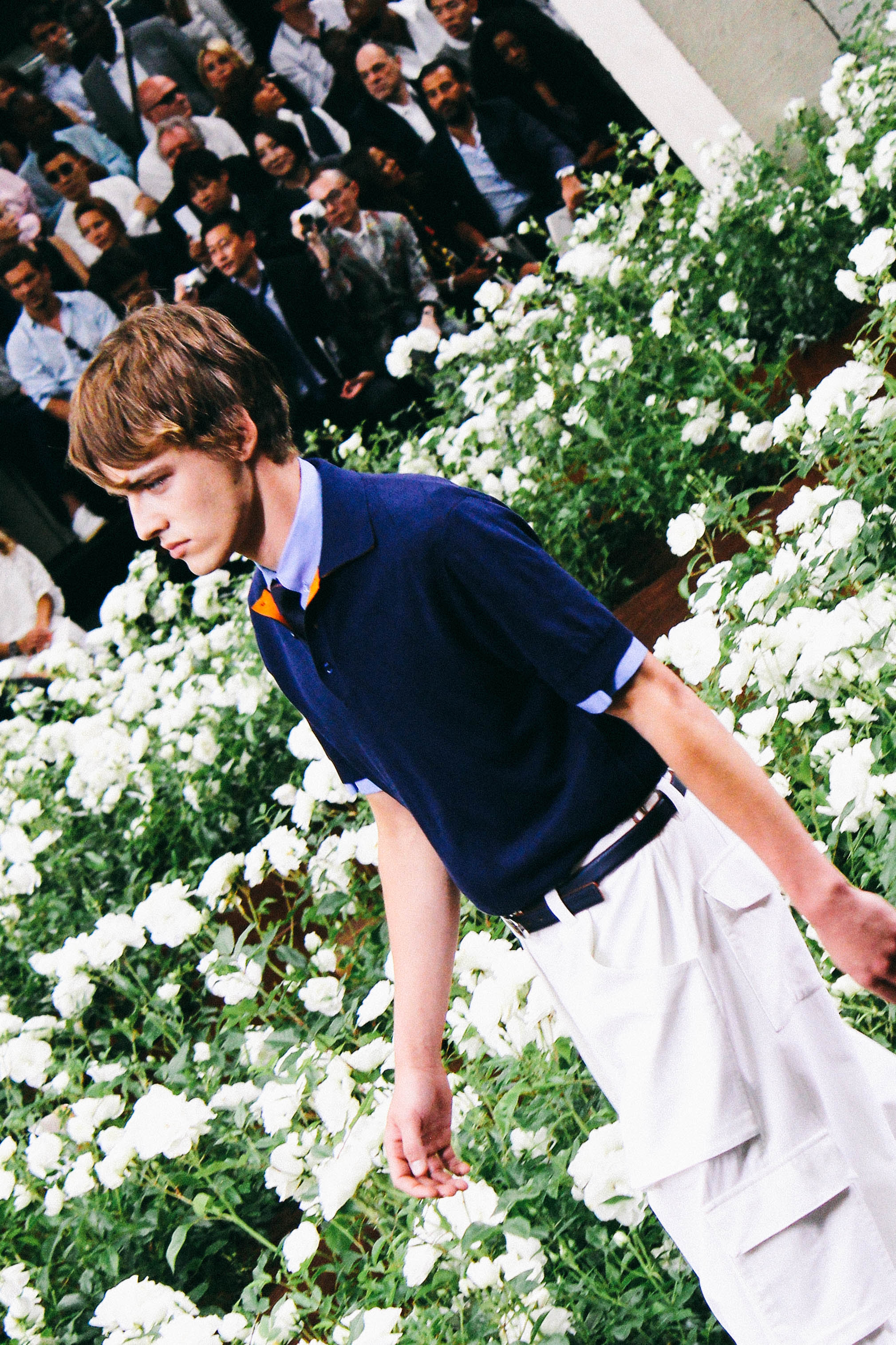
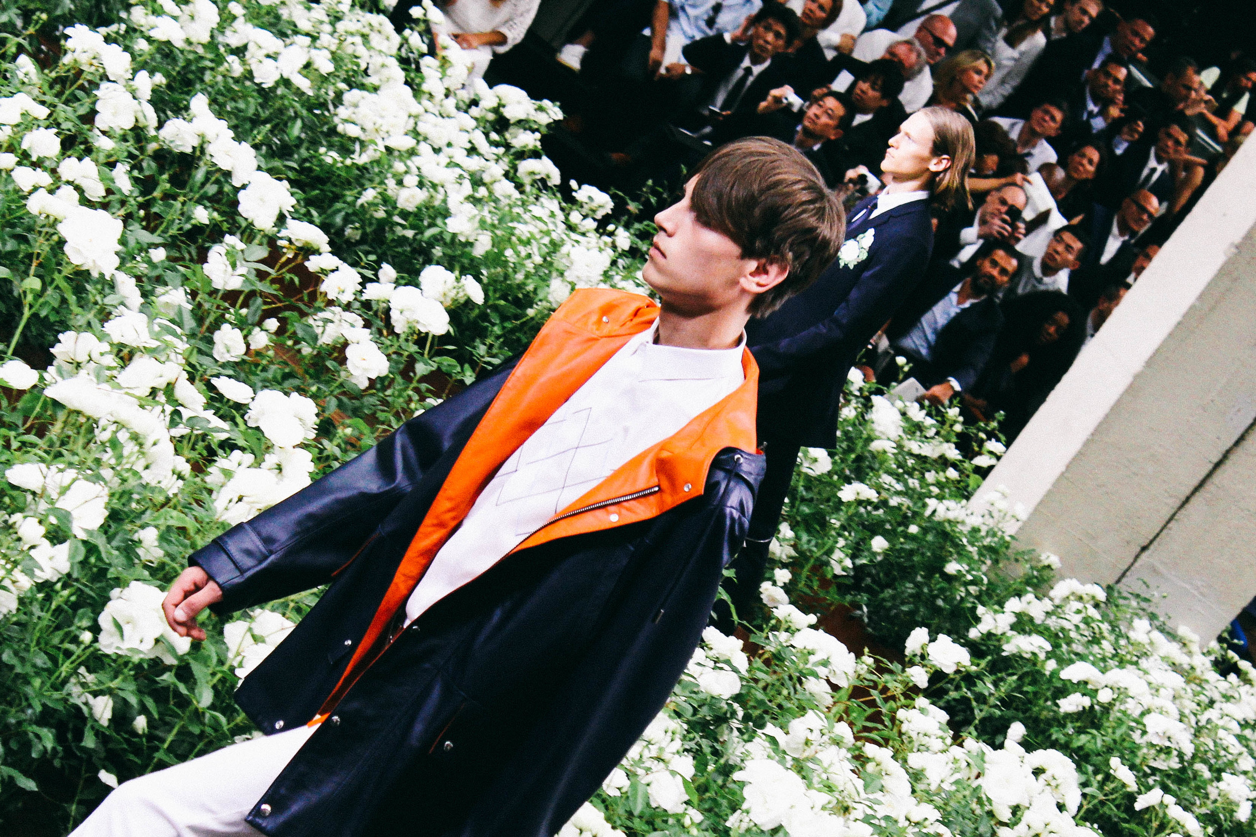
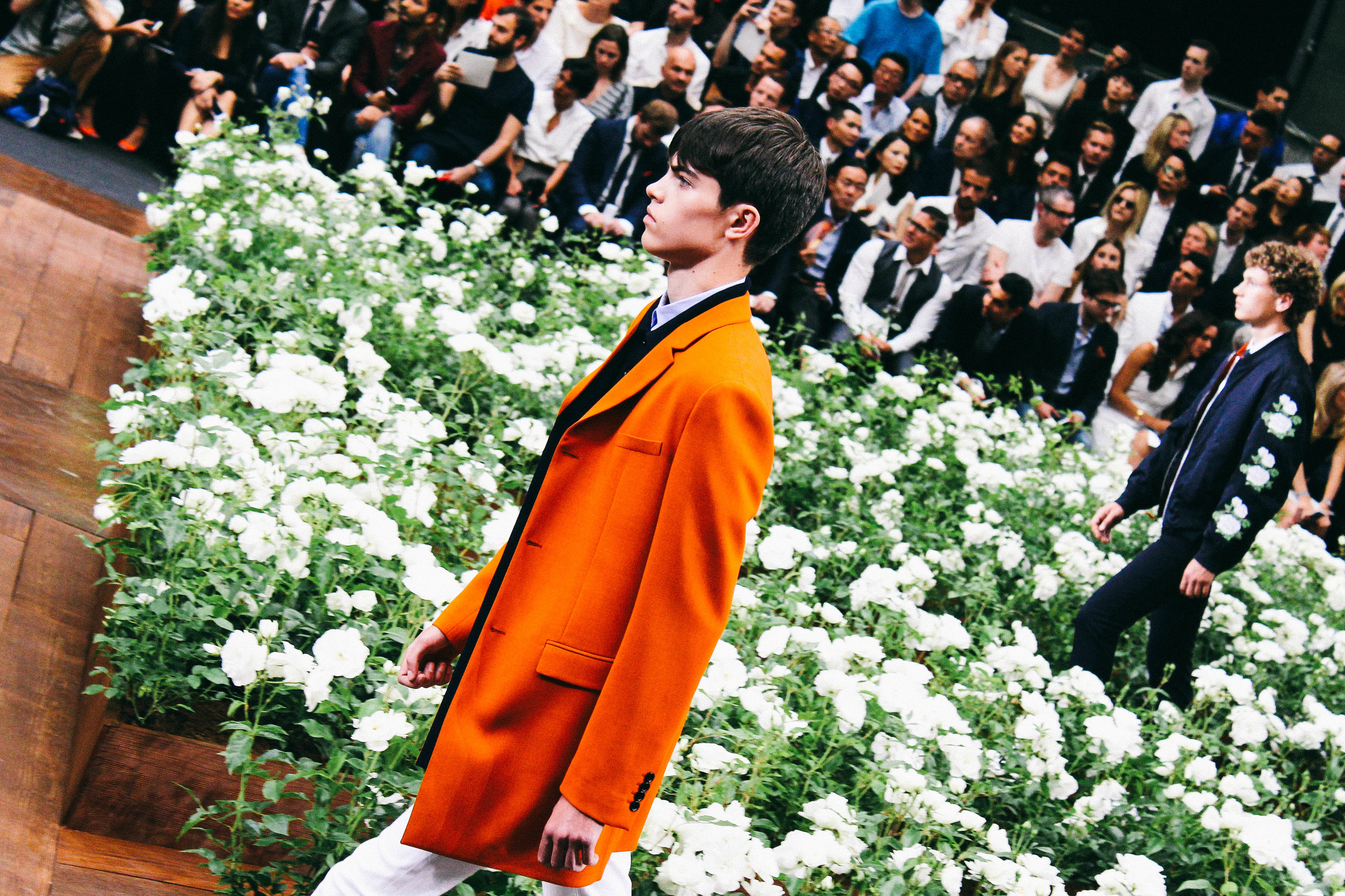
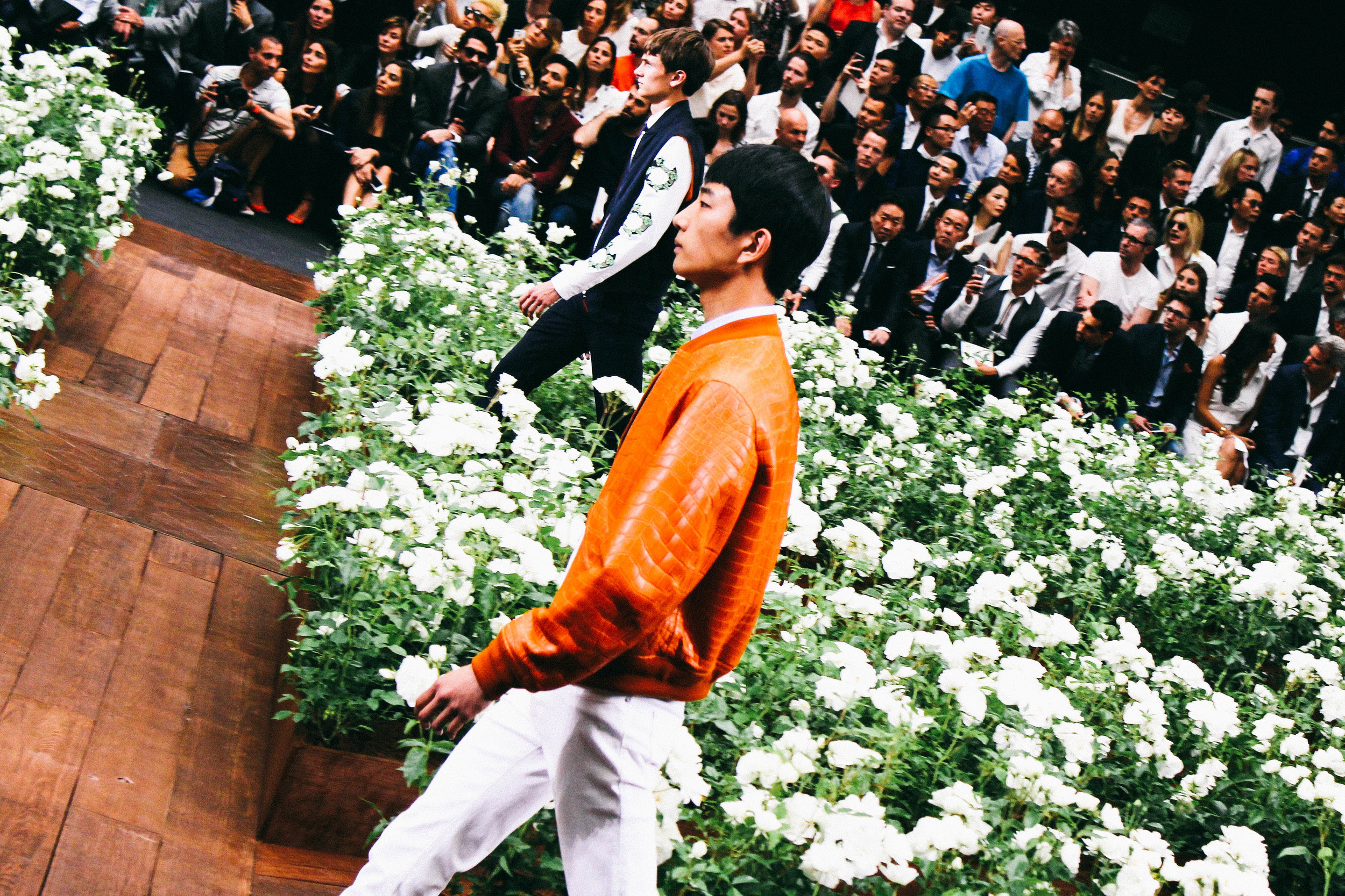
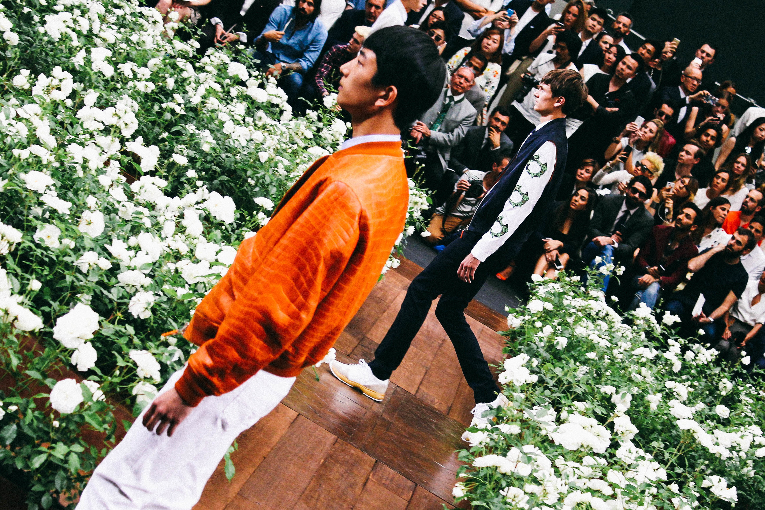
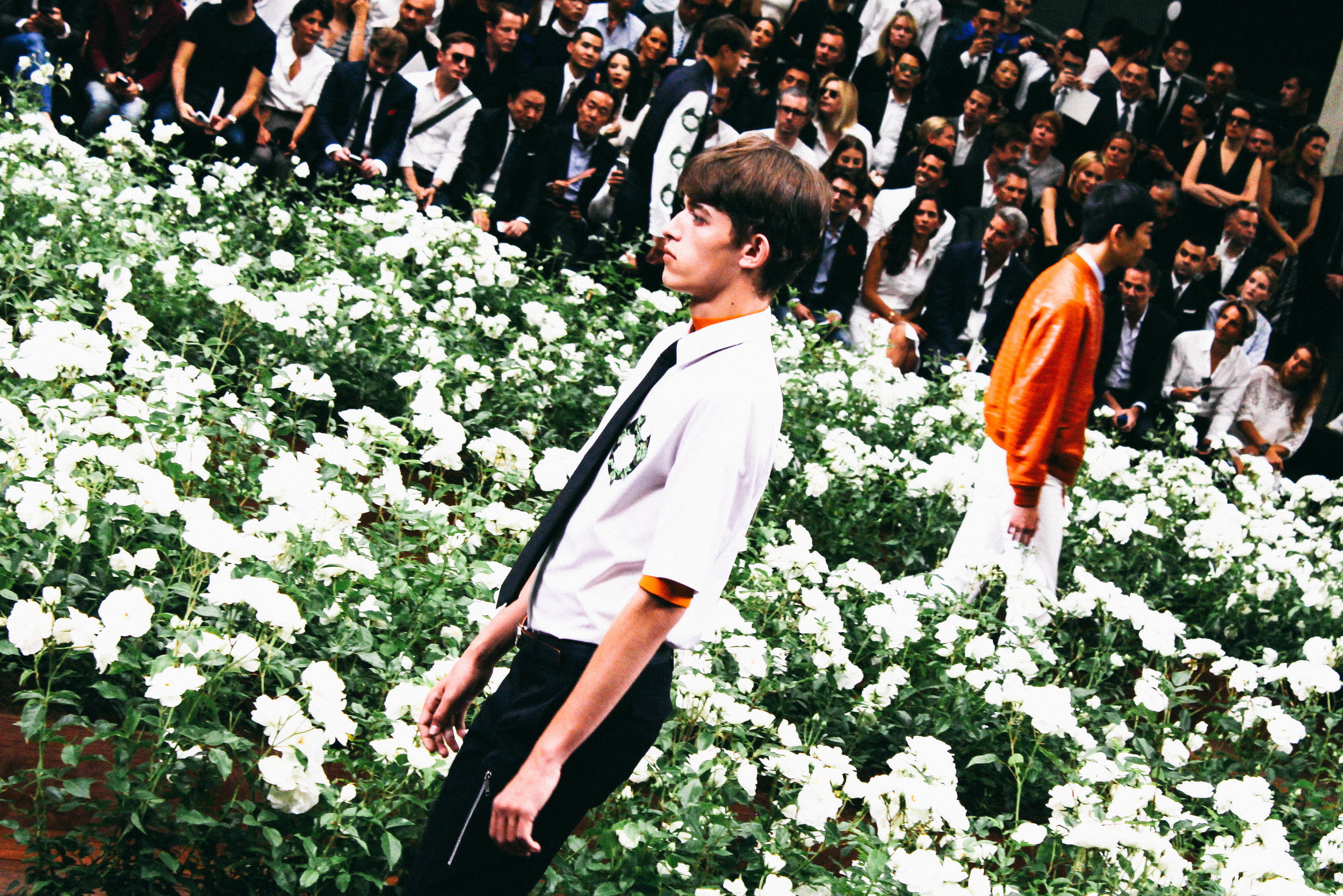
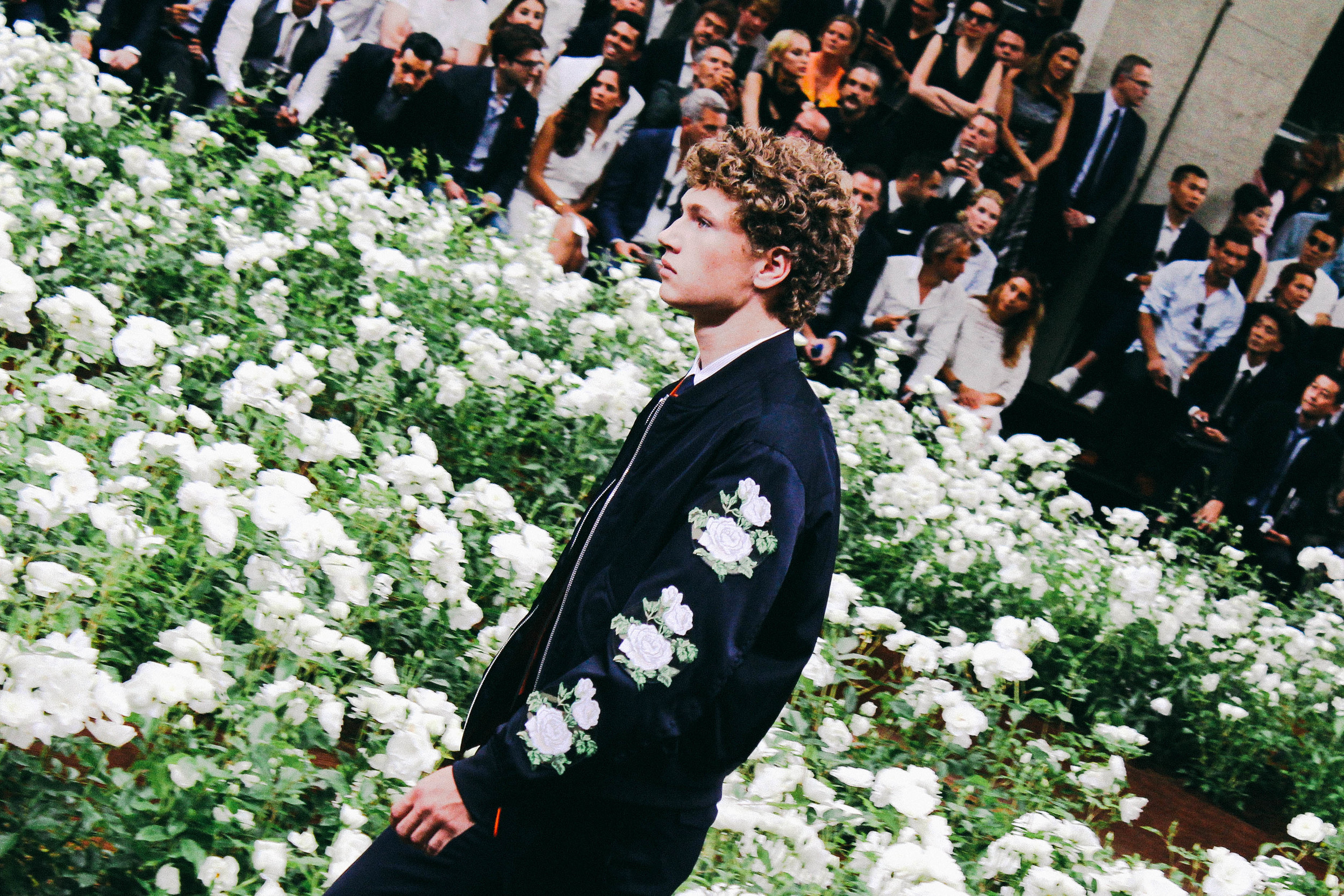
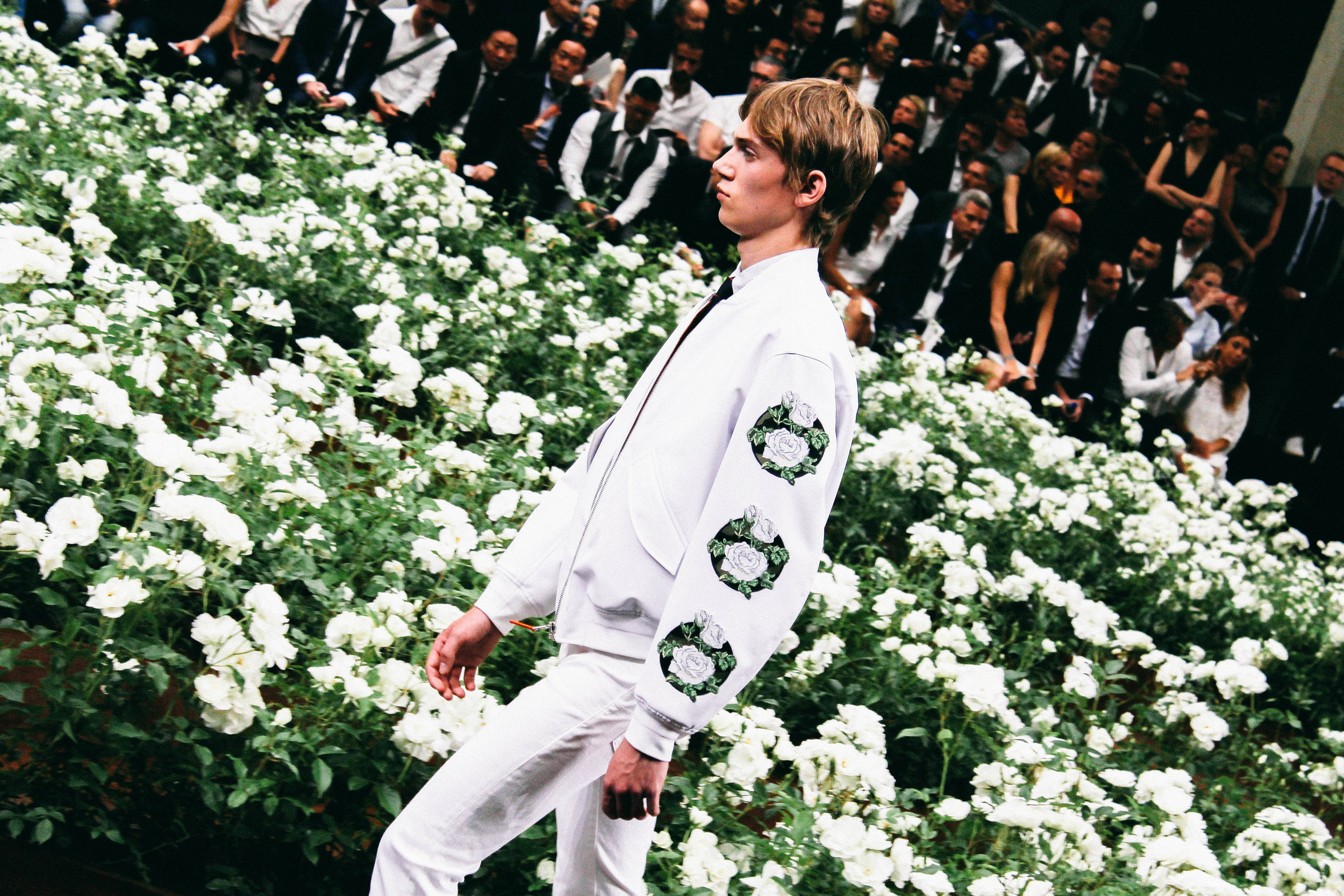
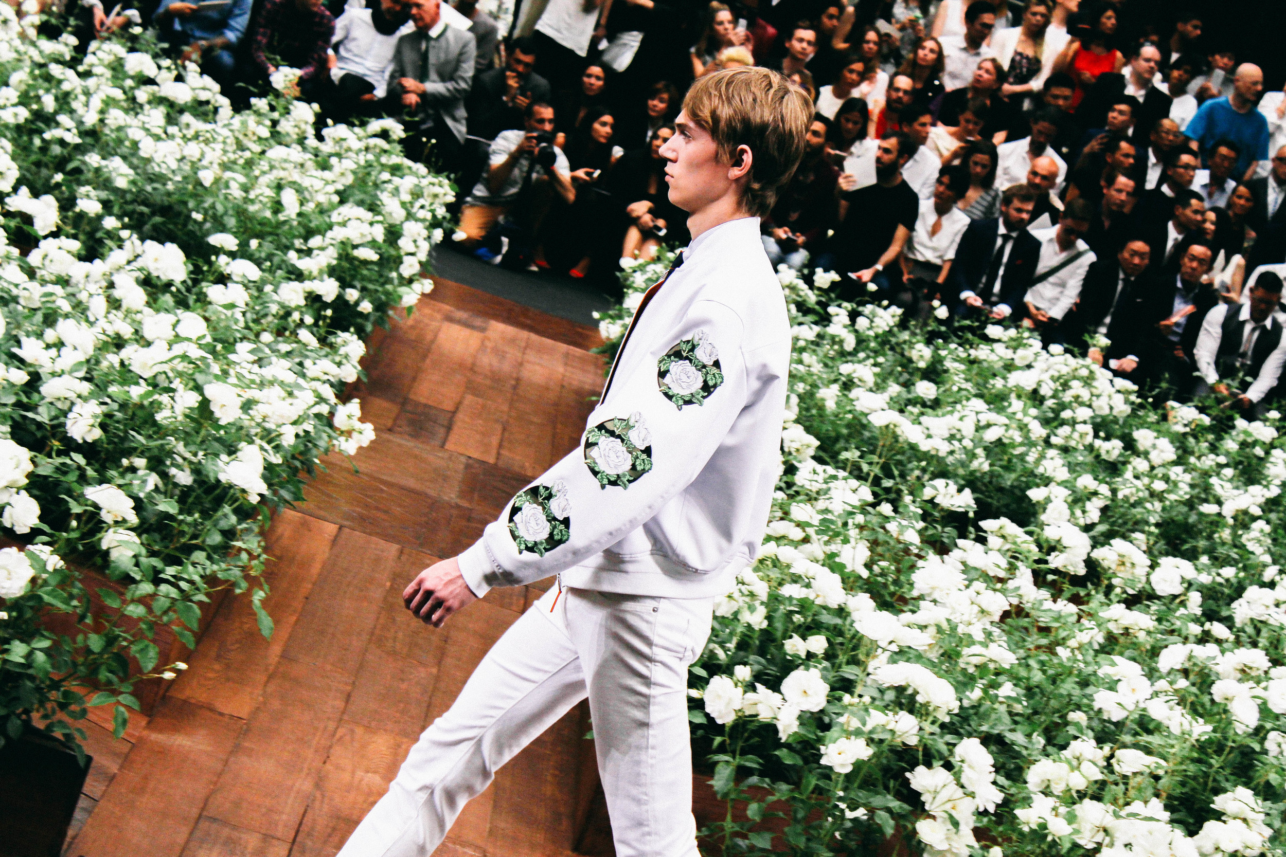
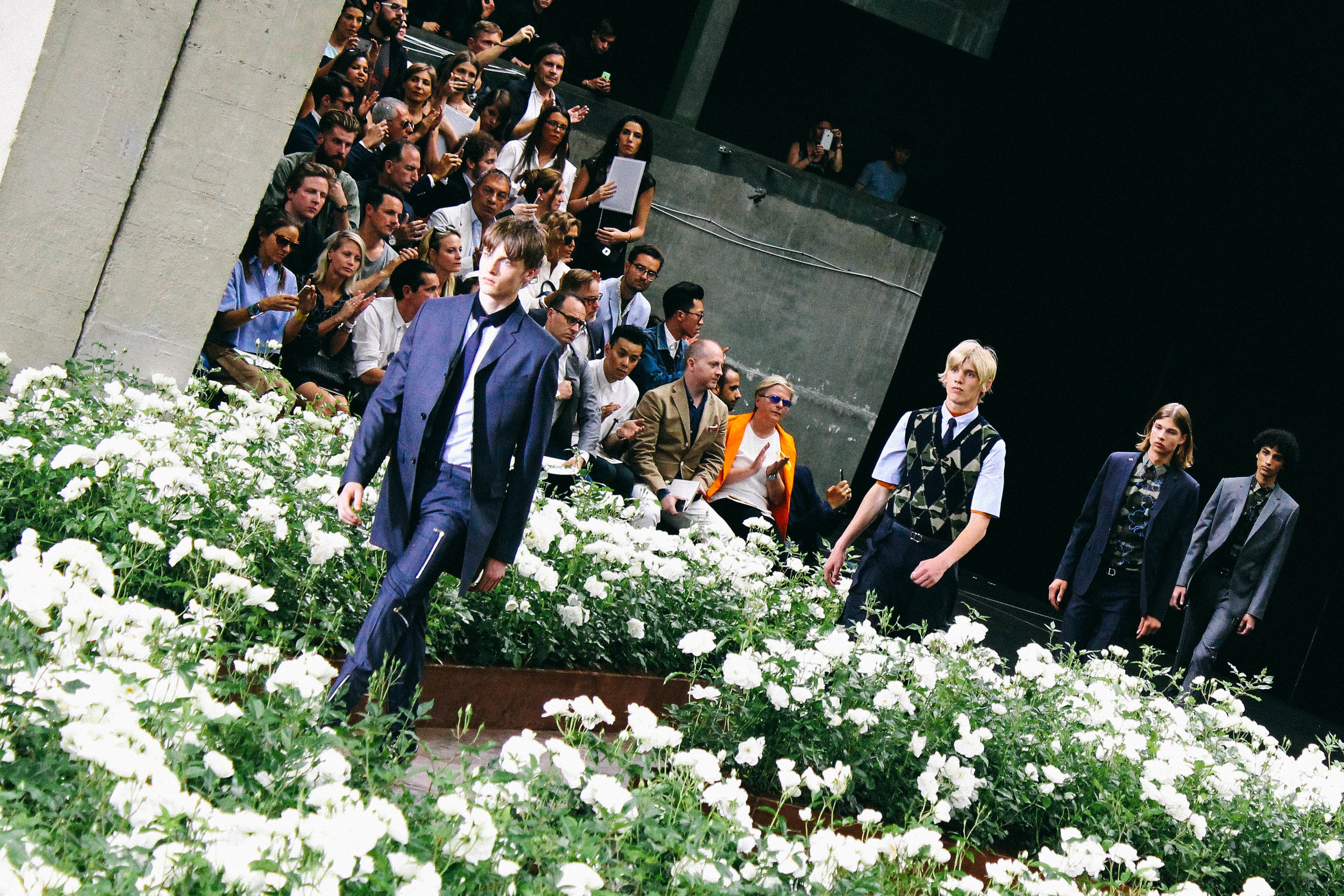
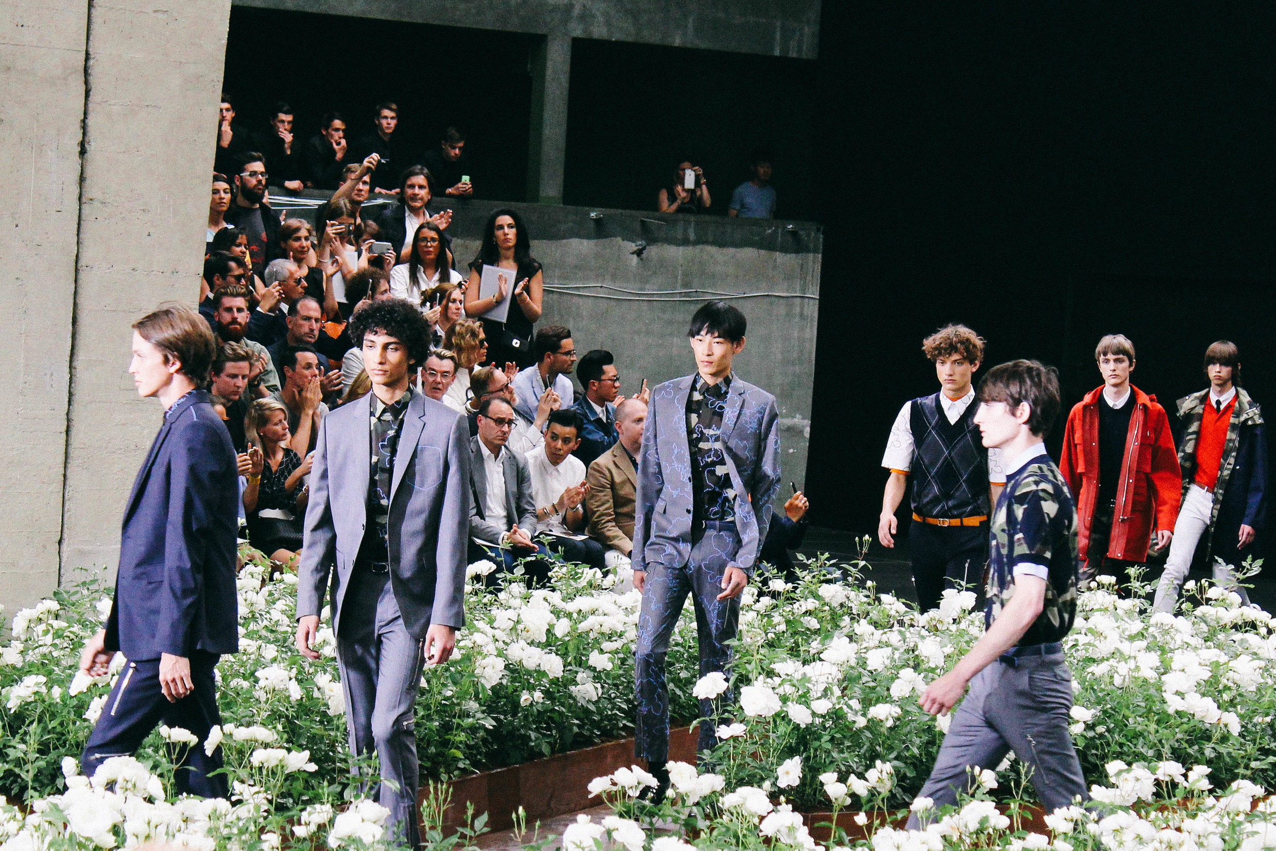
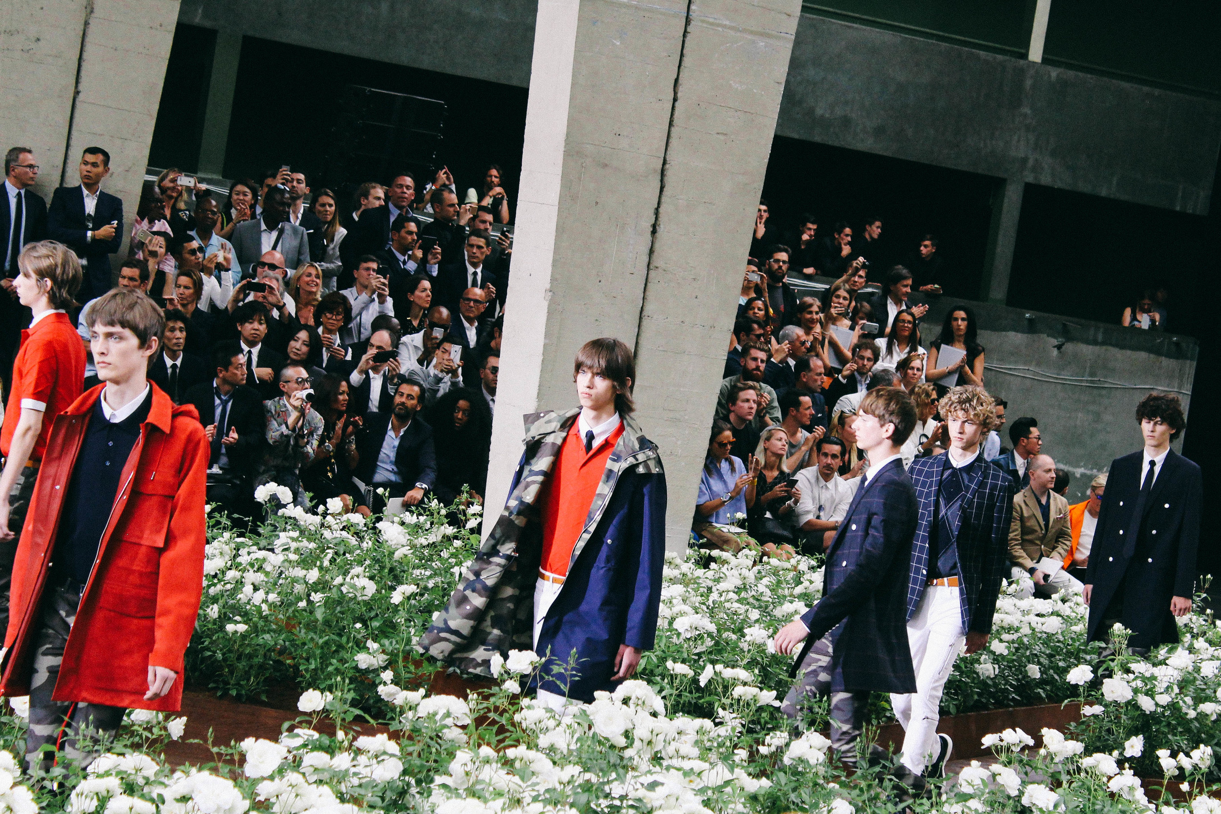
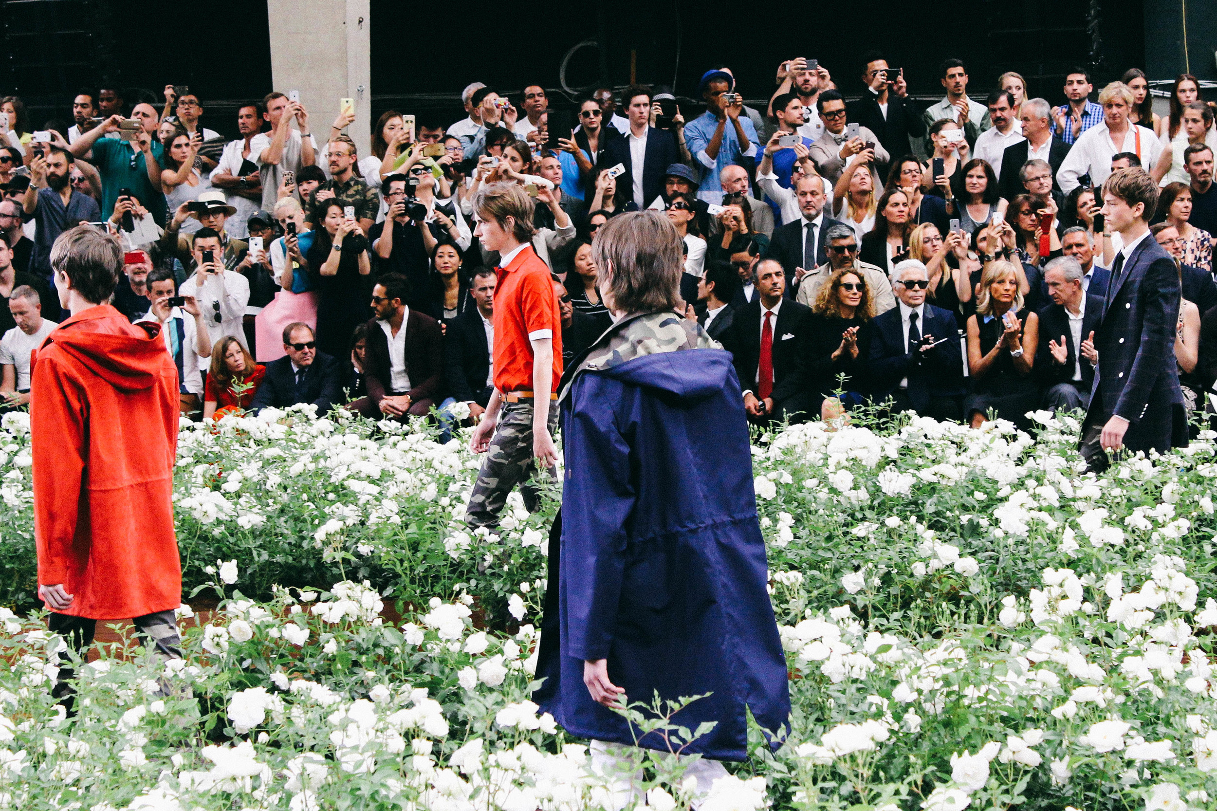
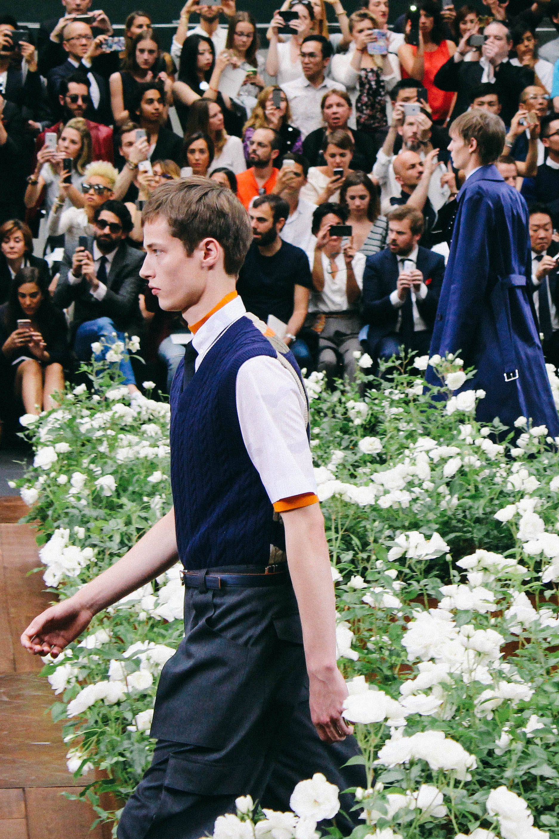
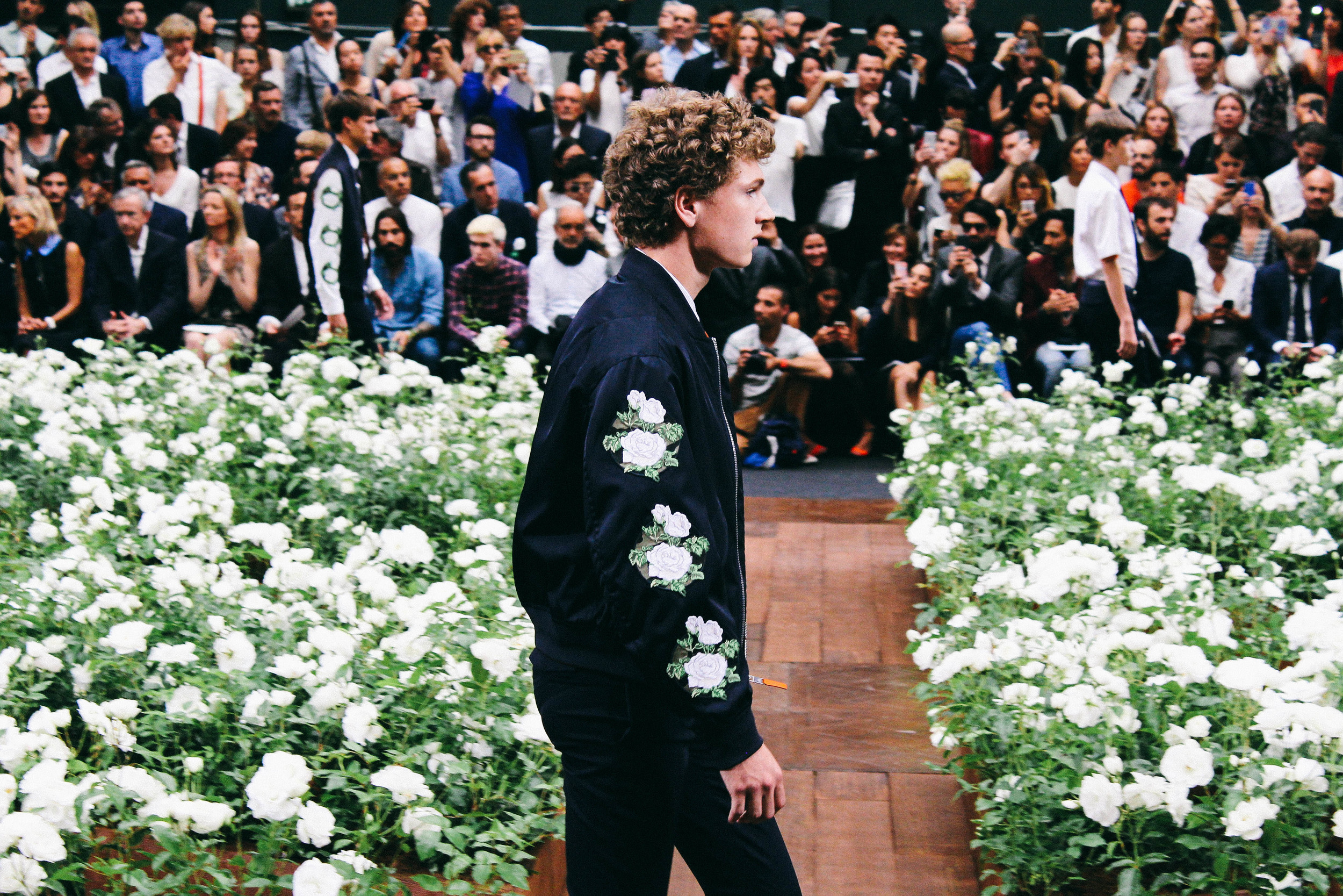
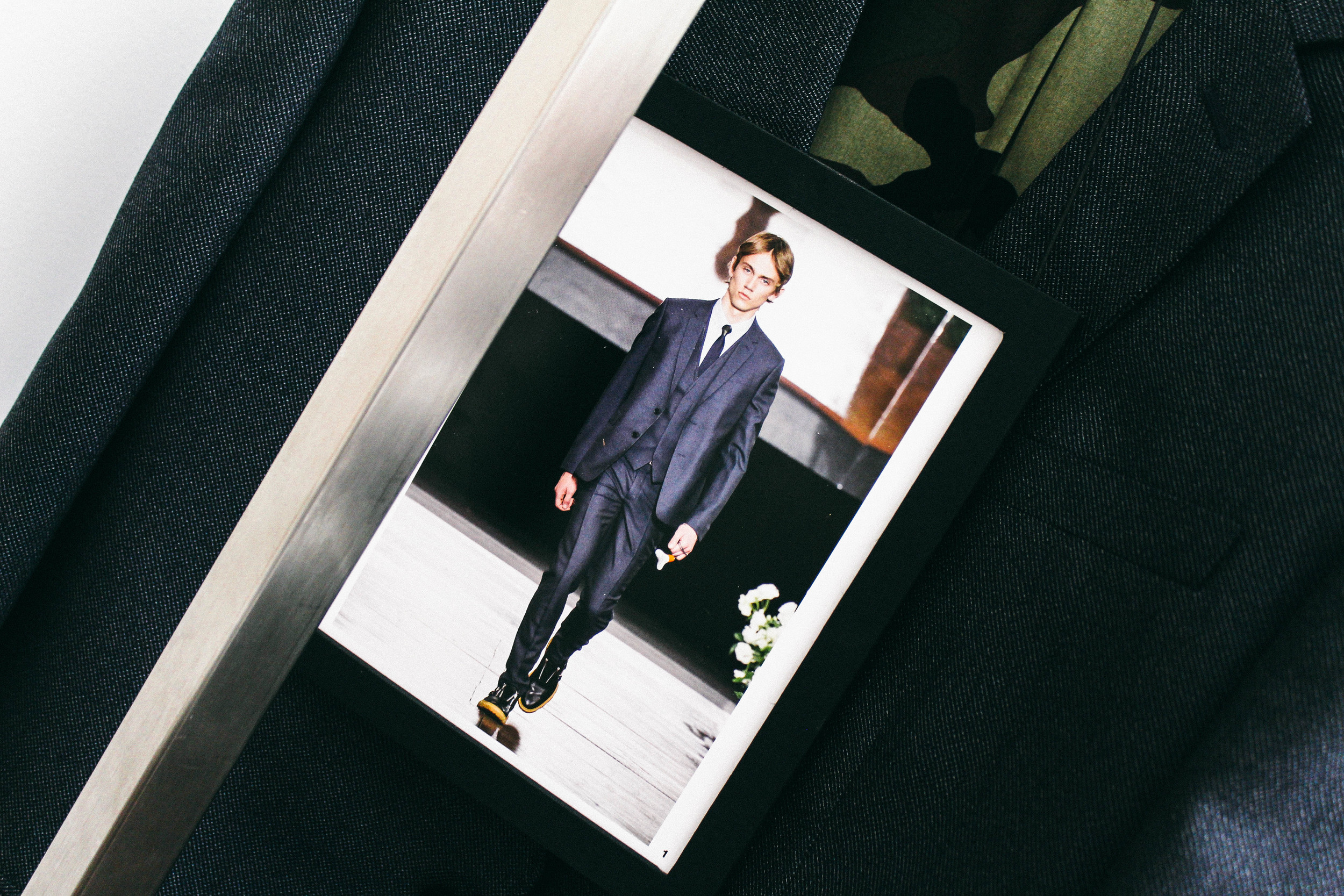
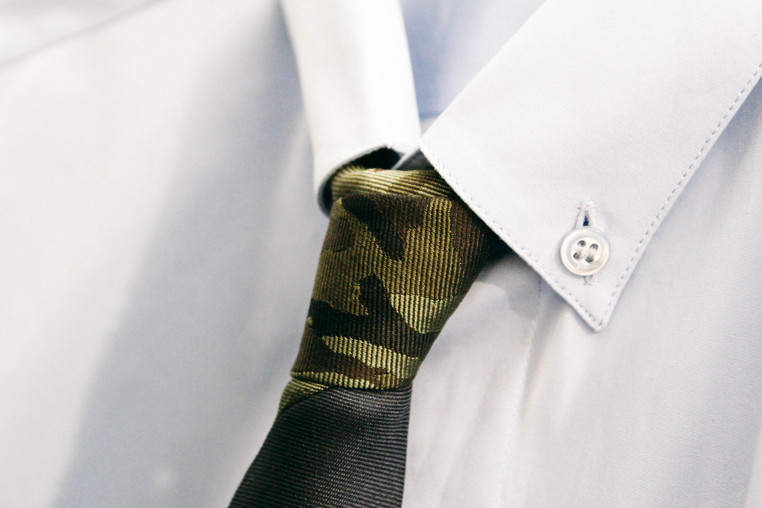
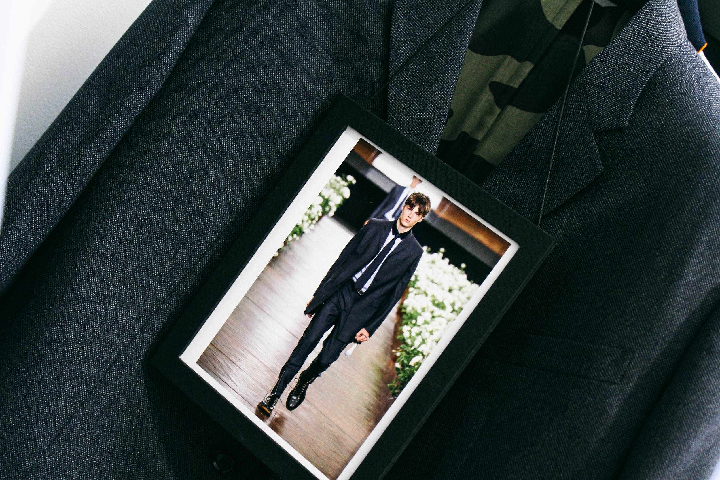
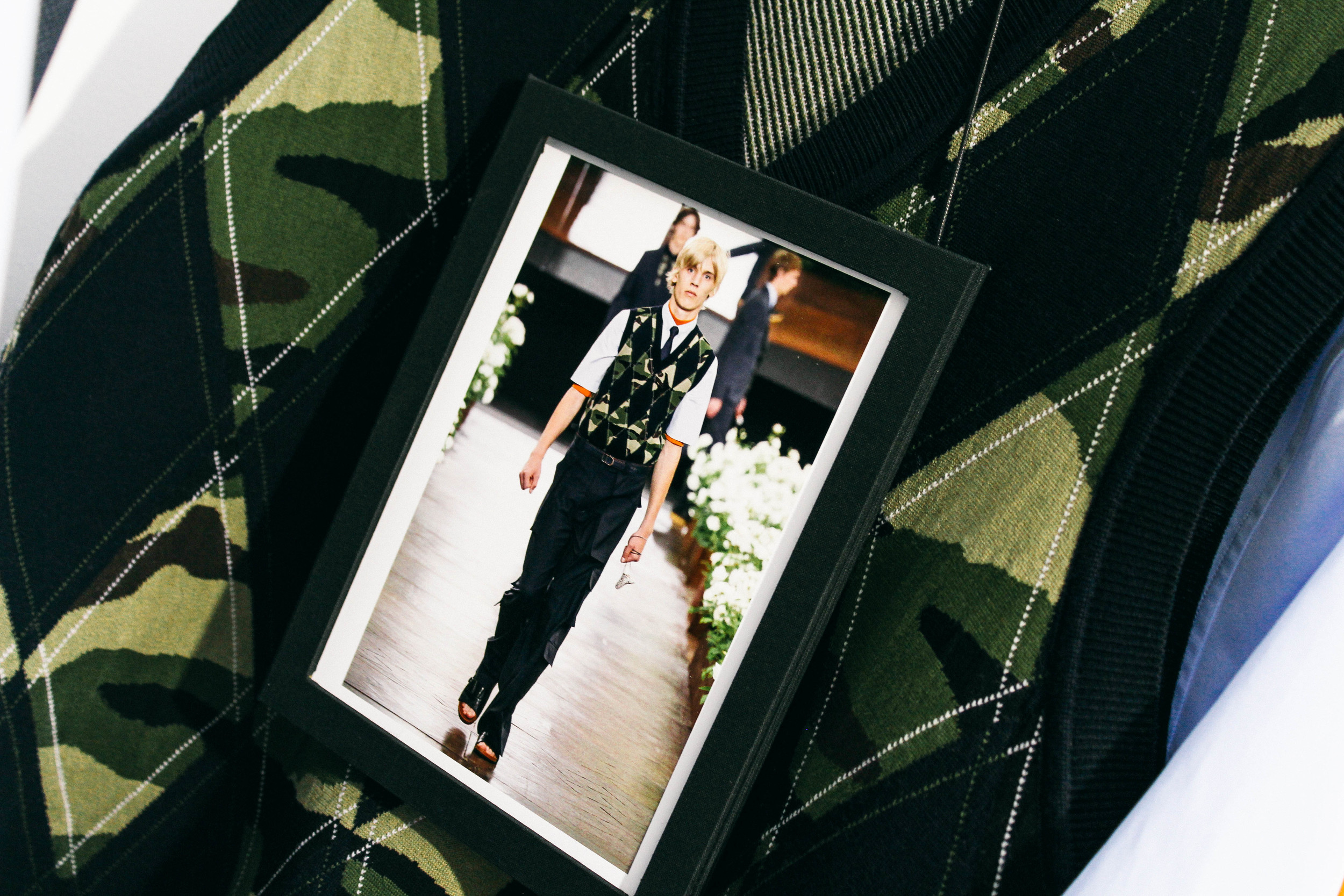
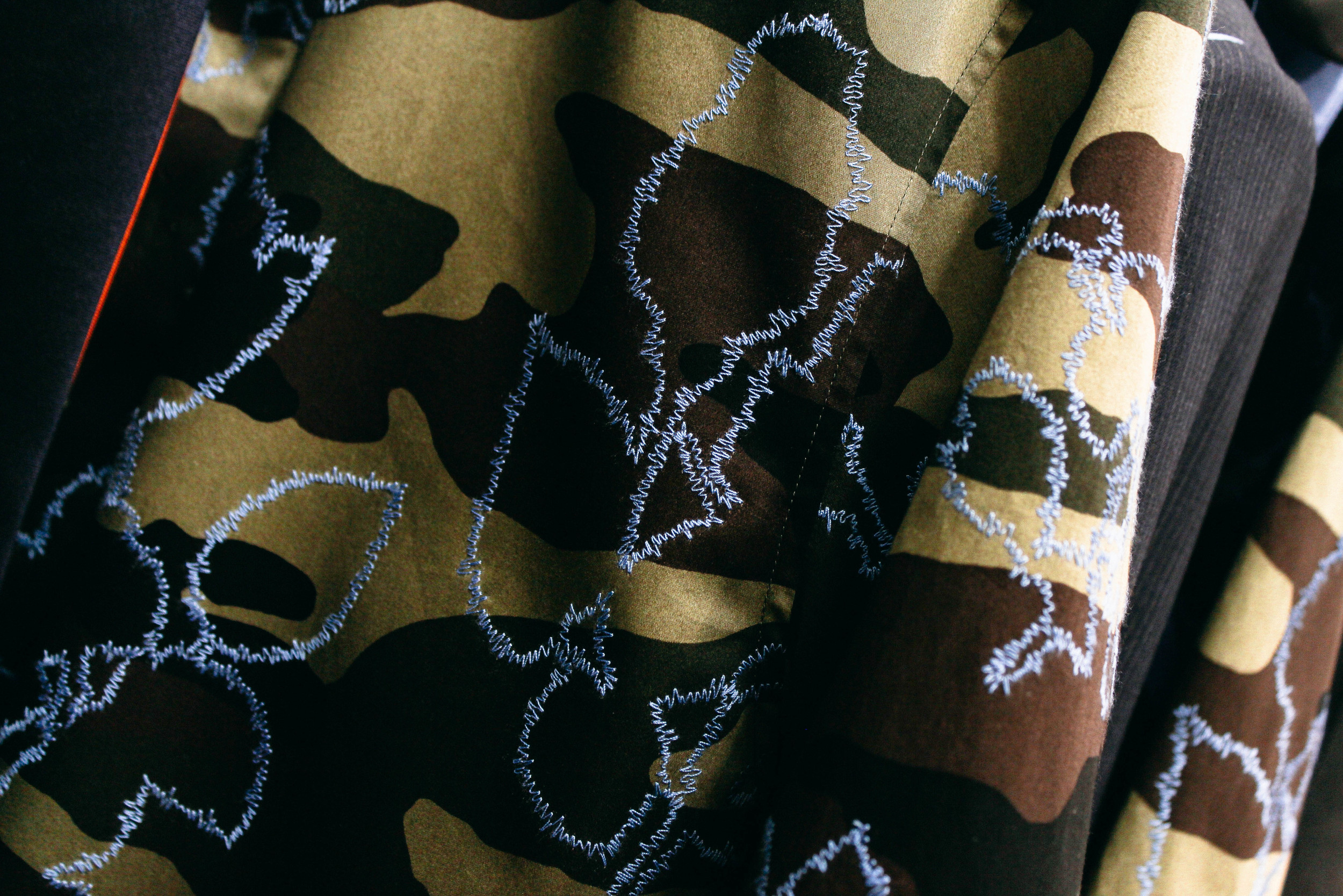
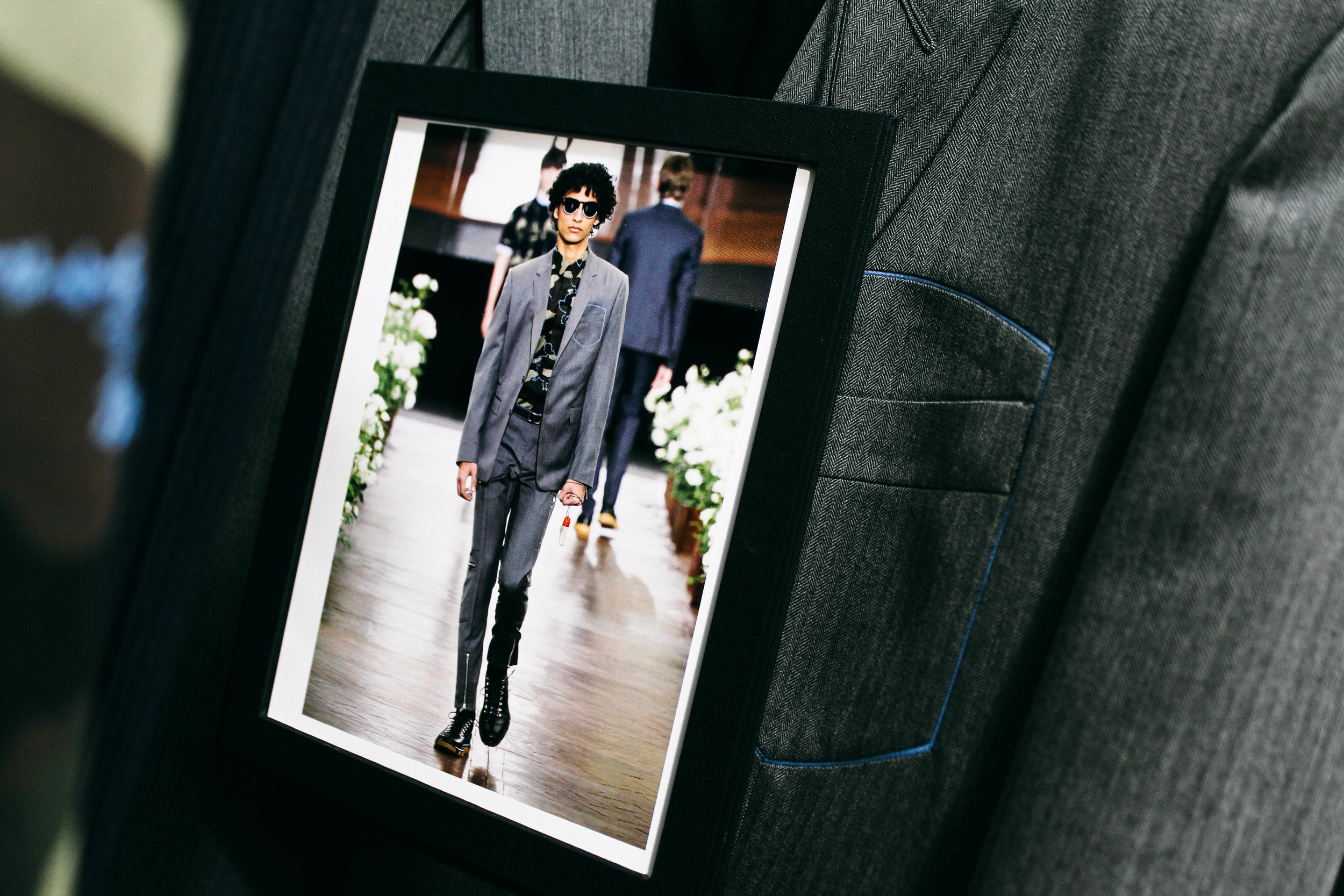
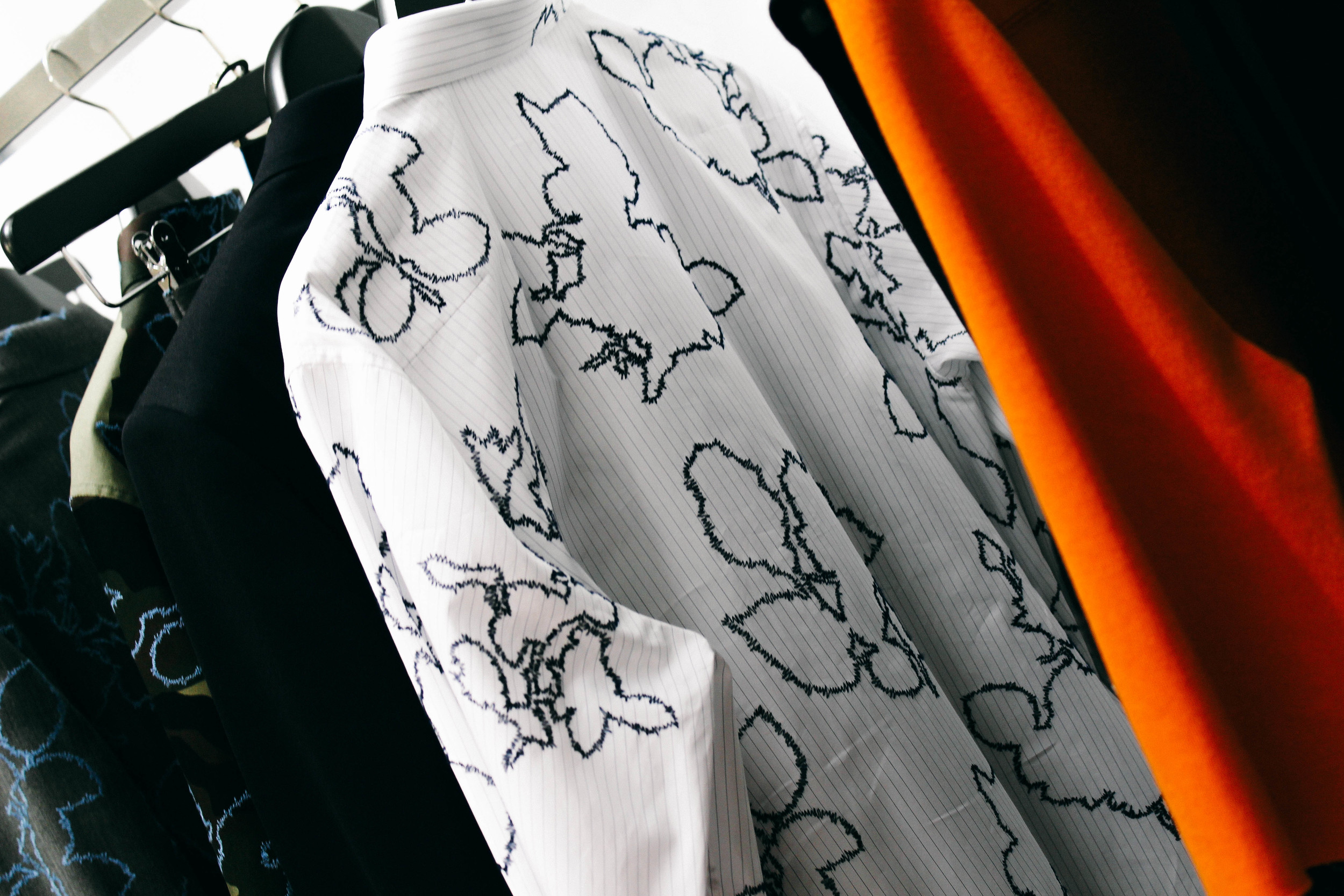
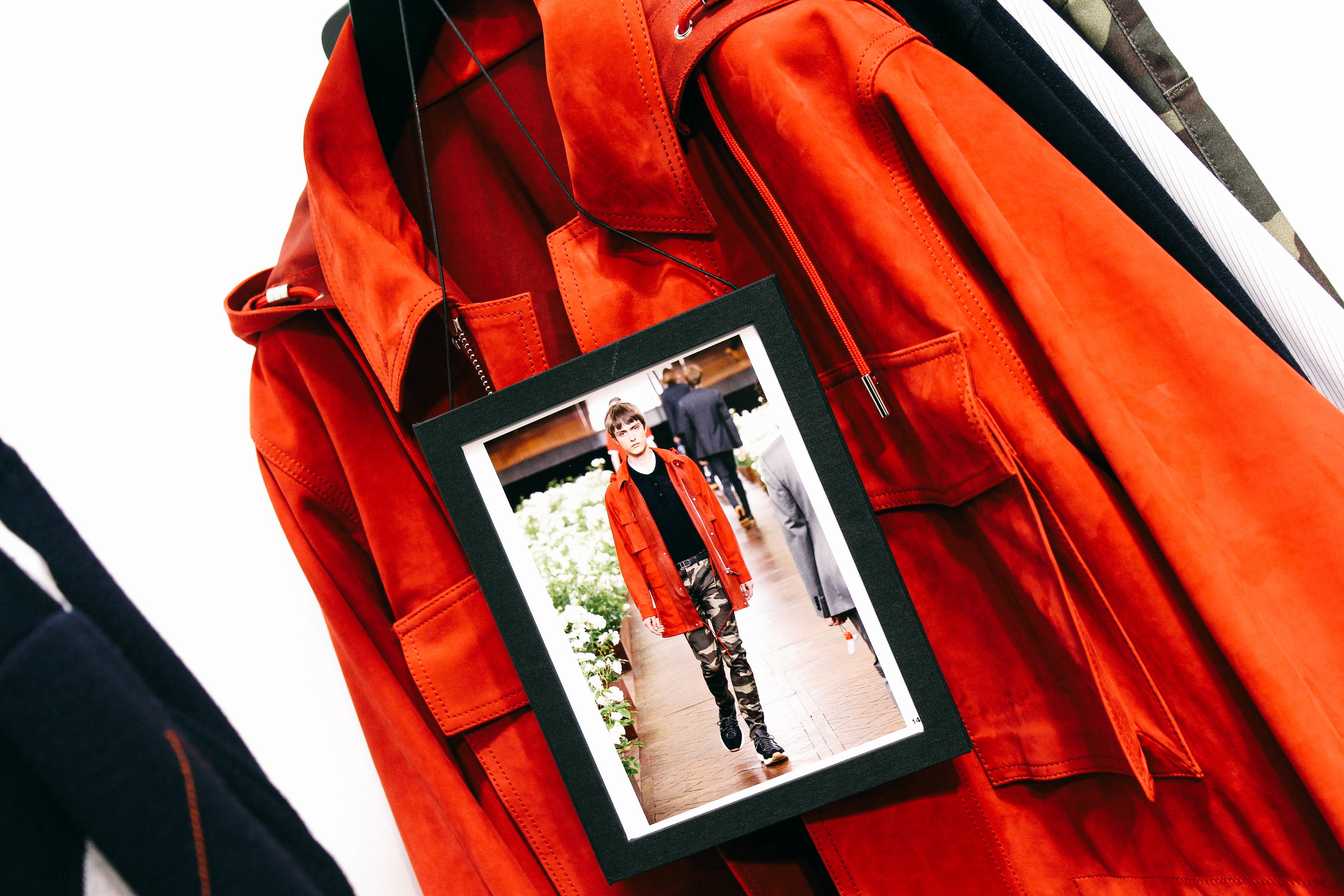
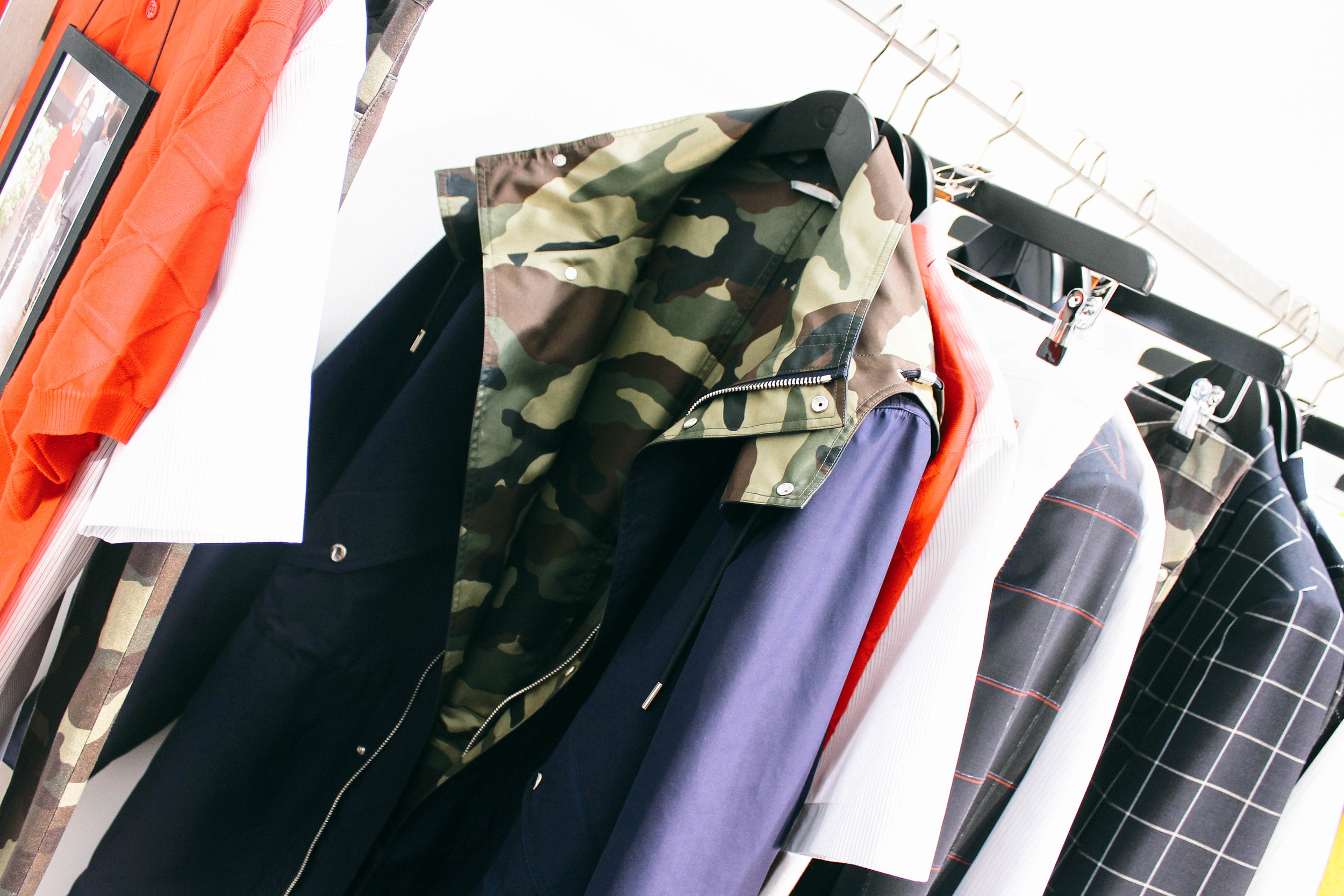
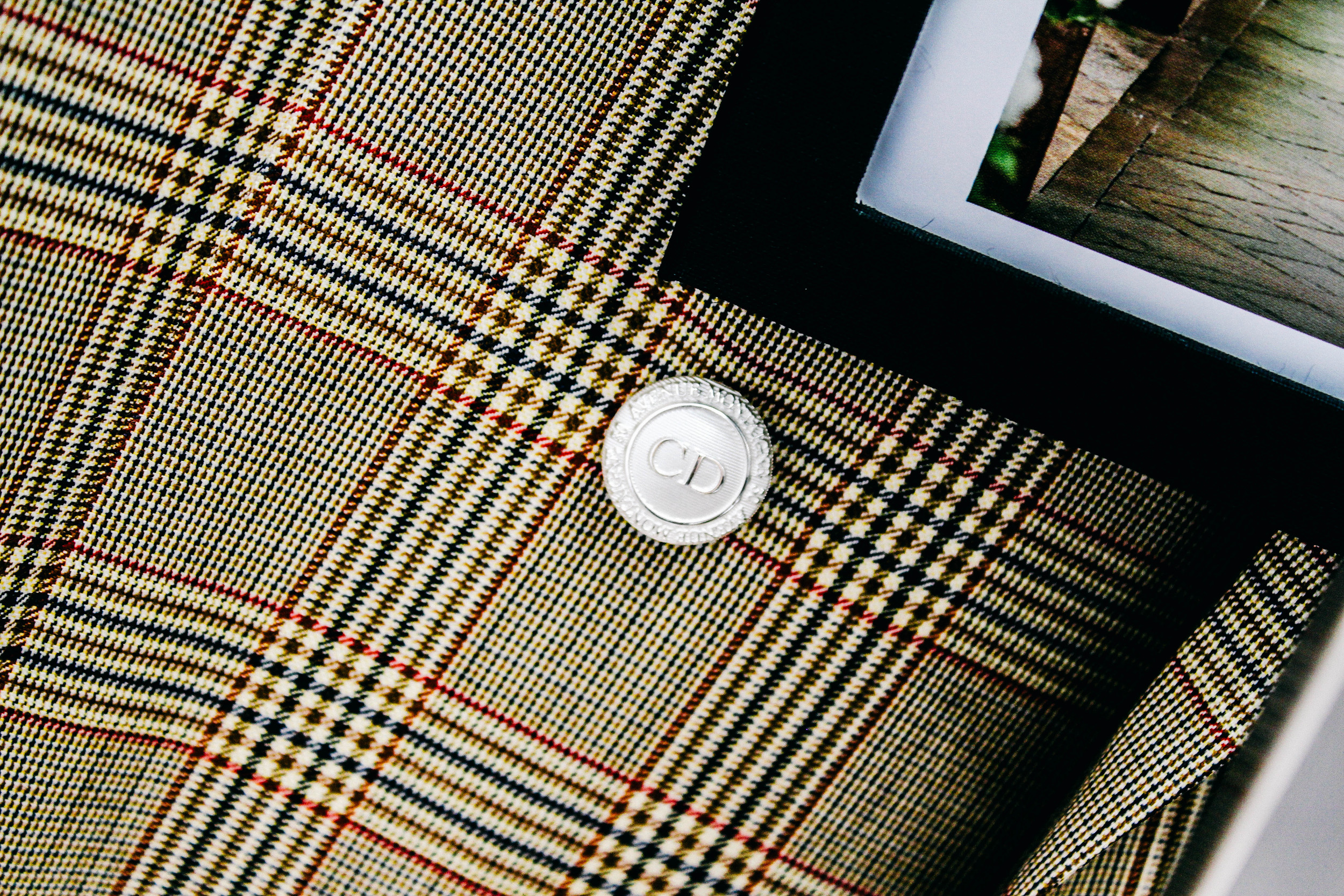
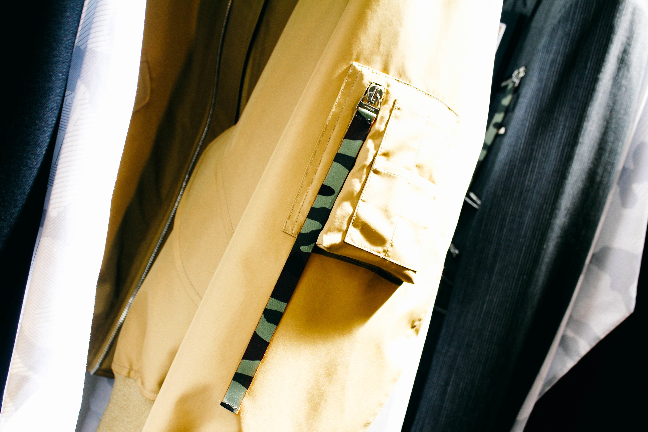
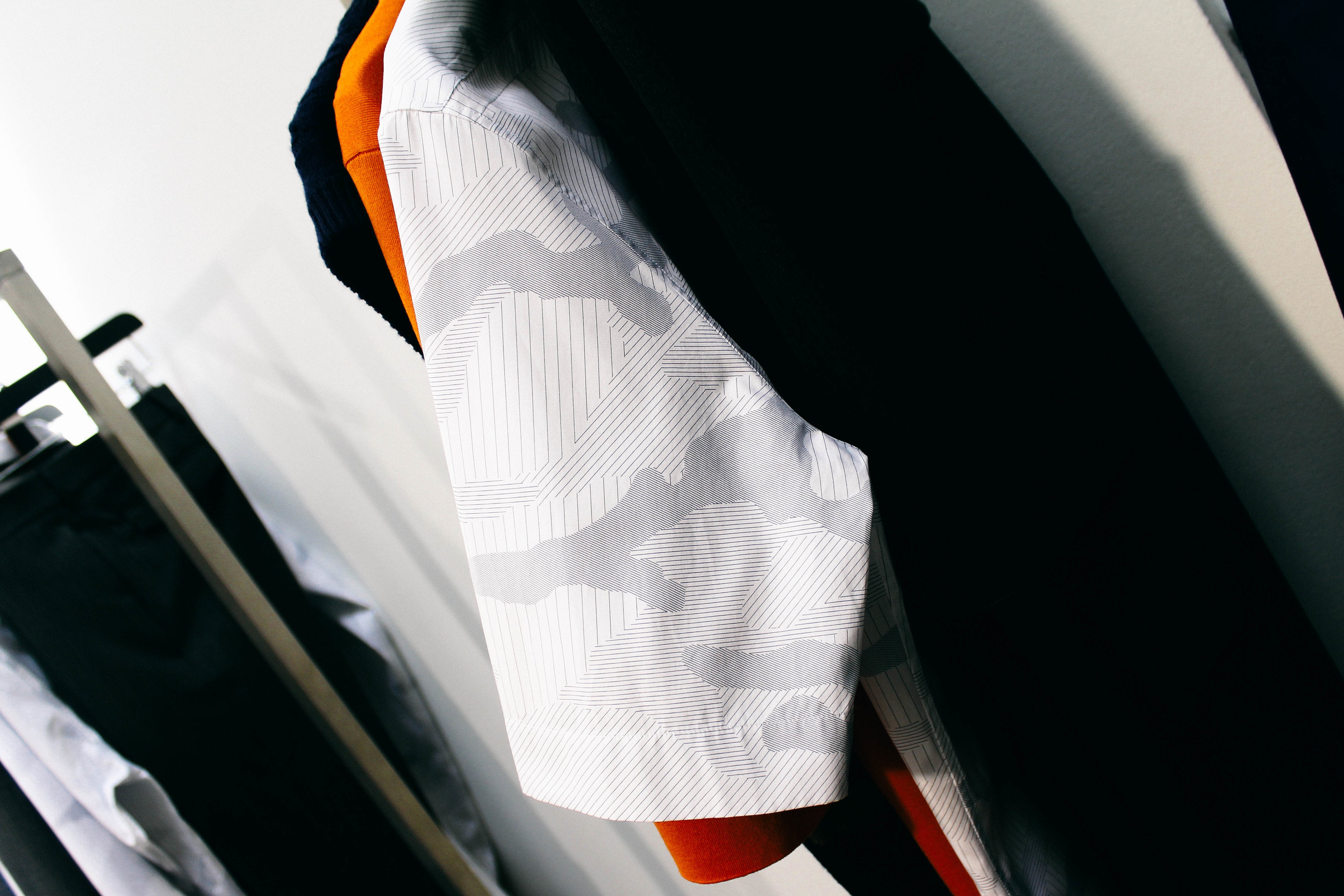
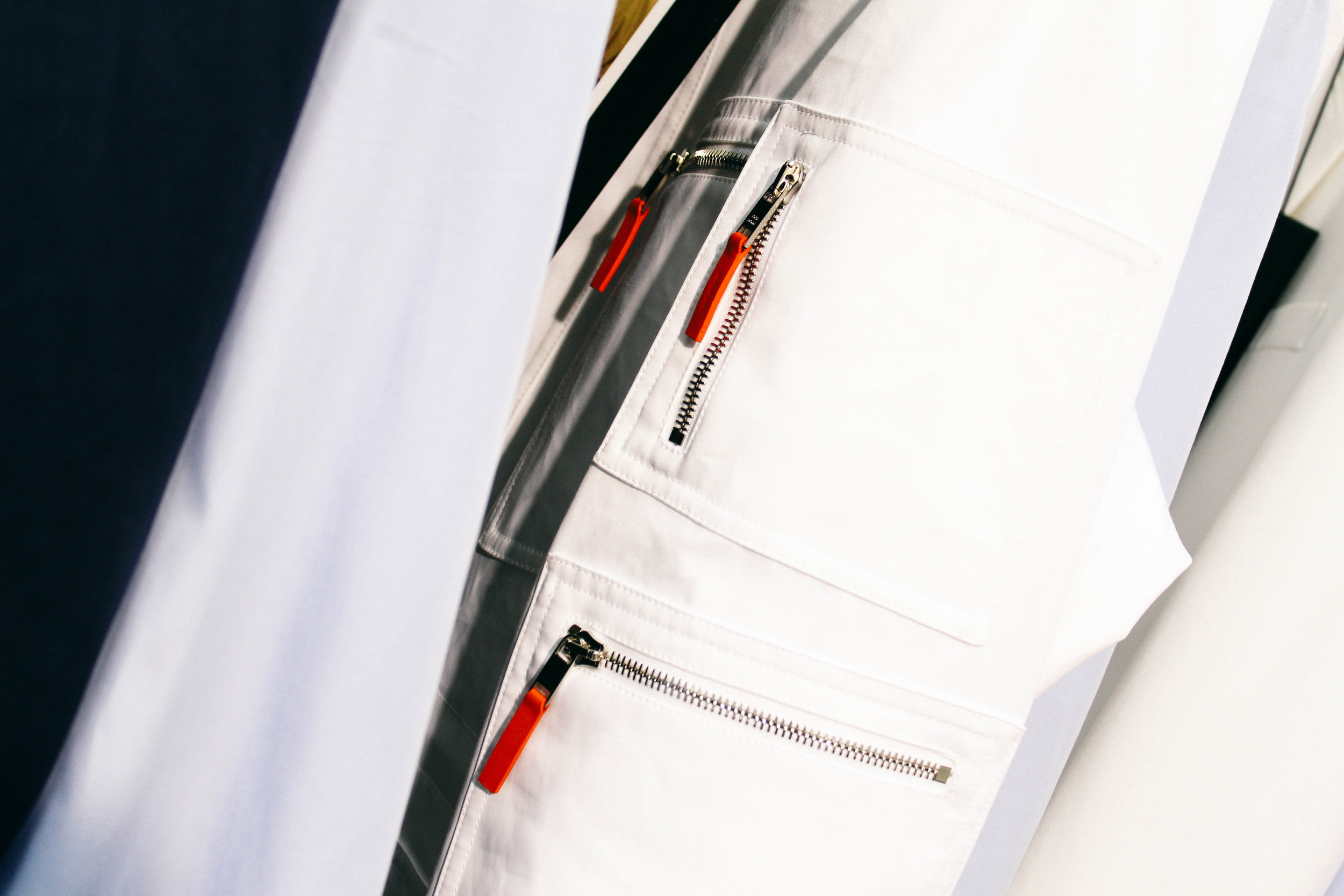
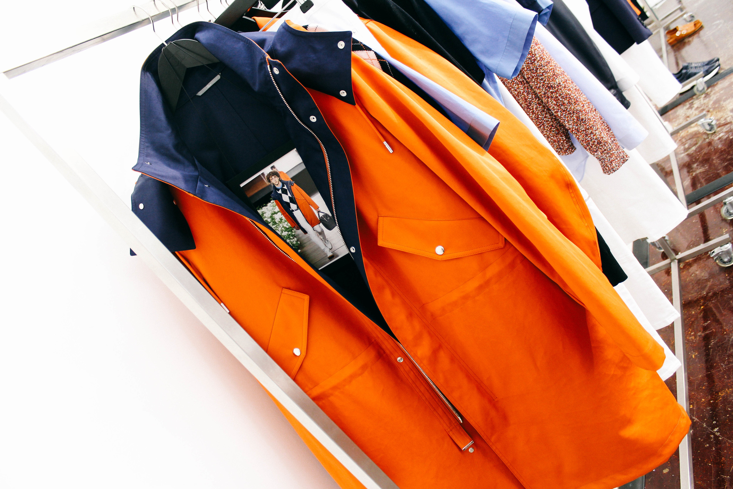
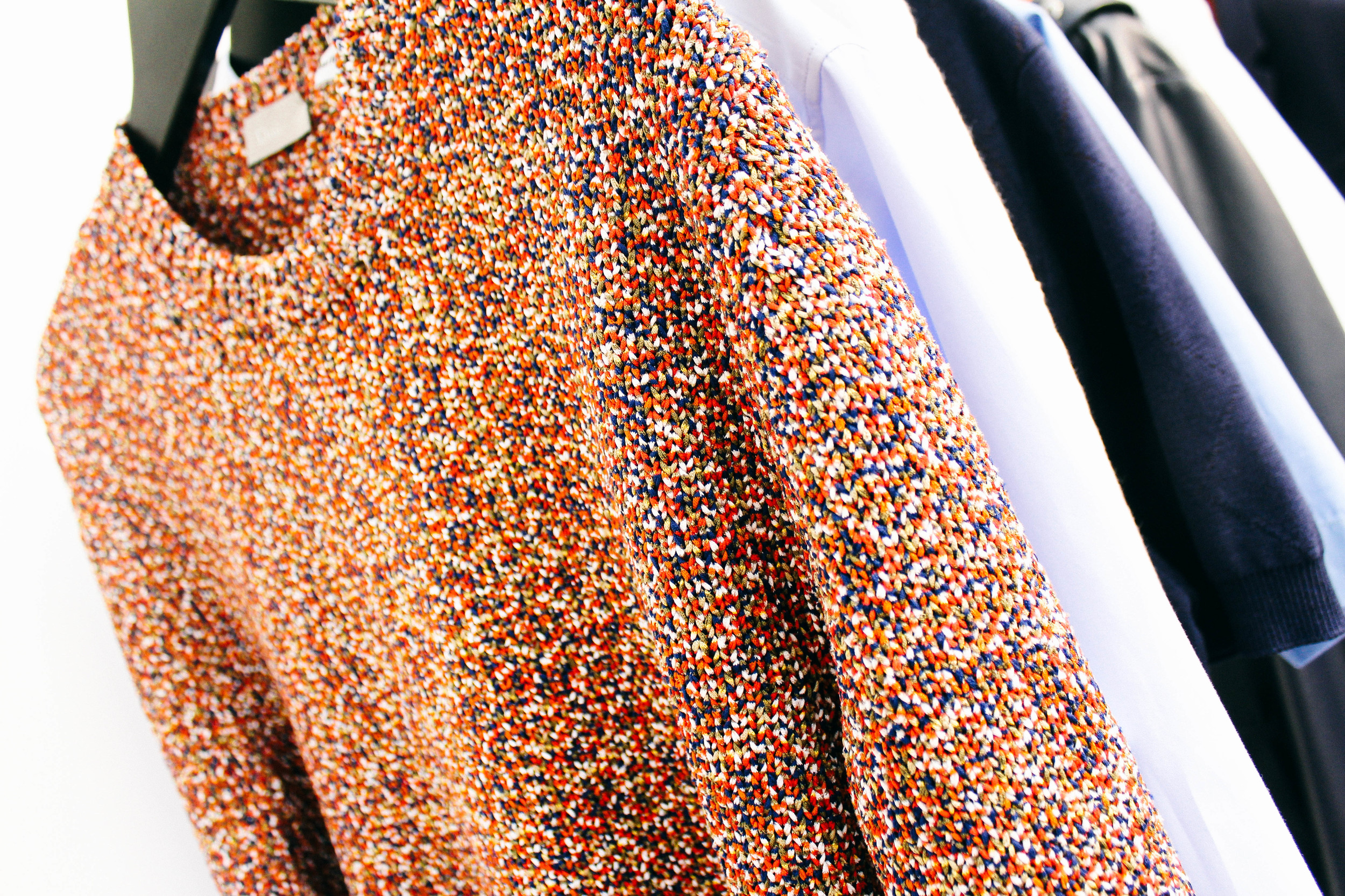
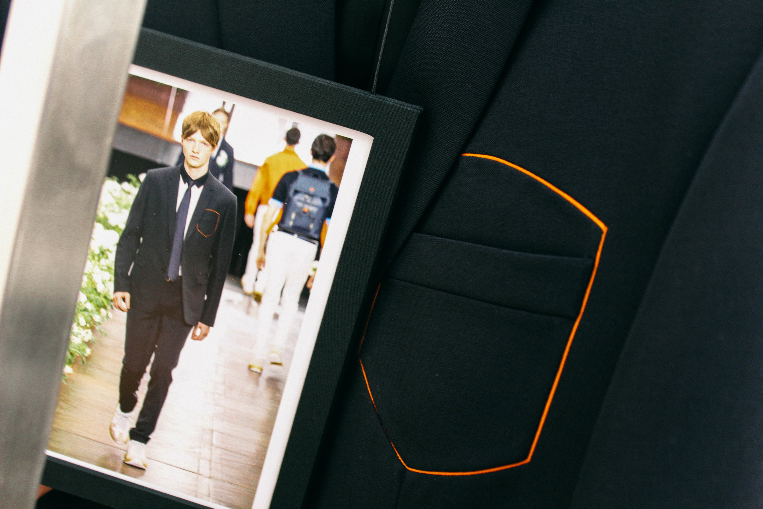
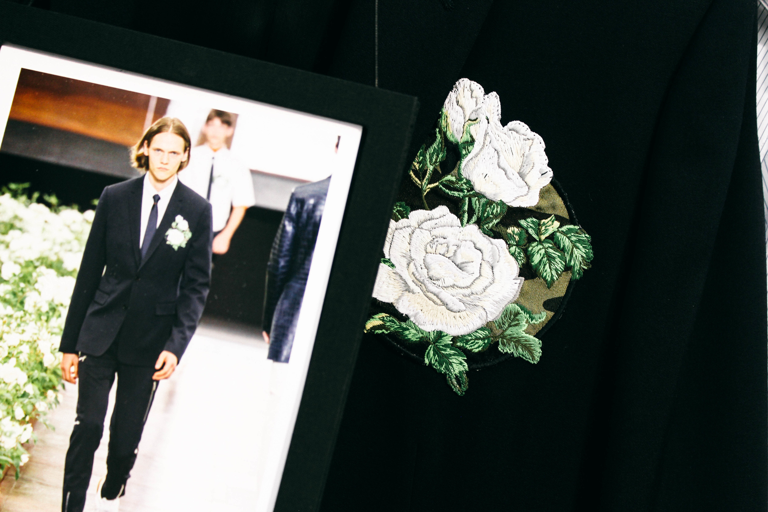
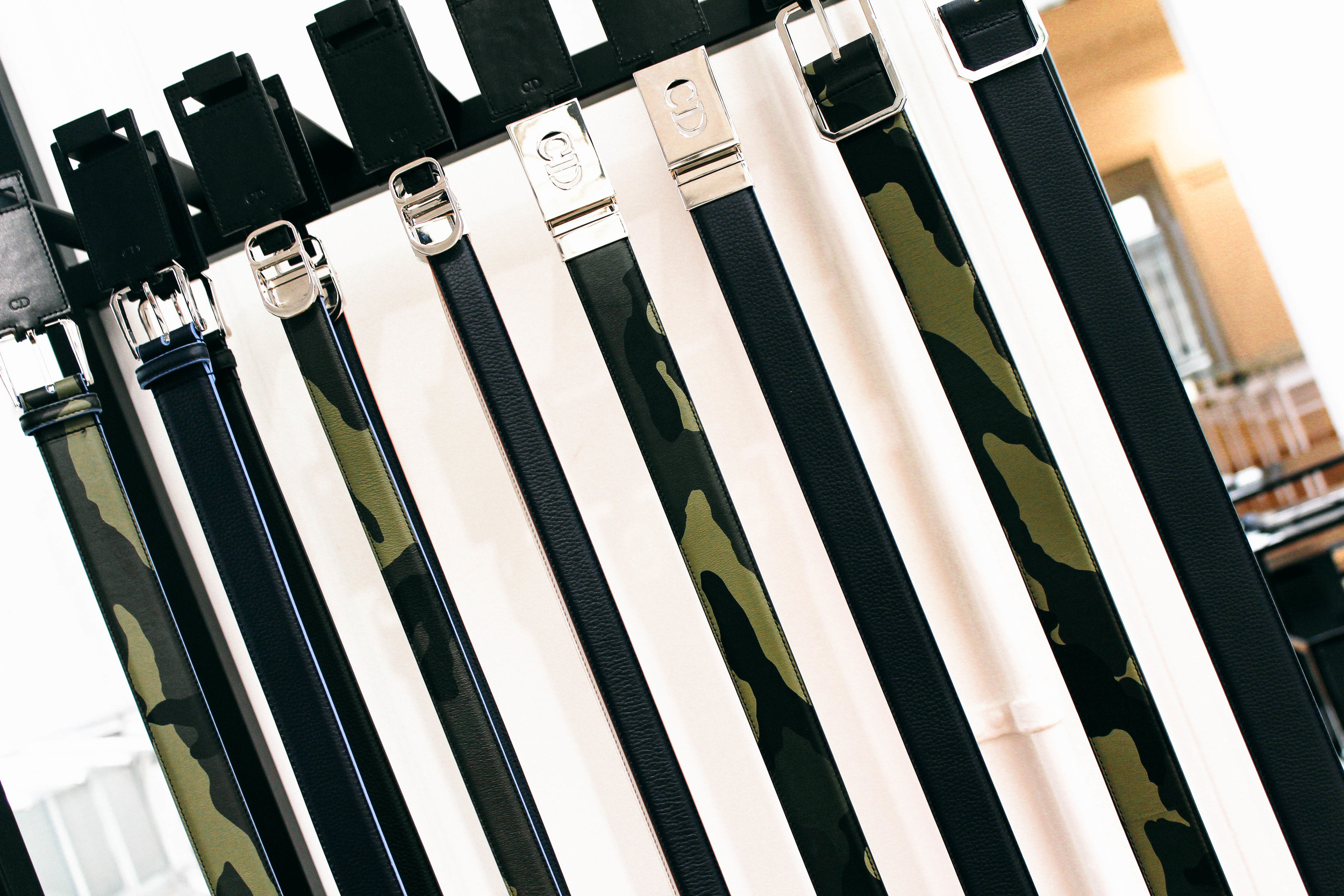
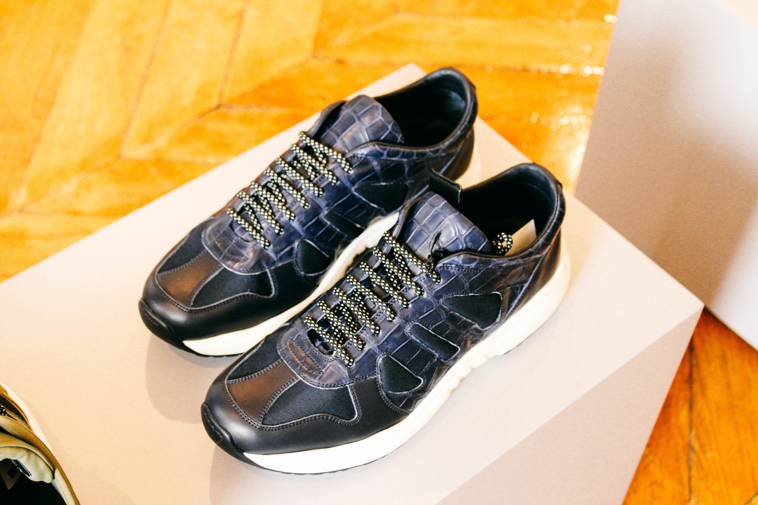
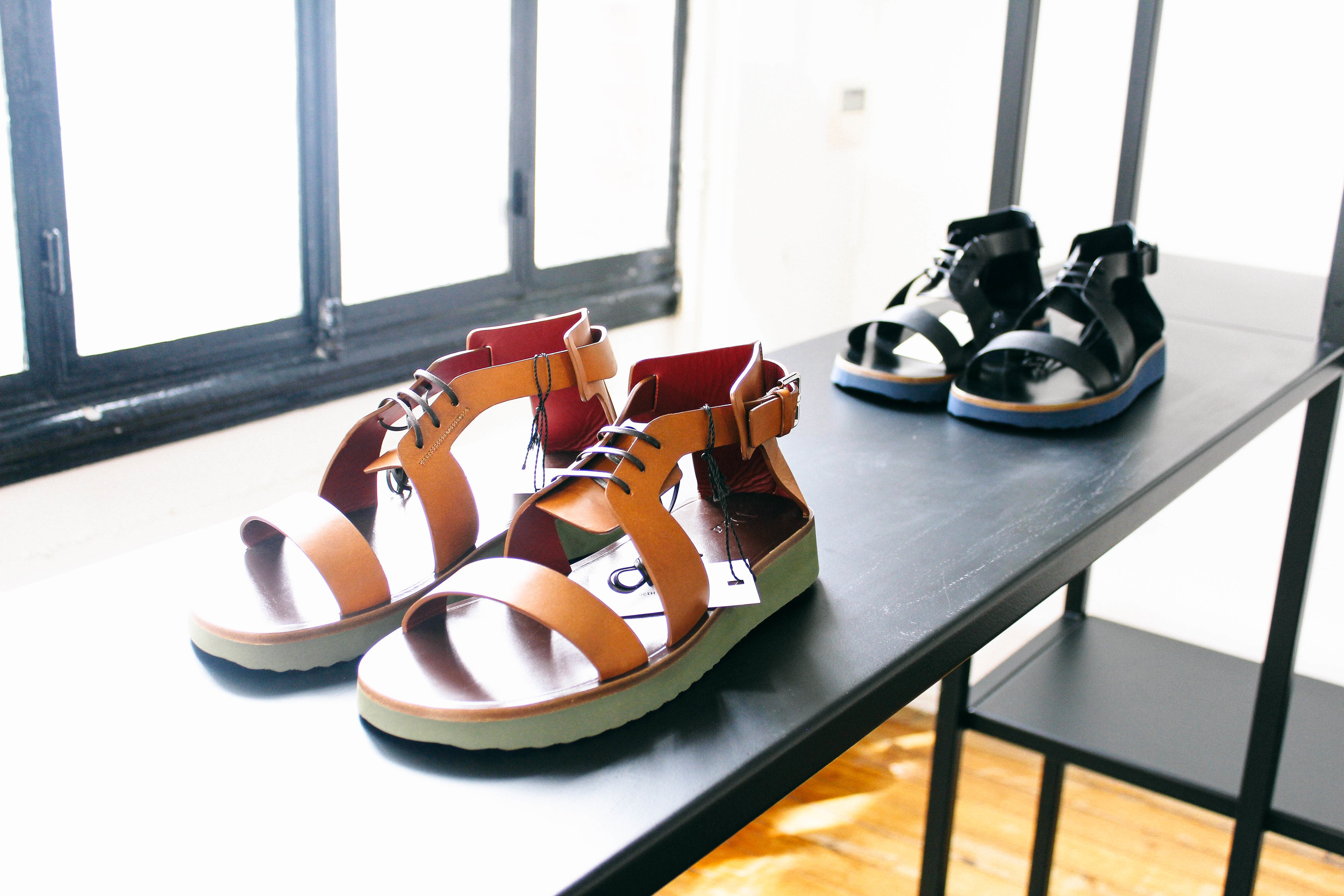
The flowers came into life: a mesmerising extravaganza as rows of over 2000 Fee des Neiges white rose bushes set the runway. Kris Van Assche wanted the dialogue with Christian Dior to be more abstract and contemporary. Emerging from the super formal of Hiver 2015, the Dior Homme wardrobe has tied in with hints of sportswear; khaki camouflage patterning and the MA1 bomber jackets are perhaps the first time to be seen amongst the brand’s collections. There’s also the more polished up side: argyle prints appearing in vests, short-sleeved knit sweaters and shirts. At times, there was even the mix of camouflage and argyles where the idea of the contemporary and traditional are merged and morphed into a new concept.
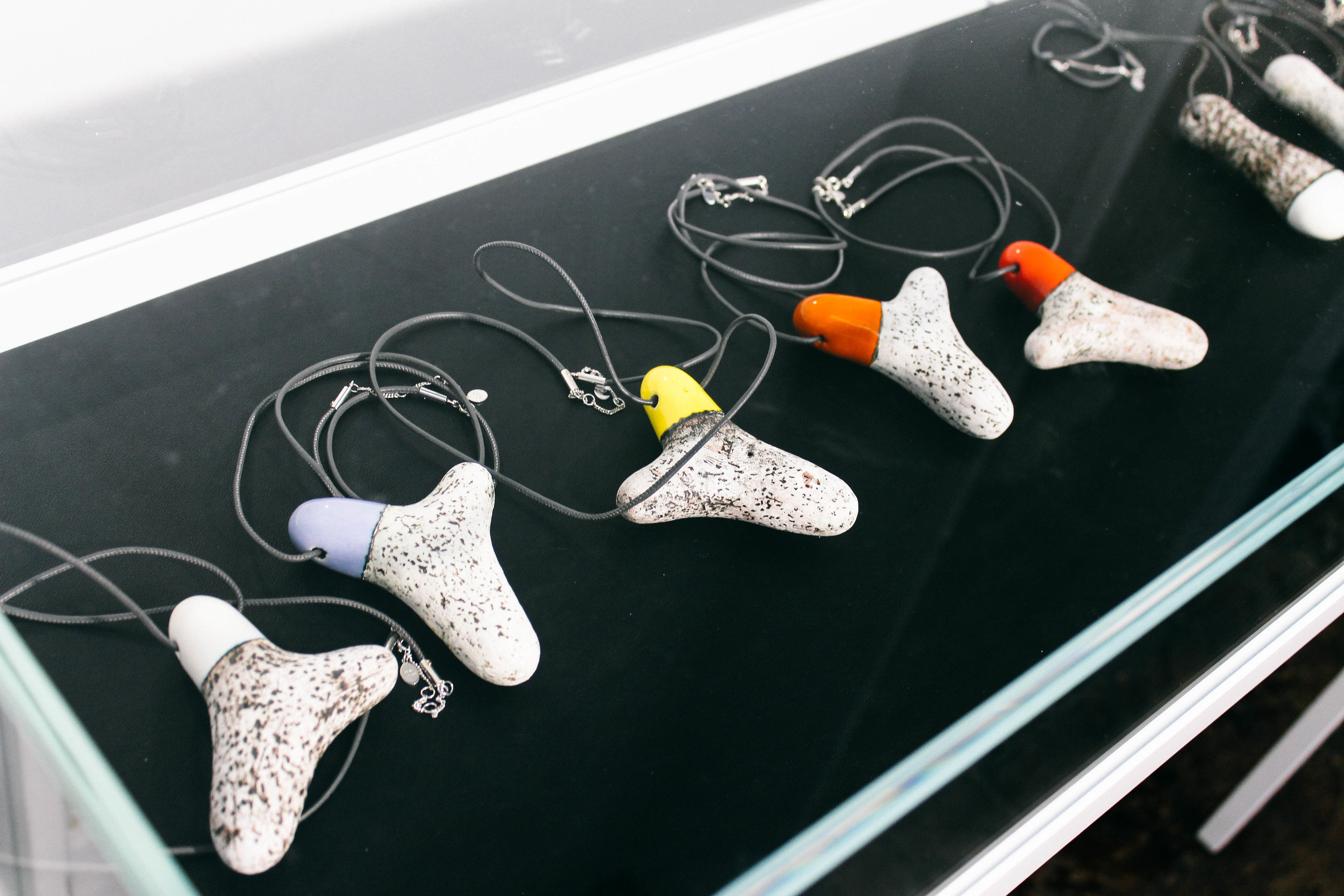
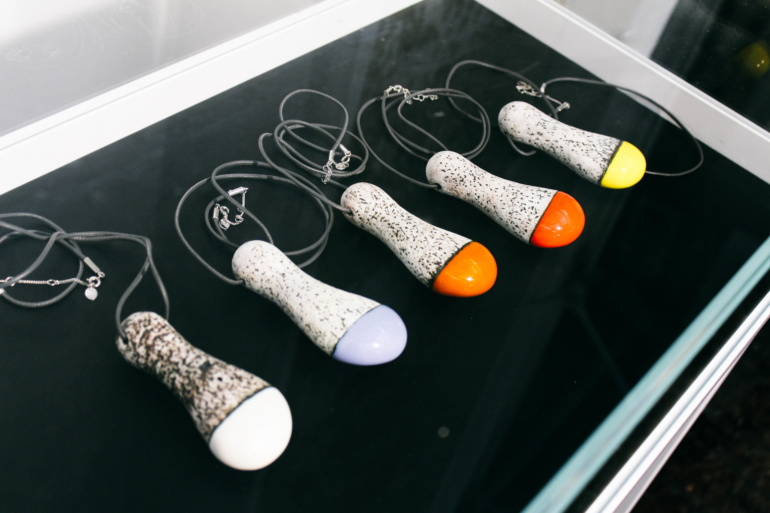
Reviewing the pictures made myself familiar with the works of Kristin McKirdy - a Canadian ceramicist known to use stones and mix of colour to complete irregular artworks. The way she works is similar to Van Assche. As in Anne Bony biography of McKirdy, 'she [McKirdy] doesn't alter the object, she underlines the beauty.'
“Colour isn’t something obvious for me”
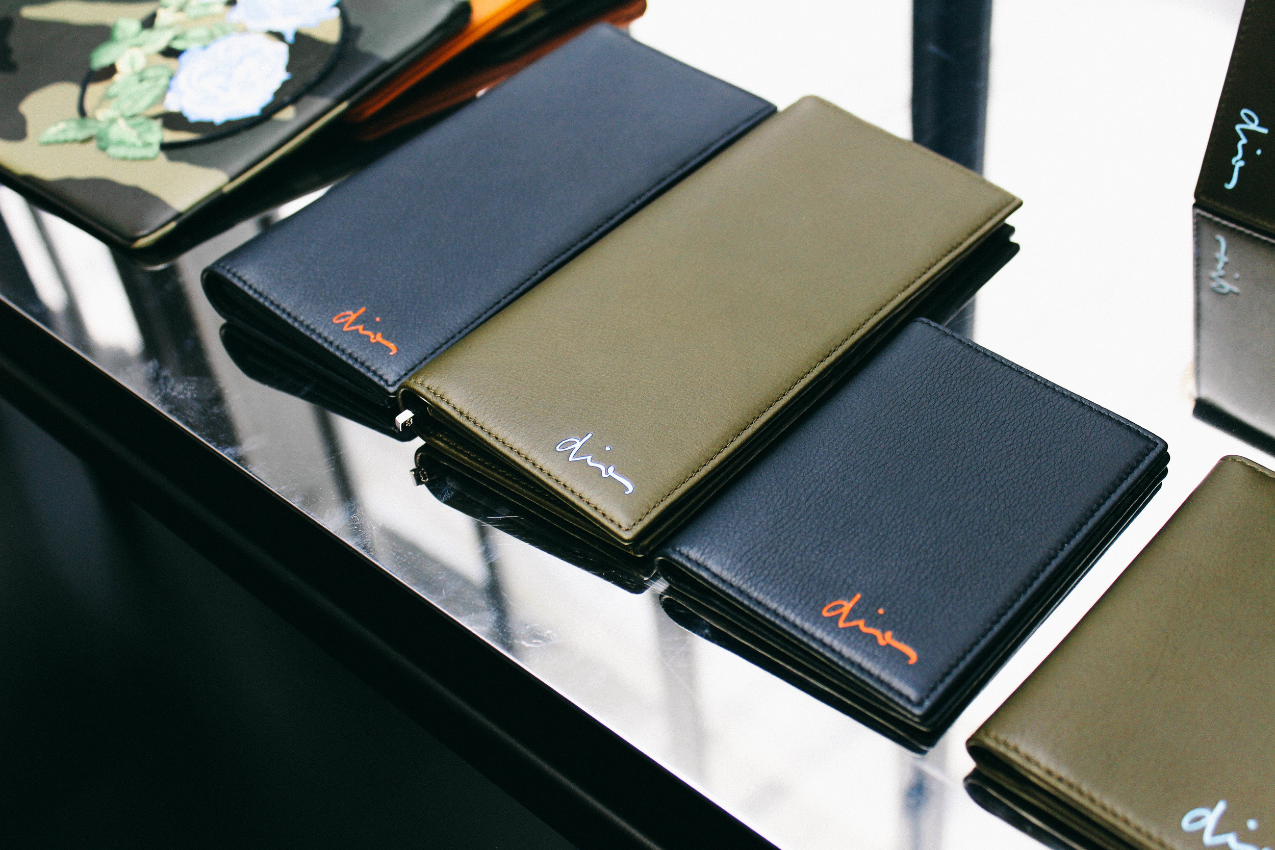
Van Assche shared the problem of incorporating colour into work, and so did McKirdy. Van Assche wanted more colour in his collections in a less expected way but had the responsibility of retaining the image of the Dior Homme. And so the 'base' remains, in McKirdy's use of calabashes and primeval pots, as in the long wool coats and waterproof parka jackets at the show. McKirdy 'finds anew the primitive meaning of the pot' and so does Van Assche - suits with cornflower blue stitching or a bright orange, high-neck knitted tee worn under an outfit. It's all an accumulation of codes that we, men, naturally like to decode.
Undoubtedly more toned down when comparing to the Hiver collection's hyper-formal tone. This collection presented a brave crisscross between designs of 'real middle-class' and streetwear; not at all 'rough military camouflage' but comfortable-to-look-at, casual wear camouflage. These sartorial codes discreetly come together to form the new order: a reordered dress code that respects the traditional code.


To be continued...